heat embossing

SUPER SPARKLY HEAT EMBOSSING

2020-10-05 18.34.08.jpg

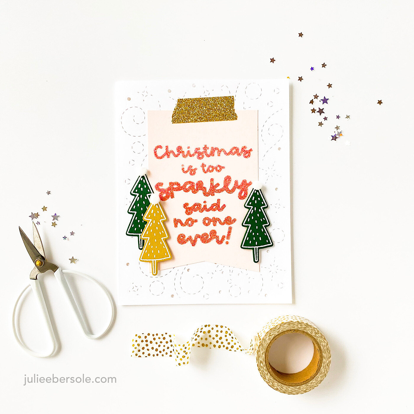
Can you use just “glitter embossing powder”—you know, the kind with the glitter built right in? Sure! It works! But, what if you want a “luxe” glitter effect? Oh, man, nothing beats Sticky Stuff + glitter and in my opinion? Totally worth that extra step!

2020-10-05 18.34.51.jpg

I’ve used Sticky Stuff for well over a decade; I like the grind and how it’s always beens super reliable for me. Yes, there are other similar sticky embossing powders out there, but I always come back to this one for the best sticky experience. LOL!

Hope you are doing well and getting some holiday crafty time in! Stay safe and healthy!

TIPS:

  • Use a well-inked embossing pad so this specialty embossing powder really sticks.

  • Pre-heat your embossing tool for at least 30 seconds.

  • Watch carefully as you apply the heat; once the powder turns “wet” looking, move on to the next area; do not overheat or it will cause the embossing powder to cure/harden. When properly heated, you can let it cool and touch it with your finger tip to feel that it is tacky. If it’s “hard”, you overheated and nothing will stick to it.

  • After applying the glitter, “lock” it in (cure the embossing powder) by reheating with powder from the back side and around the front; this will cause the powder to harden and trap the glitter to it.

  • Glitter not your thing? Try ground coffee, sand, flock powder, transfer foils . . .


BEAUTIFUL BOLD FLORALS BY BRANDI

sos-hop2-ebe.jpg

Happy to be hopping this week for sweet Brandi Kincaid’s release for the Ellen Hutson Summer of Stamping event! See Brandi’s full release HERE.

I’ll have a few more samples to share over this week that I made with her sets—all three of which I positively ADORE!!!

Feat. Mondo Pansy

Did some quick and easy watercoloring but with an “anti-coloring” twist to it—one of my favorite ways to approach a beautiful and large card-front-covering stamp . . . (swoon):

 
rnc-sos-brandi-pansy-wtrclr-002.JPG

So gorgeous and easy to work with—LOVE!!!

I’ve had my head down working on some illustrations for future releases, but it was fun to come up for air to share this design—thank you for stopping by and read on for more hop and prize details:


Hop Prize Info


We’ve got a super fun prize!!! One random & lucky commenter will win $25 to the EH shop!!! To enter for a chance to win, make sure to leave comments at each stop along the hop! And don’t forget to comment here, too, for a bonus entry! Comment before Saturday, July 18th at 11:59pm PDT. The winner will be notified by email.

HOP ROSTER:


SUPPLIES:

Disclosure: This post contains affiliate links; if you see something you like, want or need, and purchase via my links, I receive a small commission, at no extra cost to you, which I use to buy coffee, which fuels my creativity and provides energy to make more card ideas. And, pay the rent.

RELAX AND CREATE - EASY DROP SHADOW DIE CUTS

rnc-dropshadow-diecut-001.JPG

I needed a card to celebrate someone special’s recent accomplishment and wanted to keep the design very clean and classy. I nearly white embossed the tag line underneath the “OMG” but went with clear and am really glad I did because I think the white would have detracted from the overall design on the card front itself. WHEW!!! Good call, me! (chortle)

I love this look so much . . . I need more mondo letter dies. Definitely.

rnc-dropshadow-diecut-002.JPG

I love the contrast of the bright yellow for the drop-shadow effect . . . I don’t think things get much easier than this . . .

Hope you are continuing to take good care and staying healthy!


RELAX & CREATE - WATERCOLOR OUTSIDE THE LINES

wtrclr-neg-amaryllis-je.JPG

TRUTH: I don’t enjoy coloring in large detailed images. •gasp

Please don’t huck tomatoes at me; I have always felt that way even since primary school. If it’s gonna take me a long time to color in, I simply won’t do it. I remember in first grade, a classmate looking down her nose at me because I colored outside the lines. My logic: We’re going to be cutting this out, what is the point of staying inside the lines??? Her coloring, on the other hand, was perfect—seriously, every stroke of the crayon was PERFECT. As the teacher came by to observe our progress, she praised my classmate for her beautiful, impeccable coloring. I got a smile and a pat on the back.

WHAT. EVER.

•hair flip•

But, I still absolutely love a large image that fills practically a whole card front and I love color!

I know that the Amaryllis is typically a holiday flower, but I like using it for non-holiday cards, too. I mean, it kinda looks like a lily, possibly a hibiscus flower (dang, that makes me wanna make a tropical floral card with this image—EEP!!!) . . .

This card actually is quite colorful, but, inspired by my friend Carly, I went rogue . . . heh, heh, heh!

Some things you may or may not have noticed in the video:

  • Anti-static pouches (Embossing Magic Bag, Inkadinkado) pounced over the paper surface neutralize moisture or oil from your finger tips and calm down a lot of static electricity so embossing powder doesn’t stick in unwanted areas.

  • Prior to stamping, blow off the excess powder from your paper surface. Otherwise, the pigment or embossing ink on your stamp will “pick up” quite a bit of the loose powder with every impression and transfer to your ink pad when you re-ink the image. Eventually, this can build up on your ink pad, and make it less tacky.

  • This image has finer detail lines; stamping over them a second time can make them bolder. The ink is also more saturated and even; helpful when stamping onto a textured surface like watercolor paper.

  • Every time I use black embossing powder, I end up with a hot mess; instead, I prefer a really good black pigment ink and clear detail embossing powder over top. Works beautifully every time.

  • Notice how I laid down “strokes” of color from the markers against the outside edge of the embossed lines. These aren’t like Sharpies; you don’t want to “brutalize” (a.k.a. smash) the brush nibs against the surface. Think of them like delicate paint brushes, pre-loaded with color.

  • With mid-to-dark hues, it doesn’t take a lot so be careful how much color you initially lay down; start with a few strokes and avoid trying to “fill in”. Paint by “pulling” the colors away from the embossing lines with your waterbrush. You can always add more color later.

  • If you get in a hurry and slop a little watercolor where you don’t want it, lift it out by using clean water on your brush and dabbing with clean paper towel, but keep in mind that with dark/intense colors, this can be harder to accomplish.

  • Note to self: I probably should have positioned my stamp in the lower right corner (with the bottom of the floral closer to the hinges) instead of the lower left. I would have had more room to let the paper hang outside the edges of the platform on that left side.


Minimalist coloring. YAASSSSSS!!! •fist pump•

And, before I bid you good weekend, I am so happy to share that the Ellen Hutson Warehouse Team is back! YAY!!! And they want to thank you for your support during the “Shelter In Place” with 15% off your orders. Use code BACK15 at check out and please check the fine print.

may-2020-sale-ig.jpg


Stay healthy, stay crafty.


SUPPLIES:

Disclosure: Just so you know, this post contains affiliate links; if you see something you like, want or need, and purchase via my links, I receive a small commission, at no extra cost to you, which I use to buy coffee, which fuels my creativity and provides energy to make more card ideas. And, pay the rent.

3 SIMPLE BOTANICAL CARDS - FLORA & FAUNA 3RD BIRTHDAY

ff-3-botanicals-grp.JPG

My friends over at Flora & Fauna are celebrating 3 years!

They have a big sale going on to celebrate—20% off Mar 19-23, with code: birthday3

These three cards feature images from their most recent release. If you’re like me and adore hand-drawn, whimsical imagery, their stamps are so SO fun to work with!

Feat. Flora & Fauna Butterfly Dreams

Feat. Flora & Fauna Butterfly Dreams

I love how the butterfly white embossed on black POPS against that colorful flower. I used Fresh Inks in Peach, Tomato Red, Celery and Basil for this one.

Feat. Flora & Fauna Tropical Leaves | Everyday Word Party

Feat. Flora & Fauna Tropical Leaves | Everyday Word Party

Just watercolored (with Kuretake Gansai Tambi) some patches of green in various hues and then gold embossed this gorgeous leafy stem onto vellum; it’s secured to the card front with glue dots—the line details really help conceal those glue dots nicely!

Feat. Flora & Fauna Tropical Leaves | Word Party 3

Feat. Flora & Fauna Tropical Leaves | Word Party 3

OK . . . my name is liar—I actually had FOUR cards, but I forgot to grab the fourth one to shoot. I’ll shoot and share it another day—not sure why I forgot it, but hey, it’s crazy times right now, right?! Anyway, I took part of my third card and used it on this one above. I’ll give you a hint: I used a particular EH die that made pulling this off super easy . . .


Hope you’re staying healthy during this time, and maybe getting an opportunity to craft and make cards!

Thanks for stopping by!


When you purchase via my affiliate links, I receive a small commission from the vendor. Thanks so much for your support!