Essentials by Ellen

COASTAL GREETING DESIGNS

Disclosure: I include affiliate links to the products used in my projects and make a small commission when you purchase via those links, at no extra dimes to you. Thank you.

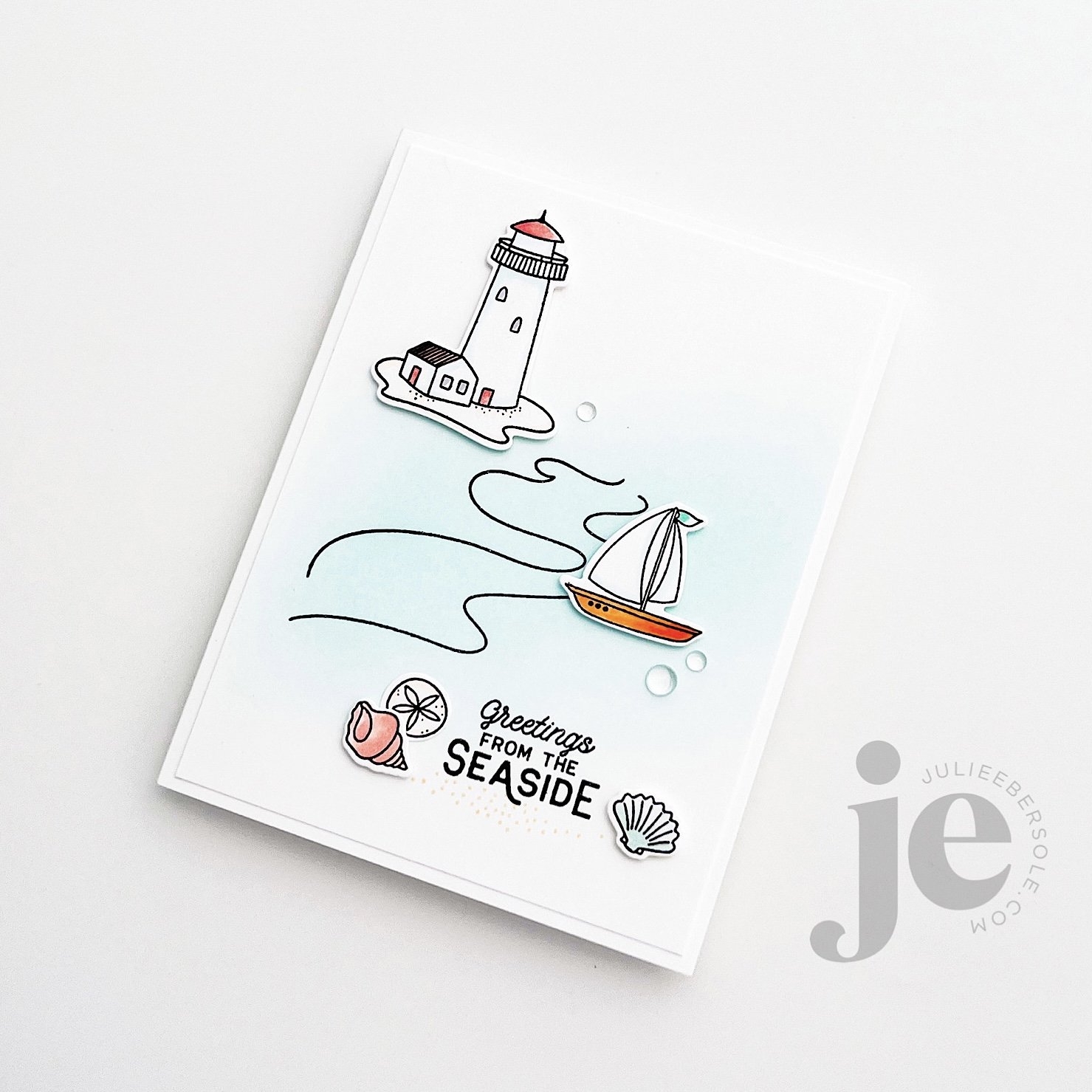
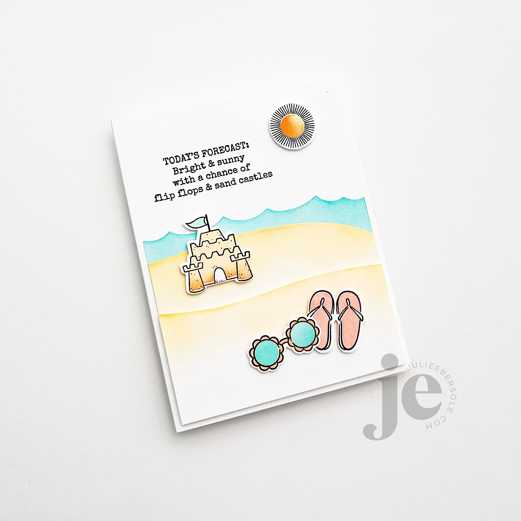
There are so many cool lighthouses along the Pacific Northwest coast line—it would be fun to take a road trip and visit them all. Some day, maybe I will. In the meantime, I have no problem creating little seaside scenes on paper, LOL!

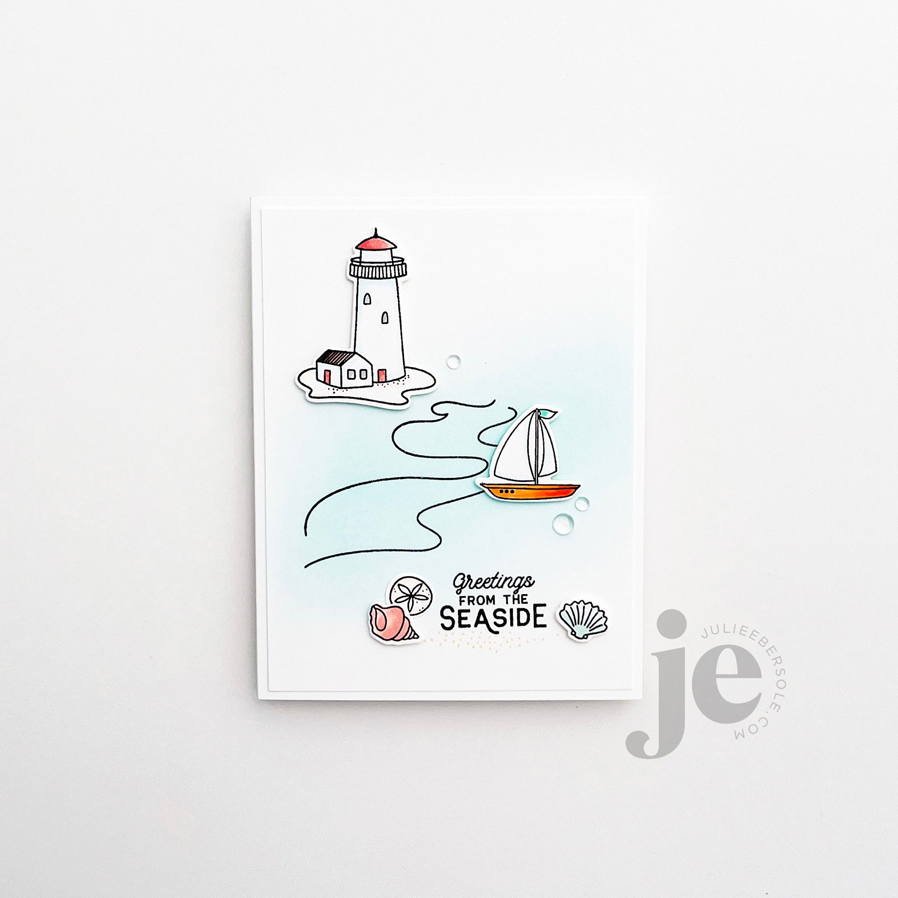
Some really soft ink blending over the wave lines for the ocean, a little quick coloring with a few alcohol markers and just a few of those Clear Droplets!

The wonderful thing about Seaside, is how well it combines with Summer Doodles—so many ideas in my head, but I haven’t yet had time to play with.

I adore a two-step stamp set like this one—those who like to color can, and peeps like me can use our beloved solids! YAY!!! An ink that stamps crisply and comes in beautiful colors is ideal, so I rely on Catherine Pooler and Concord & 9th for the job. I’ll have all the colors I used on this design listed down in the supplies.

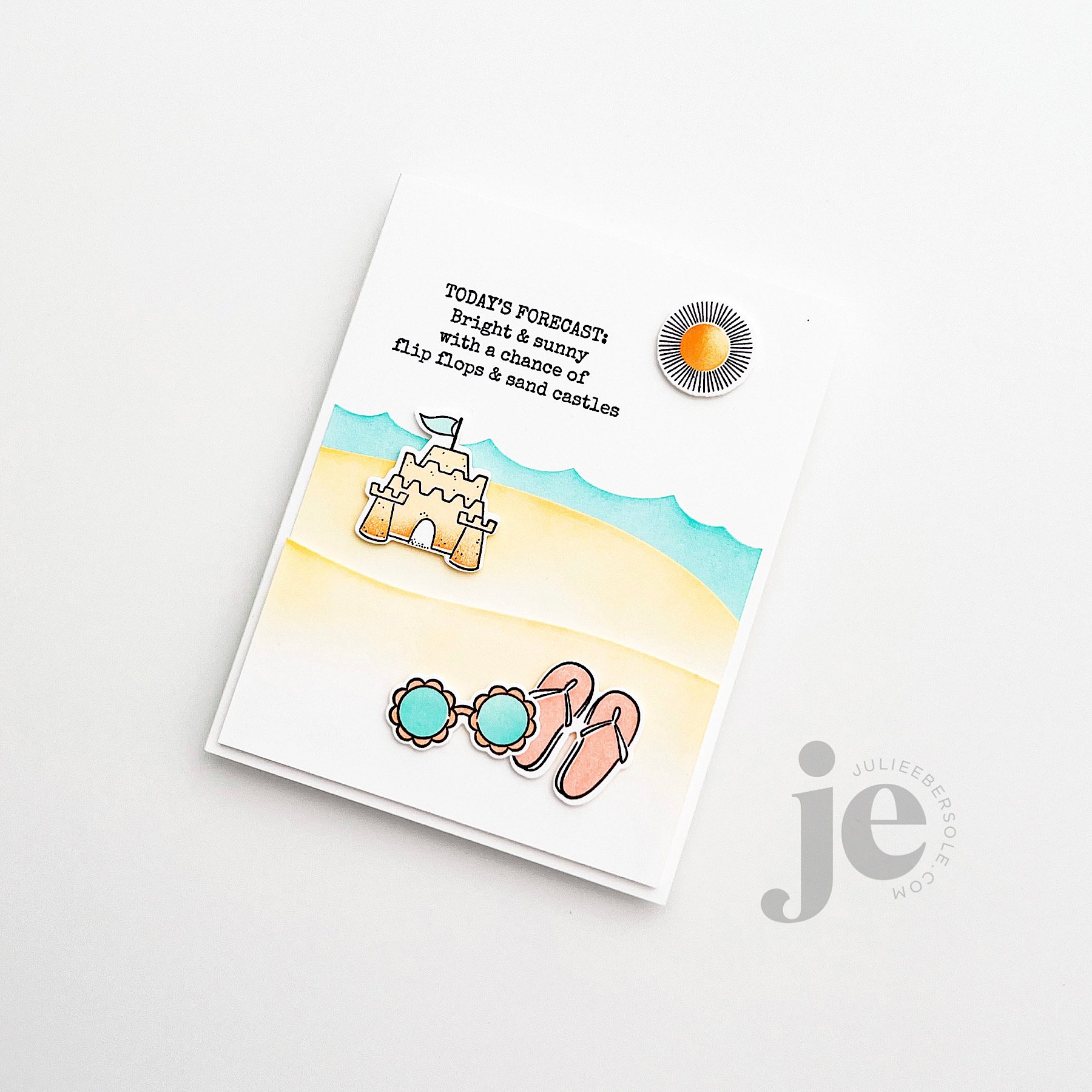
After die cutting the landscape and wave pieces, I ink blended along the shaped edges, trimmed them and popped them up on my base card. I liked this one so much the way it was, I sat on my hands overnight. It’s always tempting to add “one more thing” . . . But, the next day I still felt the same about it, so that’s my story and I’m stickin’ with it.

Have a beautiful day and thanks for stopping by!

"HEY, NOW YOU'RE A FLOCK STAR"

Disclosure: I include affiliate links to the products used in my projects and make a small commission when you purchase via those links, at no extra dimes to you. Thank you.

Flock Star , from the the July 2023 Essentials by Ellen Release , makes it super fun and easy to make an interactive card. Fans of the movie “Shrek” may recognize the opening song “All Star” by Smash Mouth, which actually inspired this particular combo. I’d never heard of the band until I saw the movie. Hence, the pun “Flock Star”. (snort)

The dies feature a debossed wing design on the body of the flamingo, making it easier to determine where to stamp whatever sentiment you want to use from the stamp set, so it will be revealed when the hinged wing is pivoted up or down. There’s also an additional wing, without a hole for the brad, if you want to layer another wing over top to conceal it. Options are nice, right?!

I gold embossed the sentiments (detail gold embossing powder), but it would also look great just with black ink. I just felt the gold was a nice touch because of the glittery gold card stock I used to cut the concealing wing. It’s popped up with a little foam tape over the pivoting wing.

I think I’ll be swooning over the Monstera Stencil for all eternity—when I was designing it, I really wanted it to have a uniquely hand-drawn or hand-cut look. You don’t want to know how many renditions I went through before I was finally satisfied, LOL! I have a tendency to obsess over things like that. OCD much? In any event, I love it SOOOOO much, so I’m going to cut myself some slack over the time it took to get it “just right”.

I’ve been practicing my ink-blending; I’m always so heavy handed but I really really want to achieve that lovely, delicate effect I’ve always admired by the talented Laurie Willison and I think I’m finally getting there.

One thing I also wanted to mention is this seriously cool, new Grip Mat by Waffleflower! I’ve been using it to anchor my paper down for stenciling and stamping!!! You can read about it on their site; they’re taking pre-orders for it now, if you’re interested. You can get a smaller one that will fit your Mini MISTI, too. I swapped out the foam layer in my MISTI platform and dropped this in, with the acetate grid they’ve designed to go with; I won’t have to deal with magnets/tape again. It truly is brilliant!!!

I have more samples to share with the products I designed for the release over the coming days. For now, you can hop over to Ellen’s site and check out the whole release HERE—it is such a lovely collection!

Thanks for stopping by and don’t forget to slather yourself in sunscreen when you’re enjoying the fabulous summer weather—it’s been gorgeous here!

BIRTHDAY VIBES

Disclosure: I include affiliate links to the products used in my projects and make a small commission when you purchase via those links, at no extra dimes to you. 🙂 Your support is appreciated more than I can say!

ESSENTIALS BY ELLEN APRIL 2023 RELEASE IS AVAILABLE NOW (affil)

I am addicted to “type”. I love words, letter forms and typography. There’s a lotta’ my beloved type in this release and the larger the type, the more it makes me giddy. I’m sharing a few samples I made with my new stamps, dies and hot foil designs but there’s a lot more inspo and goodness over on the release page, so check it out by clicking the photo above, or the link directly beneath.

Closer details can be seen in the slide show below:

I share more insights and details on the products I designed and the samples above in a recent video on the Ellen Hutson YouTube Channel right HERE.

Someone on Instagram asked about the colors I used so I am listing the color palette I stuck with for all my samples down below in the supplies. Note, some are paper colors that have been discontinued 😭 but I have included suggestions for alternatives I think would be lovely and are very similar in hue.

Hope you get a chance to join the Ellen Hutson Release Hop over on Instagram—there’s a giveaway and all you need to do is leave some comment love on the hop stops, to toss your name into the hat for an opportunity to win! The eye candy is DELISH!!!

Thanks for stopping by today and I hope you found the above inspiring!


2 PUNNY VALENTINES PLUS A TUCK AND FOLD CARD

This card started as a sketch, but as I temporarily laid everything out, I felt like it needed something “more”—something small, but a little different from what I do out of habit. Originally, I had planned to white emboss the sentiment onto a strip of black card stock and work it into the layout. That’s a great stand-by that works quite well for many of my designs.

But, the idea of deviating from my stand-by, just slightly, kept nagging at me. So, I mounted the solid pink heart to the base card and then moved that to my MISTI, and curved the sentiment slightly, along the edge of the heart, got it mounted to the lid, and then inked and stamped. The golden colored frame was then mounted a little cattywampus (intentionally) with a little bit of glue in just 3 spots—I like the dimension it gives when it curves slightly up from the card front.

Everything else was clear embossed with my favorite black ink (affil) onto watercolor paper (affil), watercolored and die cut before 3D mounting into place.

Immense satisfaction achieved! (fist pump!)

This little bubblegum machine shaker card turned out so cute! Initially, I couldn’t decide on a background/backdrop for the machine and it occurred to me to grab my 1” circle punch and just punched a bunch of “dots” from card stock in coordinating colors—I love it!

I used Staz-On Cotton White (affil) to stamp the sentiment on the Crystal Clear Plastic (affil); I probably should have heat embossed it (this acetate is heat resistant) for better visibility as it’s hard to capture it that well in a photo, but IRL, it shows more prominently. Those teeny, tiny rainbow confetti hearts (affil) were just beggin’ to be filler, so I had to do it!

Here’s a TIP:

If you don’t have any sheet size foam tape (affil) to die cut for the shaker walls, try cutting the shaker front piece 5x from 110# Neenah Solar White (EH / AMZ affil) and just layer/stack them all together with Bearly Art Glue (affil)

feat. BIG LOVE STAMPS (the hearts background) | XOXO DIE

This way fun “fun-fold” design is actually a tri-fold that tucks and folds! I haven’t done one of these in so long and it’s one of my favorites so I need to poke myself as a reminder to do this more often because it’s so easy and always feels “clever”.

Video Tutorial below:

If you give this fun fold a try, you’ll have to let me know what you think! I love that it’s soooooo simple but the explosion of colors just makes it so visually impressive!

I cannot believe we are mid-way through January already; CRAZY!!!

Stay crafty!


Disclosure: I include affiliate links to the products used in my projects and make a small commission when you purchase via those links, at no extra dimes to you. 🙂 Your support is appreciated more than I can say!

OTHER SUPPLIES

The color palette I used for these samples:

Tools:

Embellishments:

Miscellaneous:

LOVE, FRIENDSHIP & VALENTINE RELEASE TODAY!


A new release is here—YAY!!! All the samples on the release page (affil. link) have been givin’ me the vapors!

There’s an Instagram hop going on—skedaddle on over to see eye candy from the design team, toss your name into the hat for prizes and just flat out be inspired! Link: Instagram Hop starts at @ellenhutsonllc

I’m sharing a few samples here, that I’ve shared on my Instagram, in case you don’t follow me there. Hey, I totally get it; not everyone is on all the social medias—not everyone actually “likes” social medias. #amirite? #itsOK

feat. BIG LOVE STAMP SET/DIE (affil link)

Glued some strips of colorful card stock onto my base card, triple die cut LOVE and layered the letters together to create faux chipboard and clear embossed “ya’” over the stripes. A deviation from my normal white; love it so much, I wanna marry it! LOL!

feat. SO CHEWSY STAMP SET/DIE (background hearts from BIG LOVE) (affil links)

Stamped a random background of hearts in my color scheme and popped the die cut image onto a mini Action Wobbler (affil link)—it will compress down when you slip it into the envelope but as you slide it out, it will bobble! One of my favorite interactive mechanisms because it comes already preassembled and you just slap it on there. BAM!!!

I couldn’t capture the shine of the Rose Gold hot foil stamping on the mailboxes, but it is soooooo pretty IRL!

  1. Die cut from watercolor paper (affil link)

  2. Hot foil images

  3. Watercolor over top of foiled designs (it resists the paint/water like heat embossing does)

  4. Assemble

  5. Rinse & Repeat 🤣

Seriously, I could hot foil stamp all.day.long. And, the results on watercolor paper? CHEF’S KISS!!! #allthehearteyes

I like chocolate, but I LOVE dark chocolate and truffles most especially and this set is so fun to play around with because of the different truffle shapes and variety of “toppings”. That rich, chocolatey ink effect was achieved by first stamping the solid images using Catherine Pooler Spiced Ink, then ink blending directly onto the stamp using a sponge and Catherine Pooler Icing On the Cake and stamping over the top again to create some shading and dimension. I then stamped the detail images over top with Versamark and white embossed them.

If you have any trouble with embossing powder sticking where you don’t want it in this situation, make sure the solid images are fully dry —you can use your heat tool to warm the paper and evaporate any moisture—and by applying anti-static powder over the surface and THEN stamping and heat embossing the detail images.

I am old enough to remember the satisfying sound of the Librarian’s date stamp going “tttthhhhhunk!” onto a library card. When I got home with my books, I would slip the card out and then tuck it back into the pocket, repeatedly. No idea WHY I would do that, but I suspect it marked the beginning of my love affair with office supplies and stationery products. Go figure!

Hey, weirdough!

When you open this one, you’ll see a sweet surprise inside!

feat. JAMMIN’ STAMP SET/DIE (affil link)

I call this a Peek-a-boo Pop Out card—the li’l Bread Slice is hand-trimmed slightly smaller than the actual die cut window and mounted onto foam tape for dimension. Before mounting him through the window, I flush-mounted Jam to the inside of the card in a spot where, when you opened it, she would appear and be peeking over Bread’s “shoulder”—err, ahem—CRUST. (snort)

By the way, that decorative edge along the card front is actually one of the “WAVES” dies; I thought it made for an awesome, shallow and imperfect scalloped edge. (fist pump). Gently blended a little ink along the edge to make it pop a wee bit more.

I must admit that the “just because”, non-occasion-specific card is probably my most favorite of cards to make and receive.

How ‘about you?


Disclosure: I include affiliate links to the products used in my projects and make a small commission when you purchase via those links, at no extra dimes to you. 🙂 Your support is appreciated more than I can say!

OTHER SUPPLIES

The color palette I used for these samples:

Tools:

Embellishments:

Miscellaneous: