ebebybrandi

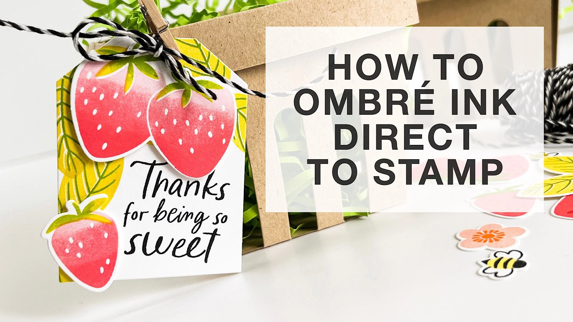
HOW TO OMBRE INK DIRECTLY ON YOUR SOLID STAMPS

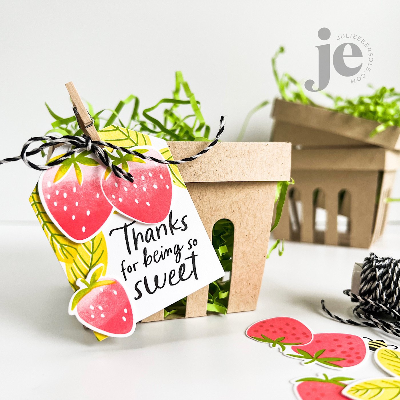
That beautiful variegated or ombré ink effect is a wonderful look when combined with solid stamps. You can achieve it by blending ink colors directly on the stamp surface! I’m working with water-based dye inks and using a MISTI positioning tool; for this method, a positioner is key to being able to stamp precisely over the original impression multiple times.

VIDEO

HOW TO:

  1. Select 2-3 shades of ink in the same hue, ranging from light/pale to dark (for really large stamps, you may want 3-5 variations of ink color, but for stamps the size used in this project, 2 is plenty).

  2. Ink stamp with lightest color first and impress to paper; if mass producing and die cutting images out, try my suggestion of trimming quarter sheets of card stock even further down into smaller pieces so you only have to rotate those pieces and not reposition the stamp in order to maximize the paper.

  3. Use the darker color to ink only a portion or a side of the stamp where you want shading or deeper color.

  4. Use a blending tool, like the Little Smoothie, to rock or pounce the rounded end of the sponge across the edge of the ink to soften. Stamp over original impression.

  5. Repeat Step 4 as often as desired.

  6. Highly contrasting colors of ink may require you to clean the stamp before switching colors to avoid cross-contamination of ink pads.


All the beautiful shades of ink pads out there make this one of the easiest methods for achieving “multi-colored” images, especially when working with solid stamps!

Thanks for stopping by!


SUPPLIES:

Disclosure: Affiliate links to the products used in my projects, that I like and use may be included; I make a small commission when you purchase via those links, at no extra cost to you. Thank you for all your support!

A SHADOW BOX BOOK AND PRESSED PANSIES

2021-JUN-RELEASE-EDITED-08.jpg

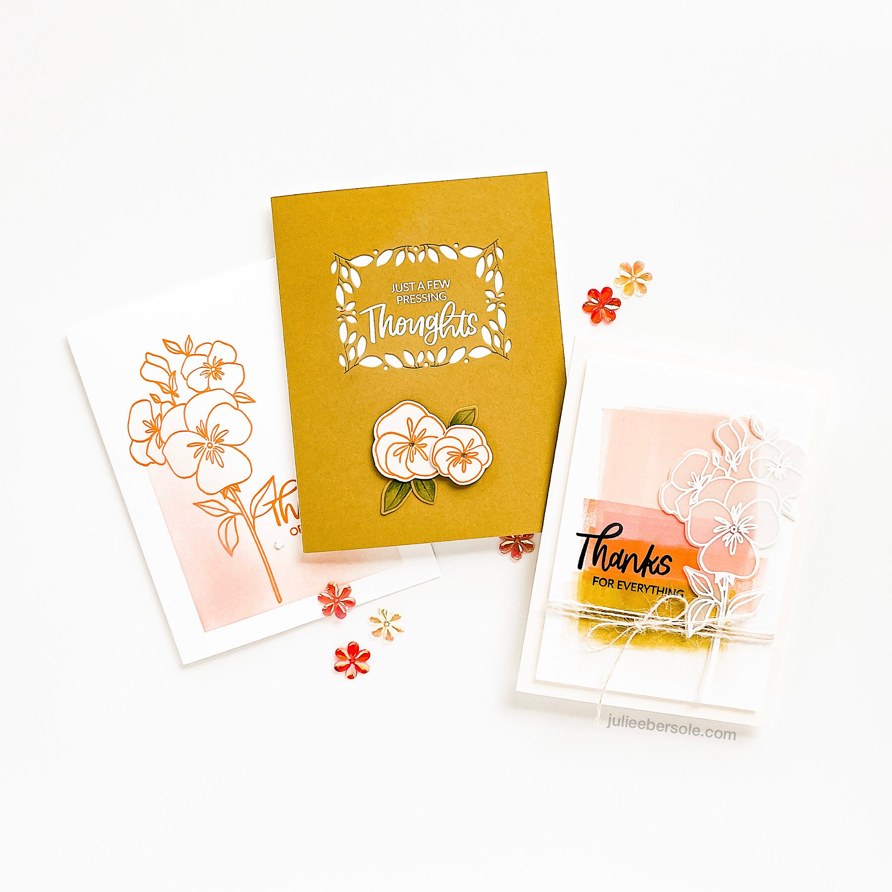
Brandi Kincaid’s Shadowbox Die is such a well-thought out concept; the extra elements for foiling or die cutting a cover label and for foiling the page grooves is brilliant! I ran out of time as I was generating the samples for this release to get to a foiled version, but I’m dying to do it—you’ve got to see how Emily Leiphart foiled her samples. Just stunning!

Sometimes, a monochromatic card is all you need—a little bit of ink blending, masked off in the lower left corner, makes a subtle backdrop for the flowers and sentiment stamped in a darker, more intense hue—the ink blending was done in a combination of Oxide Tattered Rose and Catherine Pooler Bellini and the focal images were stamped with Oxide Spiced Marmalade.

2021-JUN-RELEASE-EDITED-10.jpg

For this one, I brayered a backdrop starting with Oxide Tattered Rose, then continued with Catherine Pooler Bellini—where the Bellini ink overlapped back onto the Tattered Rose left a different variation of color that I just love! It looks like I used another color of ink, but nope! I finished along the bottom with that Concord & 9th Stardust I adore so much! The sentiment was stamped with C9’s Midnight, which is a rich navy blue and the florals were white embossed onto vellum card stock. I have had great luck using Mini Glue Dots to glue vellum down; when an image has been embossed, there are usually several spots where you can place the glue dots that will be pretty much concealed—I think you’d need a microscope to tell! LOL!

Wrapped those two pieces with my favorite twine, and then popped it up onto a vanilla card base. Turned out dreamy!

2021-JUN-RELEASE-EDITED-02.jpg

Here’s the front cover of my Shadowbox Book—I used the beautiful hot foil stamp to actually die cut that lovely, leafy label into the cover (quarter sheet of C9 Stardust).

2021-JUN-RELEASE-EDITED-03.jpg

I used colored pencils to color in the pansies, and as I was assembling everything, realized how cool it would be to have those popped up on a strip of clear plastic; when the card is closed, they lie flat, but as you open the card and the shadow box pops up, so do the flowers because the strip is attached at each end behind the frame of the window. You could certainly just use card stock for that strip, but I love how the acetate just blends in and does not become obtrusive to the overall design.

Want to know a surprising fact about me (the girl who doesn’t like to cook and rarely bakes)? When my daughter was wee little (i.e. 3-6 yrs. old), I’d put together tea parties for her, with vintage china and tea service trays and little finger sandwiches, etc. I went the whole 9 yards with prom dresses, heels, gloves and tiaras I’d found at second hand stores. And, I also kept pots of violas and pansies. I would sugar the violas and pansies and place them atop little cupcakes, covered with a cream cheese frosting . . .

Brandi’s Pressing Thoughts brings back such sweet and happy memories for me . . .

Hope you are having a beautiful day and thanks so much for popping in.


RELAX & CREATE - PAINTING SKIN TONES WITH JUST 3 COLORS

mini-voices-together-001.JPG

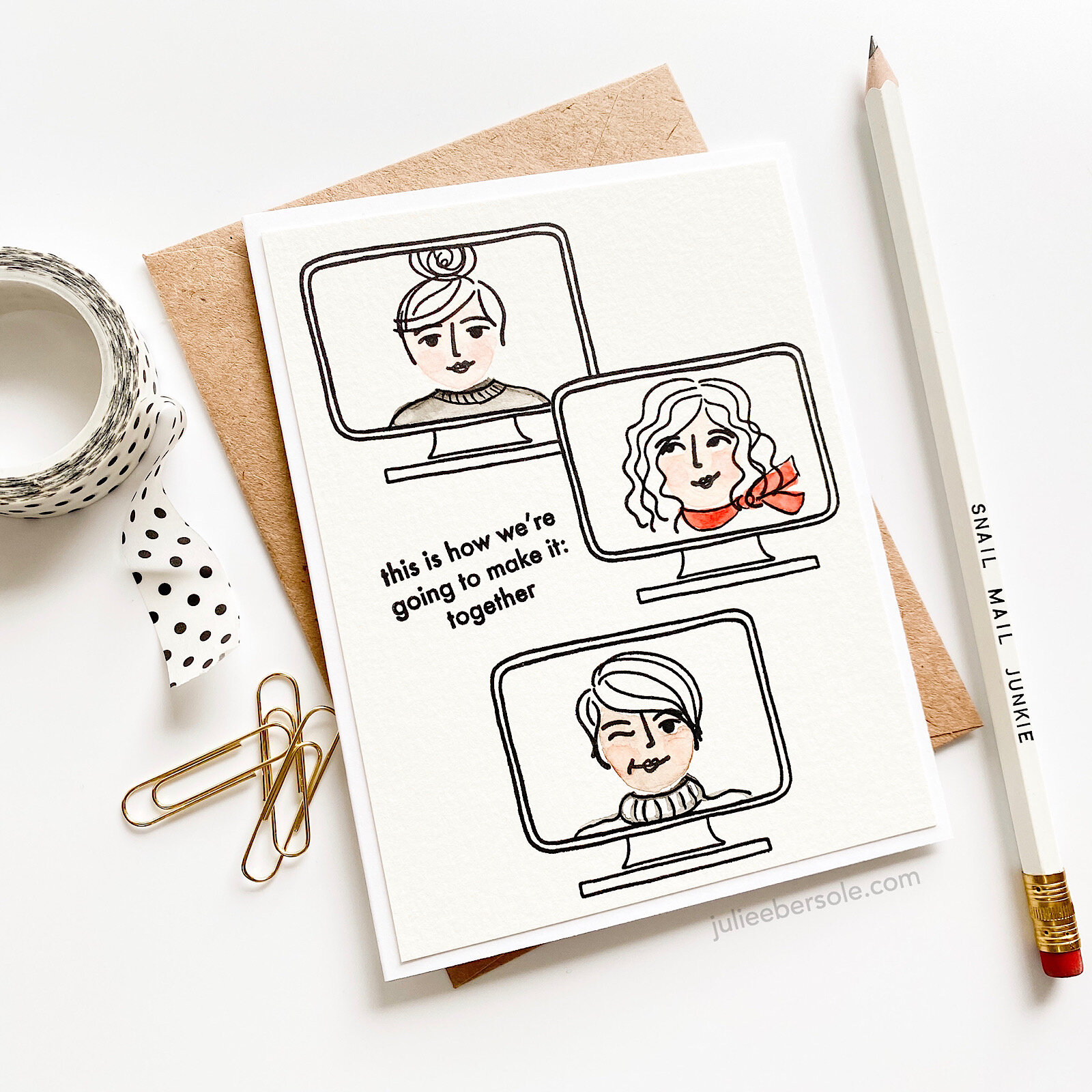
Surprisingly enough, you can use just 3 colors from your collection of Gansai Tambi watercolors to develop a wide range of skin tones! Watercolor is my favorite coloring medium, and it was fun to experiment with custom mixes. This card was actually inspired by some recent designs by my friends (and creatives extraordinaire) Lisa Spangler and Jessica Frost Ballas! I loved Lisa’s use of watercolors on her Mini Voices In My Head Designs, and Jessica’s minimalist approach with a basically black and white color scheme, accented by a pop of red.

gansai-tambi-for-skintones.jpg

You’ll see in the beginning of the video that I used the three colors shown above, and diluted them down with water from my waterbrush, and then played around with mixing the colors—I suppose I could have made a color chart, but honestly, when I have to mix colors, I tend to do so on the fly—and if I should need to repeat the mix down the road, I oddly enough remember the colors I worked with. What can I say? It’s a gift.

KIDDING.

I AM KIDDING YOU.

Also, I have to mention that I LOVE using the Waffleflower Mini Media Mat as a palette—it is just sooooo handy! And if the colors dry up while I’m working, I just rehydrate them with a couple drops of water by squeezing the waterbrush.

In one part of the video, I use a “thirsty” brush to wick up wet color from an area where I got a little heavy-handed; “thirsty” just means dry. I swipe my paintbrush against a clean paper towel to soak up the water (if I need, to, I might even pinched it with paper towel to get it REALLY dry); when I apply the dry brush to an area that has too much water or too much paint, it wicks it up into the bristles (hence why they call it a “thirsty” brush). I off load that onto paper towel, then I can go back and wick up more, if needed.

As you can probably tell, I had increased difficulty getting those rosy cheeks I was after when I tried to do them on the darkest skin tones; I’m going to need to practice. Rosy cheeks are a thing for me. I literally can’t help myself from painting rosy cheeks. Weirdness.

 
mini-voices-together-002.JPG

That expression from Brandi’s “You Should Know” set just seemed to suit my design nicely, so I had to borrow it. Seriously, this turned out so cute I let out a squeal when I finished! •all the heart eyes•

Hope you are continuing to stay safe and I appreciate you stopping by!


RAINBOW INKING WITH BRANDI'S THANK YOU FOR BEING A FRIEND

feat. THANK YOU FOR BEING A FRIEND by Brandi Kincaid for Ellen Hutson LLC

feat. THANK YOU FOR BEING A FRIEND by Brandi Kincaid for Ellen Hutson LLC

That hand-lettering, tho . . . (happy sigh)

More, please!!!

The secret to pulling off the rainbow inking is using a MISTI and blending the edges of the ink where they will transition to the next color by using blending sponges. Note: Even tho the sponges will inevitably become stained, you can wash them with a little “fairy liquid” (dish soap), rinse and squeeze them out and let them air-dry. Or, if you’re like me, you want one for every color of ink so you never have to do that. Just sayin’ . . . Anyhoo, I find these sponges are the best for blending out water-based dye inks directly on the stamp.

Towards the bottom of my post, I have details on a fab deal—a ridiculously cute and FREE Rainbow Stamp set you can get with purchase at Ellen Hutson LLC now through July 19, while supplies last. And trust me, you wantsessss it, Preciousssssss!!!

 
sos-brandi-tyfbaf-002.JPG
Click on the photo to see more info at ellenhutson.com

Click on the photo to see more info at ellenhutson.com

Be sure to read the fine print! And, cute or what?! (all the heart eyes) #givemeallthesolidstamps

better-days-gwp.JPG

BEAUTIFUL BOLD FLORALS BY BRANDI

sos-hop2-ebe.jpg

Happy to be hopping this week for sweet Brandi Kincaid’s release for the Ellen Hutson Summer of Stamping event! See Brandi’s full release HERE.

I’ll have a few more samples to share over this week that I made with her sets—all three of which I positively ADORE!!!

Feat. Mondo Pansy

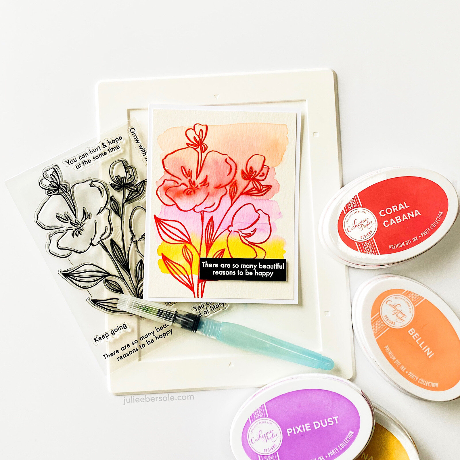
Did some quick and easy watercoloring but with an “anti-coloring” twist to it—one of my favorite ways to approach a beautiful and large card-front-covering stamp . . . (swoon):

 
rnc-sos-brandi-pansy-wtrclr-002.JPG

So gorgeous and easy to work with—LOVE!!!

I’ve had my head down working on some illustrations for future releases, but it was fun to come up for air to share this design—thank you for stopping by and read on for more hop and prize details:


Hop Prize Info


We’ve got a super fun prize!!! One random & lucky commenter will win $25 to the EH shop!!! To enter for a chance to win, make sure to leave comments at each stop along the hop! And don’t forget to comment here, too, for a bonus entry! Comment before Saturday, July 18th at 11:59pm PDT. The winner will be notified by email.

HOP ROSTER:


SUPPLIES:

Disclosure: This post contains affiliate links; if you see something you like, want or need, and purchase via my links, I receive a small commission, at no extra cost to you, which I use to buy coffee, which fuels my creativity and provides energy to make more card ideas. And, pay the rent.