feat. STARRY SKIES | THROUGH THE TREES DIE
Honestly, I am not an outdoorsy girl; the family is always teasing me that I need to “get out of the bubble” more often. Which would probably do wonders for my legs, which could use a lot more sun, LOL!
But, I was feeling the nature themes when illustrating and designing for this particular summer release and remembering how last year, we laid out on an airbed in the backyard and gazed up at the night sky, watching the Perseids shoot by . . . Yeah, for real.

Our house is surrounded by very tall evergreen trees, and there are no street lamps in our neighborhood, making it a perfect setting. I used my trusty Speedball brayer to create the sky background, using some dye inks by Concord & 9th (Grapefruit, Stardust ) and Catherine Pooler (Juniper Mist)
TIPS
When loading your brayer with ink, always roll and lift, roll and lift (continuous motion), to make sure you get the brayer inked all the way around. Make sure to place scratch paper underneath or you’ll end up with ink all over your work surface. Ask me how I know . . . (face palm)
Using the same method of rolling and lifting begin to brayer with your lightest color first, start off the project and roll onto the paper surface, to avoid odd marks to the paper; continue until the brayer goes completely across and off project, onto the scratch paper. If you don’t, you won’t get complete edge-to-edge coverage. Of course, if you don’t want edge-to-edge coverage, disregard.
Any excess ink on the brayer can be rolled off onto the scratch paper and then you can load with the next color. You probably won’t need to wash the brayer off until you’re completely done with the last, and darkest, ink color. Less clean-up. Sweet!
Want to heat emboss over the top? Well, you can let it sit for a while, OR, if you’re like me (impatient), use your heat gun to “dry” the surface, then pounce it with an anti-static pouch to neutralize any moisture, like oil or lotion from your hands.
Blow off or use a soft brush to flick away any excess anti-static powder sitting on the paper surface, then stamp and heat emboss. Why? Because if you don’t, as you press your Versamark inked stamp against the paper, it will collect that excess powder with every impression and transfer it to your Versamark pad when you go to ink up your stamp again. As the powder accumulates into your ink pad, it will become less and less sticky; ink pad no worky after a while!
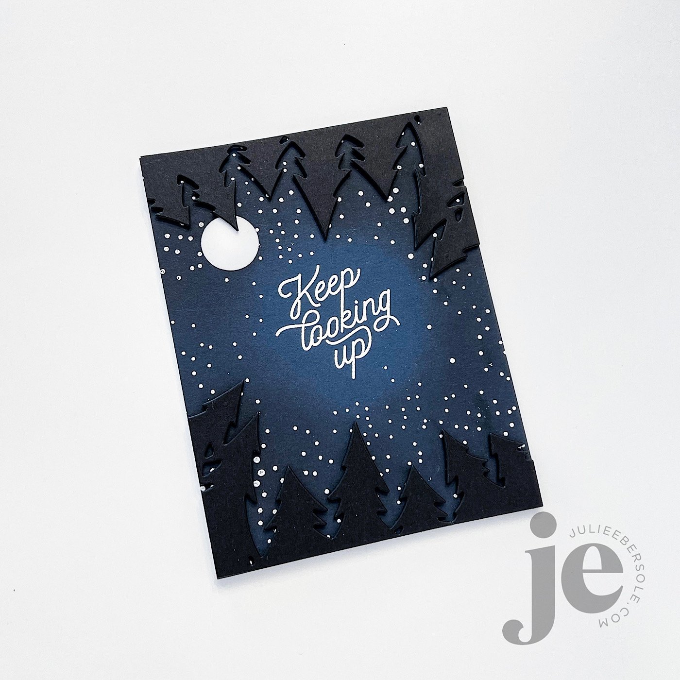
I had a rare flash of brilliance when designing the Through The Trees die, so you could create two different effects. Using one shape makes it appear you’re looking over a row of trees, but cutting it twice and mounting the two opposite each other creates the visual effect of being in a clearing, surrounded completely by trees, looking up through them at the sky. I really, REALLY love that . . .
Before doing all the white heat embossing, I used a blending brush to apply the Juniper Mist ink around the outer edge of a navy blue panel—it draws the eye towards the sentiment in the center there, and gives it a glowing effect, to emphasize it even more. You could also use black ink, but, I didn’t have any that wasn’t permanent/archival and I really didn’t want to ruin a blender brush with permanent black ink. Just sayin’ . . .

When you don’t have the color of card stock you need in your stash, you can make your own.
MORE TIPS
Use a blending brush/tool and ink to coat white or short cut your blending by starting with a colored card stock as your base, to get the color you need.
Distress Oxide Ink will give the most opaque coloring; I often use that on 110# Neenah or colored card stocks because it’s a lot less work than using dye inks. Just sayin’ . . . A girl with tendinitis in her arm needs all the help she can get!
Depending on the look you’re going for, try watercoloring over a panel of watercolor paper, and die cutting from that after it’s completely dry.
DAAAANG!!! If you’ve made it to the end, you’re a trooper and I hope you got at least one tip or idea you can use!
That’s all I got for now. Thanks for poppin’ in!
Disclosure: Affiliate links to the products used in my projects, that I like and use may be included; I make a small commission when you purchase via those links, at no extra cost to you. Thank you for all your support!