Because it’s apropos for today, which is Thanksgiving, I’m reposting one of my favorite Bear card designs!
And, if you’re shopping online while waiting for the big bird to finish roasting, heads’ up on the sale going on over at ellenhutson.com right now:

I hope your Turkey Day is indeed “fit to be pied”! (big grin)
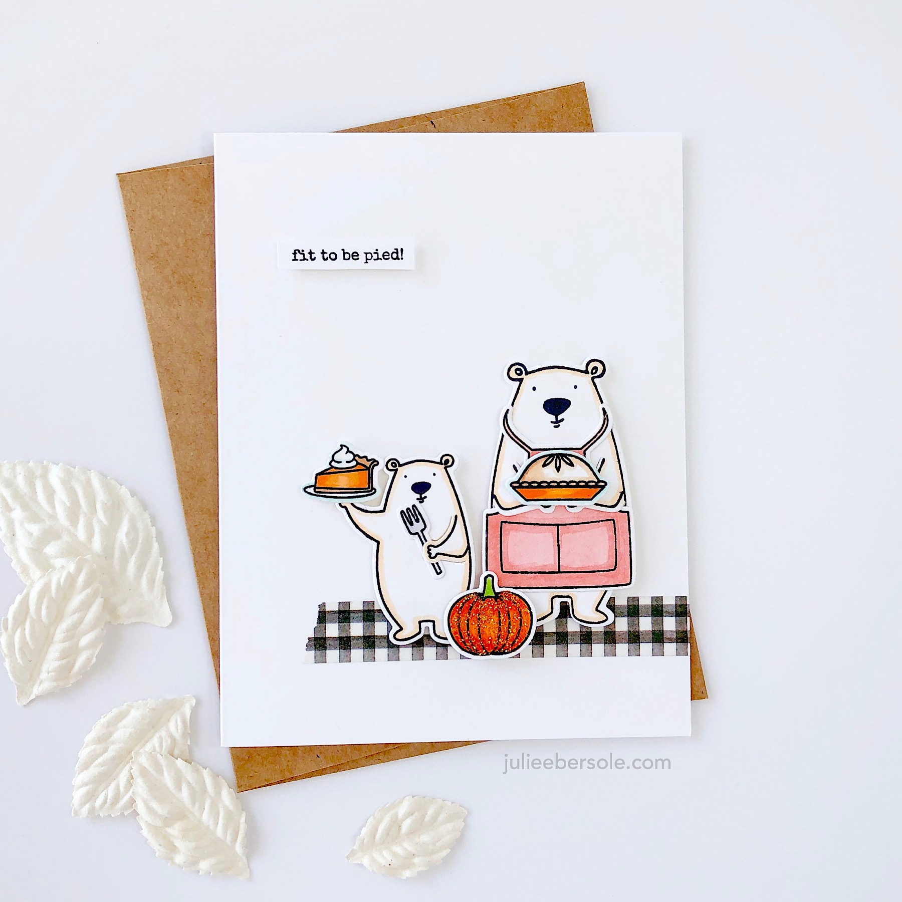
HAH!!! Mama Bear and Li’l Bear have been busy making pumpkin pie. WOOT!!!
I usually refrain from coloring Bear; I just like him in white. But I do like to outline him with a soft color and often reach for Copic Milky White. All of these were stamped with Gina K Amalgam Jet Black Ink, which is alcohol marker friendly. You could also use colored pencils, water-based markers, etc. Normally, I reach for Versafine Clair Nocturne when stamping my images in black, but it does not play nice with alcohol markers unless you clear emboss it.
I also have a quick tip for using stamps that have coordinating SOLID dies. I used the Bear from All Inside for the demo, but this works for any solid die. You can watch right here or over on my YouTube Channel.

If you look closely, you may be able to see how some of the smallish images were outlined outside the lines with a pale blue—this can actually make white images appear even whiter (like the plate and the whip cream atop the slice of pie).
I used Orange Stickles on the pumpkin, but you can substitute Diamond Stickles in a pinch.
Have a fab day and thanks for stopping by!
SUPPLIES:
All Inside by Julie Ebersole, Essentials by Ellen Clear Stamps
All Inside by Julie Ebersole, Essentials by Ellen Designer Dies,
Bear Ware 4 by Julie Ebersole, Essentials By Ellen Clear Stamps
Bear Ware 4 by Julie Ebersole, Essentials By Ellen Designer Dies
Black Checkered (Tiffi Square Black), Alexandra Renke Washi Tape
Platinum 6 Die Cutting And Embossing Machine, Spellbinders Tools
This post contains affiliate links; when you shop via my links I receive a small commission at no charge to you. Thank you for supporting me—it is so appreciated!