
TRUTH: I don’t enjoy coloring in large detailed images. •gasp•
Please don’t huck tomatoes at me; I have always felt that way even since primary school. If it’s gonna take me a long time to color in, I simply won’t do it. I remember in first grade, a classmate looking down her nose at me because I colored outside the lines. My logic: We’re going to be cutting this out, what is the point of staying inside the lines??? Her coloring, on the other hand, was perfect—seriously, every stroke of the crayon was PERFECT. As the teacher came by to observe our progress, she praised my classmate for her beautiful, impeccable coloring. I got a smile and a pat on the back.
WHAT. EVER.
•hair flip•
But, I still absolutely love a large image that fills practically a whole card front and I love color!
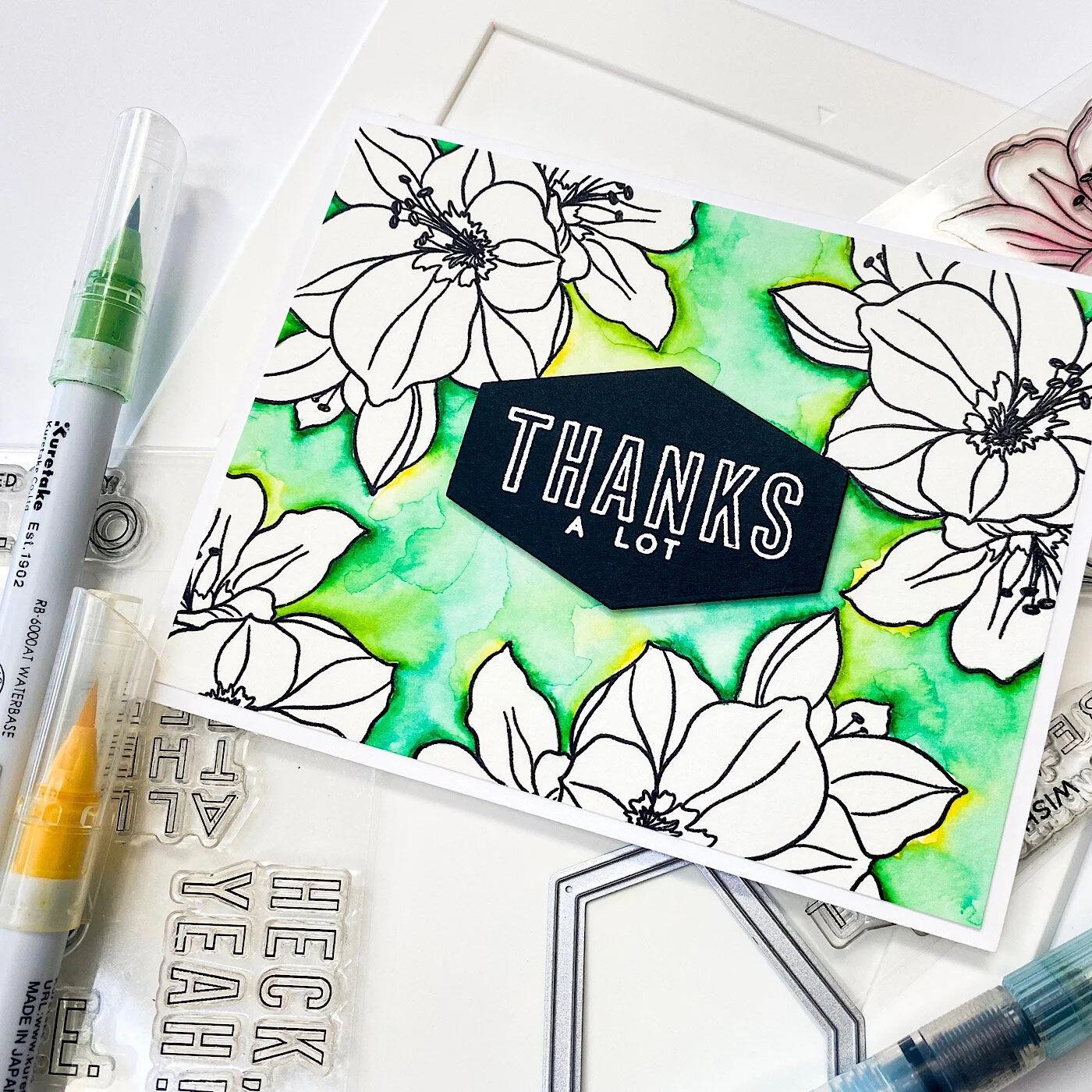
I know that the Amaryllis is typically a holiday flower, but I like using it for non-holiday cards, too. I mean, it kinda looks like a lily, possibly a hibiscus flower (dang, that makes me wanna make a tropical floral card with this image—EEP!!!) . . .
This card actually is quite colorful, but, inspired by my friend Carly, I went rogue . . . heh, heh, heh!
Some things you may or may not have noticed in the video:
Anti-static pouches (Embossing Magic Bag, Inkadinkado) pounced over the paper surface neutralize moisture or oil from your finger tips and calm down a lot of static electricity so embossing powder doesn’t stick in unwanted areas.
Prior to stamping, blow off the excess powder from your paper surface. Otherwise, the pigment or embossing ink on your stamp will “pick up” quite a bit of the loose powder with every impression and transfer to your ink pad when you re-ink the image. Eventually, this can build up on your ink pad, and make it less tacky.
This image has finer detail lines; stamping over them a second time can make them bolder. The ink is also more saturated and even; helpful when stamping onto a textured surface like watercolor paper.
Every time I use black embossing powder, I end up with a hot mess; instead, I prefer a really good black pigment ink and clear detail embossing powder over top. Works beautifully every time.
Notice how I laid down “strokes” of color from the markers against the outside edge of the embossed lines. These aren’t like Sharpies; you don’t want to “brutalize” (a.k.a. smash) the brush nibs against the surface. Think of them like delicate paint brushes, pre-loaded with color.
With mid-to-dark hues, it doesn’t take a lot so be careful how much color you initially lay down; start with a few strokes and avoid trying to “fill in”. Paint by “pulling” the colors away from the embossing lines with your waterbrush. You can always add more color later.
If you get in a hurry and slop a little watercolor where you don’t want it, lift it out by using clean water on your brush and dabbing with clean paper towel, but keep in mind that with dark/intense colors, this can be harder to accomplish.
Note to self: I probably should have positioned my stamp in the lower right corner (with the bottom of the floral closer to the hinges) instead of the lower left. I would have had more room to let the paper hang outside the edges of the platform on that left side.
Minimalist coloring. YAASSSSSS!!! •fist pump•
And, before I bid you good weekend, I am so happy to share that the Ellen Hutson Warehouse Team is back! YAY!!! And they want to thank you for your support during the “Shelter In Place” with 15% off your orders. Use code BACK15 at check out and please check the fine print.

Stay healthy, stay crafty.
SUPPLIES:
Mondo Amaryllis by Julie Ebersole, Essentials By Ellen Clear Stamps
It's All Good by Julie Ebersole, Essentials by Ellen Clear Stamps
Hex Frames by Julie Ebersole, Essentials by Ellen Designer Dies
MISTI Laser Etched Stamping Tool (8-1/8 X 10-1/2), My Sweet Petunia
Platinum 6 Die Cutting And Embossing Machine, Spellbinders Tools
Disclosure: Just so you know, this post contains affiliate links; if you see something you like, want or need, and purchase via my links, I receive a small commission, at no extra cost to you, which I use to buy coffee, which fuels my creativity and provides energy to make more card ideas. And, pay the rent.