floral

DESIGN DISSECTION #1

In the past, I’ve posted pics of my card designs on my Instagram that included some notations and folks seemed to appreciate seeing why I did what I did, or why it works—I don’t know why I’ve never thought to share something like that here, so today, I am!

Design Dissection #1

In addition to the above notations, I’m hoping you can also see the “visual flow” of this design, highlighted with the soft pink arrows. This is a triangular path that leads the eye around the design. Even if there’s technically nothing in that upper right corner, the direction of the flower naturally draws the eye towards that area. The eye then flows down towards the left where the twine is tied into a bow. The line of that twine running across the bottom then leads the eye to the right, and “into” the card.

Side note: I usually make side-folding cards because I had so many folks who have taken my live classes tell me they preferred them over top-folding cards—side-folding cards easily remain upright when displayed. I honestly hadn’t thought much about that until they pointed it out to me! LOL!

So, what do you think? Is this helpful to you?


EBE SUMMER OF STAMPING MONDO ANTHURIUM

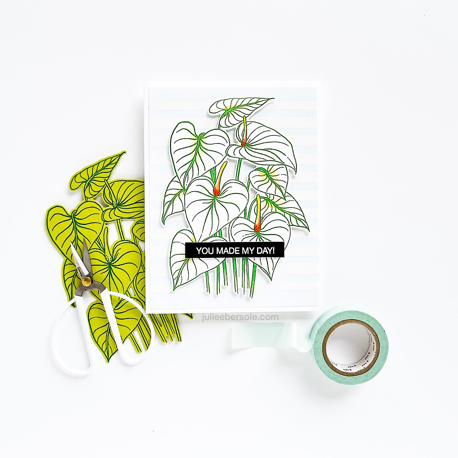
Sharing more inspo today in the way of samples made with the Mondo Anthurium. (matching dies HERE).

The Hibiscus and Plumeria are more widely known tropical flowers, but Anthuriums always make me stop right in my tracks because they are so exotic and unique looking—makes me feel like I’m deep in the heart of a lush, tropical jungle or drifting in a canoe along a secret river with gorgeous vegetation all around . . .

Anthurium-2.jpg

This one I clear embossed with Distress Oxide Mowed Lawn ink onto watercolor paper, prior to watercoloring; white embossed the stripes background onto a separate panel and then blended the palest blue gently over the top so it enhanced but didn’t distract from the Anthuriums.

Anthurium-4.jpg

Here I clear embossed Mowed Lawn Distress Oxide onto VELLUM card stock before mounting to a simple white card; the gold washi tape just adds one more stroke of elegance to an otherwise super simple design and brings out the gold embossed sentiment a wee bit more.

Anthuriums come in beautiful hues of soft and medium pinks and even bold reds! But, the white ones are equally stunning and I couldn’t tell you which ones I like the most because I find them all just gorgeous (happy eyes, happy sighs)

Thank you for visiting me on the blog today! Have a gooder! (chinkle!)


If you’d like more info on products that coordinate well with the Mondo Anthurium, please visit the release page HERE.

Disclosure: Yup, those are affiliate links to the products used in my projects and I make a small commission when you purchase via those links, at no extra cost to you. Thank you for buying all the things!

3 SIMPLE BOTANICAL CARDS - FLORA & FAUNA 3RD BIRTHDAY

ff-3-botanicals-grp.JPG

My friends over at Flora & Fauna are celebrating 3 years!

They have a big sale going on to celebrate—20% off Mar 19-23, with code: birthday3

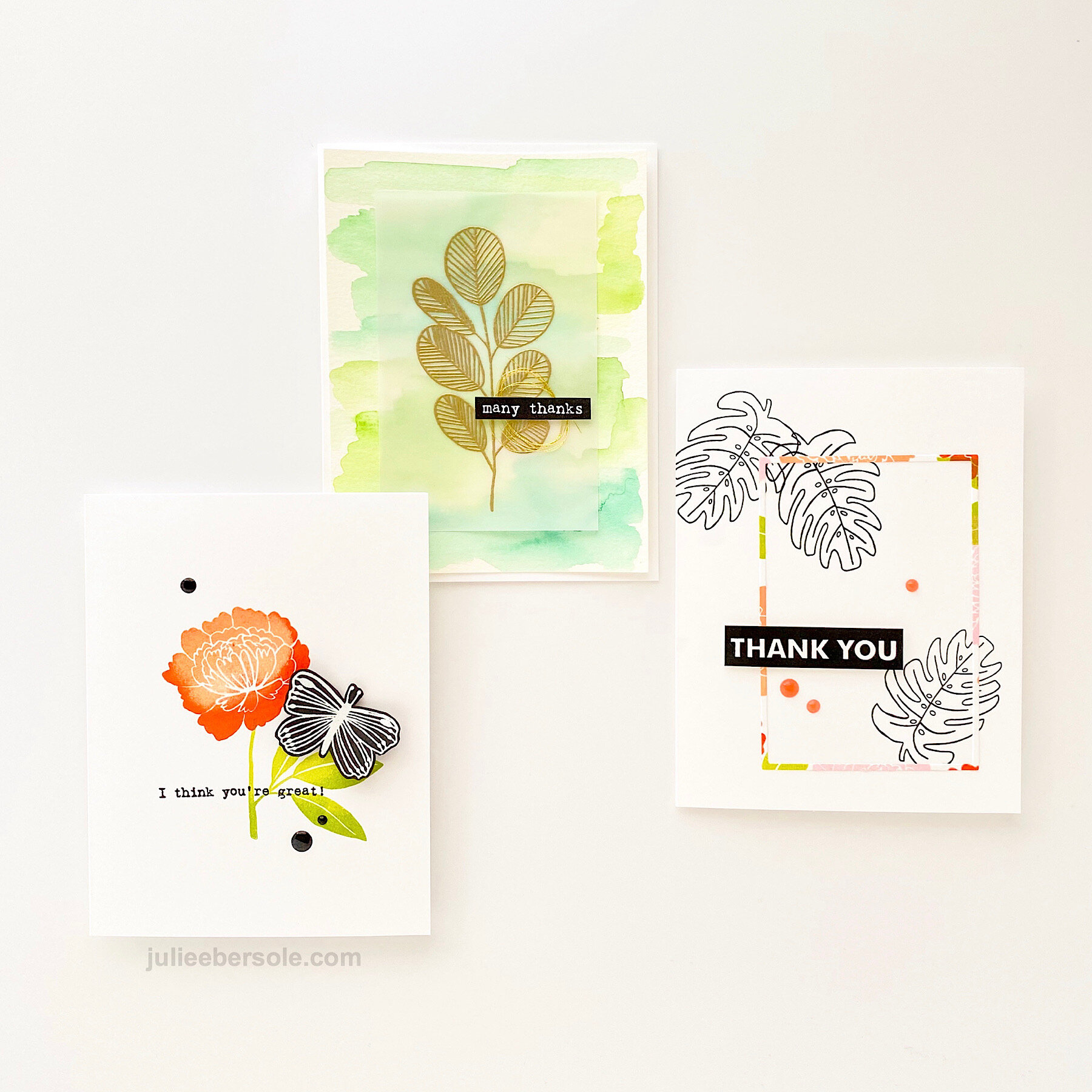
These three cards feature images from their most recent release. If you’re like me and adore hand-drawn, whimsical imagery, their stamps are so SO fun to work with!

Feat. Flora & Fauna Butterfly Dreams

Feat. Flora & Fauna Butterfly Dreams

I love how the butterfly white embossed on black POPS against that colorful flower. I used Fresh Inks in Peach, Tomato Red, Celery and Basil for this one.

Feat. Flora & Fauna Tropical Leaves | Everyday Word Party

Feat. Flora & Fauna Tropical Leaves | Everyday Word Party

Just watercolored (with Kuretake Gansai Tambi) some patches of green in various hues and then gold embossed this gorgeous leafy stem onto vellum; it’s secured to the card front with glue dots—the line details really help conceal those glue dots nicely!

Feat. Flora & Fauna Tropical Leaves | Word Party 3

Feat. Flora & Fauna Tropical Leaves | Word Party 3

OK . . . my name is liar—I actually had FOUR cards, but I forgot to grab the fourth one to shoot. I’ll shoot and share it another day—not sure why I forgot it, but hey, it’s crazy times right now, right?! Anyway, I took part of my third card and used it on this one above. I’ll give you a hint: I used a particular EH die that made pulling this off super easy . . .


Hope you’re staying healthy during this time, and maybe getting an opportunity to craft and make cards!

Thanks for stopping by!


When you purchase via my affiliate links, I receive a small commission from the vendor. Thanks so much for your support!


LADYBUG COLOR POP

I loved the “highlight” idea in these cards by Therese Calvird and it was one of the first things I wanted to try with the Mondo Gerbera Daisy when it arrived. I love the simplicity!

Although the flower is an open line design, I didn’t want to color it (the whole point of the design is to take a small aspect and highlight it with color) so to soften the starkness of the black and white a bit and add just a smidge of texture, I added a few fine spatters of black acrylic paint.

Then I cheated. •insert shocked eyeballs•

Therese uses a straight edge paper trimmer to cut out a panel in the center; I grabbed my Hero Arts Infinity Rectangle Dies. •sheepish grin• Mounted the outer “frame” to my base card, and then 3D mounted the center panel.

Sweet li’l ladybug was stamped onto a scrap of white card stock and colored in with pencil. After she was popped up on the card front, I gave her a nice coating of Glossy Accents, and Bob’s yer Uncle! •fist pump•

In other news, my “Meet the Maker” page over on the Ellen Hutson website very recently published—you can check it out HERE. •chinkle•

Cheers and hope you have a fab day!