water media mat

MAKING A LIGHT UP CARD

rnc-ezlight-squatch-001.JPG

I’ve been wanting to make this card for awhile now—so fun to make the night sky light up for this adorable Lil’ Squatch peeking out of the forest . . .

rnc-ezlight-squatch-002.JPG

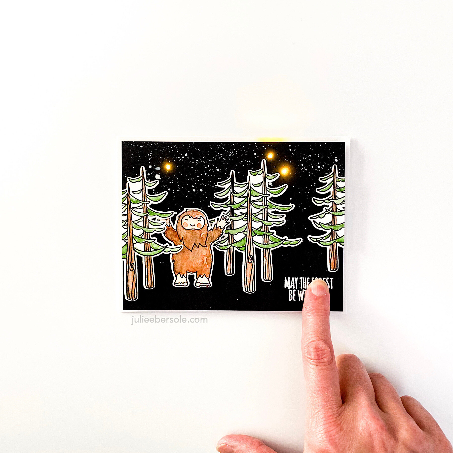
Those EZ-Lights are my favorite—I love how quick and easy it is to work with them!

Have a great weekend—stay safe out there!


SUPPLIES:

Disclosure: This post contains affiliate links; if you see something you like, want or need, and purchase via my links, I receive a small commission, at no extra cost to you, which I use to buy coffee, which fuels my creativity and provides energy to make more card ideas. And, pay the rent.

RELAX & CREATE - PAINTING SKIN TONES WITH JUST 3 COLORS

mini-voices-together-001.JPG

Surprisingly enough, you can use just 3 colors from your collection of Gansai Tambi watercolors to develop a wide range of skin tones! Watercolor is my favorite coloring medium, and it was fun to experiment with custom mixes. This card was actually inspired by some recent designs by my friends (and creatives extraordinaire) Lisa Spangler and Jessica Frost Ballas! I loved Lisa’s use of watercolors on her Mini Voices In My Head Designs, and Jessica’s minimalist approach with a basically black and white color scheme, accented by a pop of red.

gansai-tambi-for-skintones.jpg

You’ll see in the beginning of the video that I used the three colors shown above, and diluted them down with water from my waterbrush, and then played around with mixing the colors—I suppose I could have made a color chart, but honestly, when I have to mix colors, I tend to do so on the fly—and if I should need to repeat the mix down the road, I oddly enough remember the colors I worked with. What can I say? It’s a gift.

KIDDING.

I AM KIDDING YOU.

Also, I have to mention that I LOVE using the Waffleflower Mini Media Mat as a palette—it is just sooooo handy! And if the colors dry up while I’m working, I just rehydrate them with a couple drops of water by squeezing the waterbrush.

In one part of the video, I use a “thirsty” brush to wick up wet color from an area where I got a little heavy-handed; “thirsty” just means dry. I swipe my paintbrush against a clean paper towel to soak up the water (if I need, to, I might even pinched it with paper towel to get it REALLY dry); when I apply the dry brush to an area that has too much water or too much paint, it wicks it up into the bristles (hence why they call it a “thirsty” brush). I off load that onto paper towel, then I can go back and wick up more, if needed.

As you can probably tell, I had increased difficulty getting those rosy cheeks I was after when I tried to do them on the darkest skin tones; I’m going to need to practice. Rosy cheeks are a thing for me. I literally can’t help myself from painting rosy cheeks. Weirdness.

 
mini-voices-together-002.JPG

That expression from Brandi’s “You Should Know” set just seemed to suit my design nicely, so I had to borrow it. Seriously, this turned out so cute I let out a squeal when I finished! •all the heart eyes•

Hope you are continuing to stay safe and I appreciate you stopping by!


BEAUTIFUL BOLD FLORALS BY BRANDI

sos-hop2-ebe.jpg

Happy to be hopping this week for sweet Brandi Kincaid’s release for the Ellen Hutson Summer of Stamping event! See Brandi’s full release HERE.

I’ll have a few more samples to share over this week that I made with her sets—all three of which I positively ADORE!!!

Feat. Mondo Pansy

Did some quick and easy watercoloring but with an “anti-coloring” twist to it—one of my favorite ways to approach a beautiful and large card-front-covering stamp . . . (swoon):

 
rnc-sos-brandi-pansy-wtrclr-002.JPG

So gorgeous and easy to work with—LOVE!!!

I’ve had my head down working on some illustrations for future releases, but it was fun to come up for air to share this design—thank you for stopping by and read on for more hop and prize details:


Hop Prize Info


We’ve got a super fun prize!!! One random & lucky commenter will win $25 to the EH shop!!! To enter for a chance to win, make sure to leave comments at each stop along the hop! And don’t forget to comment here, too, for a bonus entry! Comment before Saturday, July 18th at 11:59pm PDT. The winner will be notified by email.

HOP ROSTER:


SUPPLIES:

Disclosure: This post contains affiliate links; if you see something you like, want or need, and purchase via my links, I receive a small commission, at no extra cost to you, which I use to buy coffee, which fuels my creativity and provides energy to make more card ideas. And, pay the rent.

RELAX & CREATE - WATERCOLOR OUTSIDE THE LINES

wtrclr-neg-amaryllis-je.JPG

TRUTH: I don’t enjoy coloring in large detailed images. •gasp

Please don’t huck tomatoes at me; I have always felt that way even since primary school. If it’s gonna take me a long time to color in, I simply won’t do it. I remember in first grade, a classmate looking down her nose at me because I colored outside the lines. My logic: We’re going to be cutting this out, what is the point of staying inside the lines??? Her coloring, on the other hand, was perfect—seriously, every stroke of the crayon was PERFECT. As the teacher came by to observe our progress, she praised my classmate for her beautiful, impeccable coloring. I got a smile and a pat on the back.

WHAT. EVER.

•hair flip•

But, I still absolutely love a large image that fills practically a whole card front and I love color!

I know that the Amaryllis is typically a holiday flower, but I like using it for non-holiday cards, too. I mean, it kinda looks like a lily, possibly a hibiscus flower (dang, that makes me wanna make a tropical floral card with this image—EEP!!!) . . .

This card actually is quite colorful, but, inspired by my friend Carly, I went rogue . . . heh, heh, heh!

Some things you may or may not have noticed in the video:

  • Anti-static pouches (Embossing Magic Bag, Inkadinkado) pounced over the paper surface neutralize moisture or oil from your finger tips and calm down a lot of static electricity so embossing powder doesn’t stick in unwanted areas.

  • Prior to stamping, blow off the excess powder from your paper surface. Otherwise, the pigment or embossing ink on your stamp will “pick up” quite a bit of the loose powder with every impression and transfer to your ink pad when you re-ink the image. Eventually, this can build up on your ink pad, and make it less tacky.

  • This image has finer detail lines; stamping over them a second time can make them bolder. The ink is also more saturated and even; helpful when stamping onto a textured surface like watercolor paper.

  • Every time I use black embossing powder, I end up with a hot mess; instead, I prefer a really good black pigment ink and clear detail embossing powder over top. Works beautifully every time.

  • Notice how I laid down “strokes” of color from the markers against the outside edge of the embossed lines. These aren’t like Sharpies; you don’t want to “brutalize” (a.k.a. smash) the brush nibs against the surface. Think of them like delicate paint brushes, pre-loaded with color.

  • With mid-to-dark hues, it doesn’t take a lot so be careful how much color you initially lay down; start with a few strokes and avoid trying to “fill in”. Paint by “pulling” the colors away from the embossing lines with your waterbrush. You can always add more color later.

  • If you get in a hurry and slop a little watercolor where you don’t want it, lift it out by using clean water on your brush and dabbing with clean paper towel, but keep in mind that with dark/intense colors, this can be harder to accomplish.

  • Note to self: I probably should have positioned my stamp in the lower right corner (with the bottom of the floral closer to the hinges) instead of the lower left. I would have had more room to let the paper hang outside the edges of the platform on that left side.


Minimalist coloring. YAASSSSSS!!! •fist pump•

And, before I bid you good weekend, I am so happy to share that the Ellen Hutson Warehouse Team is back! YAY!!! And they want to thank you for your support during the “Shelter In Place” with 15% off your orders. Use code BACK15 at check out and please check the fine print.

may-2020-sale-ig.jpg


Stay healthy, stay crafty.


SUPPLIES:

Disclosure: Just so you know, this post contains affiliate links; if you see something you like, want or need, and purchase via my links, I receive a small commission, at no extra cost to you, which I use to buy coffee, which fuels my creativity and provides energy to make more card ideas. And, pay the rent.

RELAX & CREATE - RAINBOW DIE CUT GREETING

rainbow-hello-slat-support.JPG

I collect “hellos”. Hello stamps, hello dies. I don’t think you can ever have too many because you need small ones, big ones, scripty and block styles, skinny and chunky styles, etc. I’m totally serious. “Hello” is a staple word.

Anyway, the DIY Sticky Mat shown in the video has really saved my sanity sooooo many times when working with die cuts!

I’ve been working on a magnetic cutting mat by Heidi Swapp lately. It comes with 4 little magnets and a magnetic ruler. These have come in handy for lining die cut letters, etc. or holding things down and preventing them from scooching (is that a word?) away from me as I work. I made a little custom washi tape “cross-hair” to remind me to keep my project in that spot for the camera when I’m filming, which I REALLY like because I could position that mark closer to me, rather than dead-center on the mat.

Hope you find the video below relaxing and that it inspires you in some way. ↓ There is an “enbiggan” button in the lower right corner, of the video player if you want to watch in full screen.

Thanks for stopping by!

Keep stayin’ safe, healthy and crafty! (wink)


SUPPLIES:


Disclosure: Just so you know, this post contains affiliate links; if you see something you like, want or need, and purchase via my links, I receive a small commission, which I can use to buy coffee, which fuels my creativity and provides energy to make more card ideas.