card design

NO COLORING FUNNY BIRTHDAY CARD

party_sausage_001-A.JPG

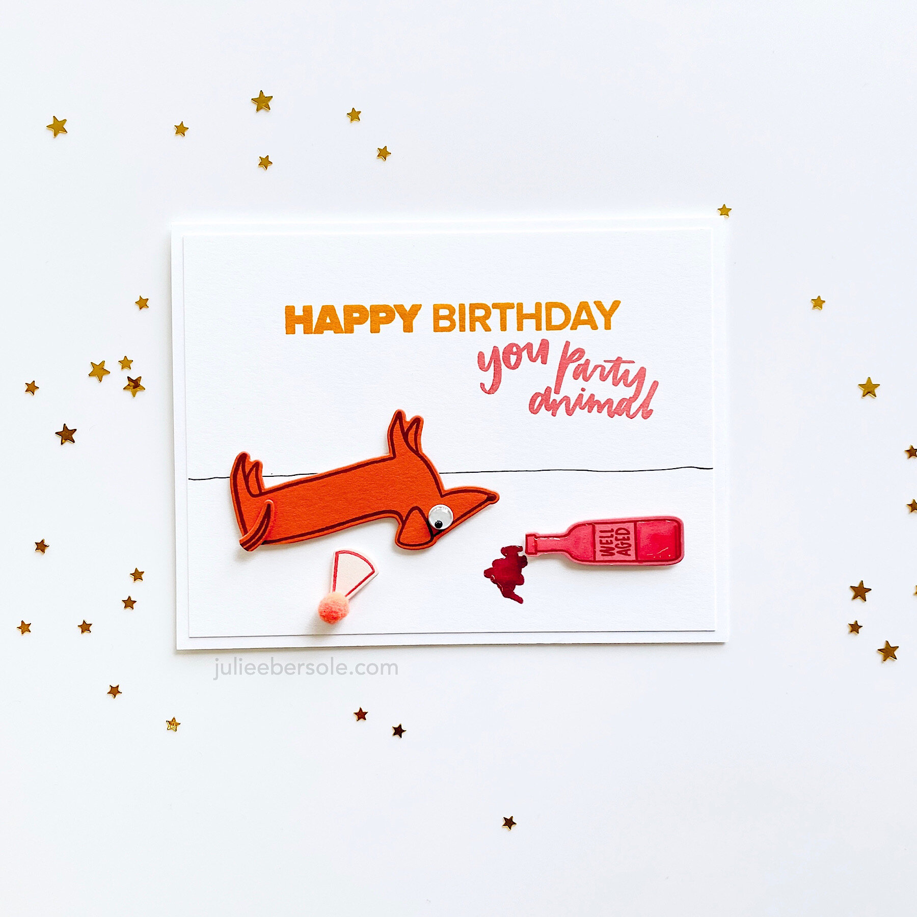
Last minute birthday cards don’t have to be “generic”—they can still be funny and relatable, UKWIM? Sausage dog got a little too much party goin’ on . . . (chortle)

All the images were stamped with coordinating (meaning they “look good together”, not matchy matchy) ink hues on pretty colors of card stock—I don’t always have the time, nor the desire, to meticulously color things. I had scraps of pretty colors of card stock just sitting in my bins, so it made sense to use them up this way—saved me time, reduced waste. What more can you ask for?

Oh yeah, you do have to add a dash of humor. (wink)

party_sausage_001-B.JPG

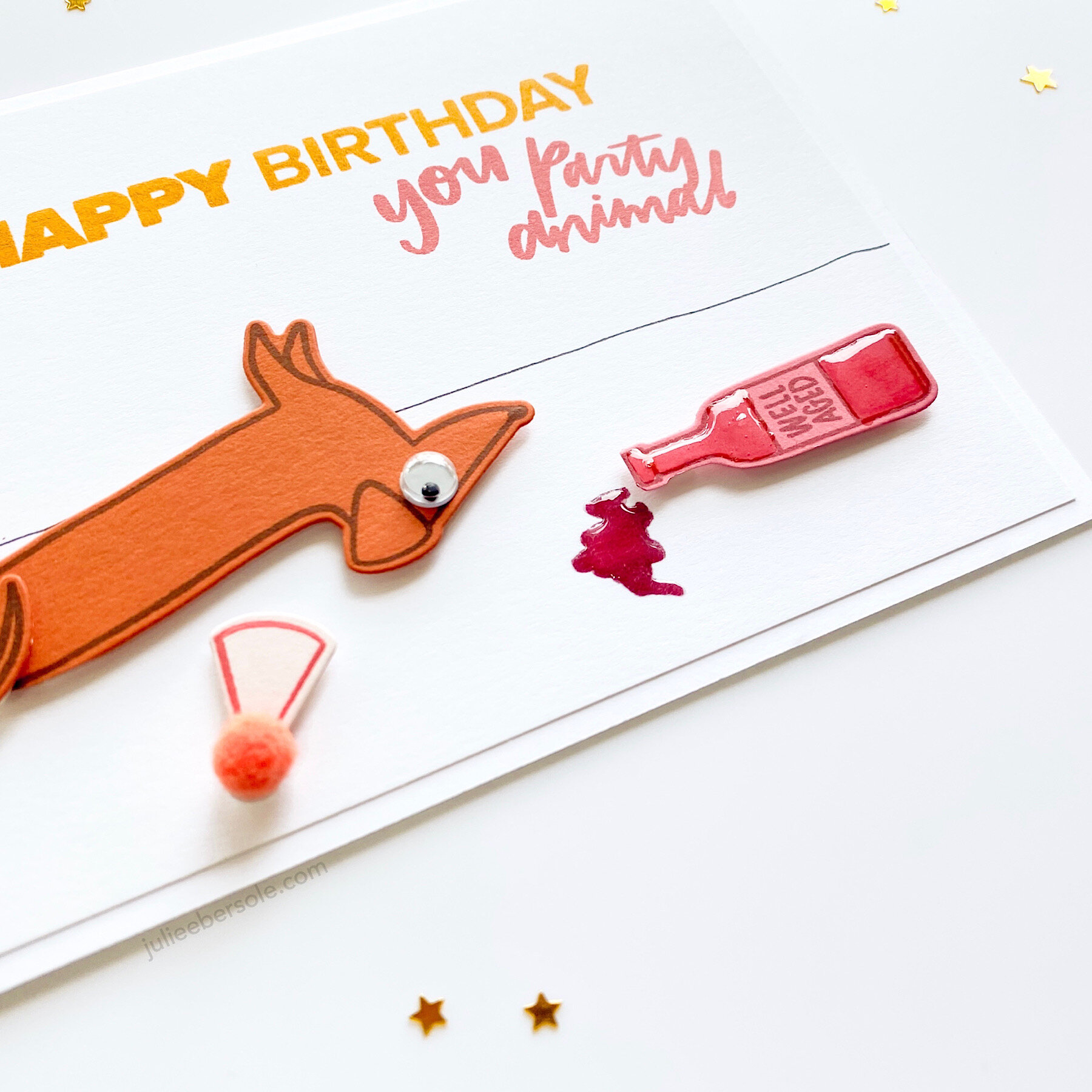
I did borrow from a variety of sets* to pull this off the way I wanted, but um, soooooo very worth it! (cheeky grin) Also raided my stash of pom poms and wiggly eyes for just the right embellishment. And, helloooOOOooooOO—Glossy Accents on the wine and bottle for the win! (monkey clapping)

It’s Wednesday. Just in case you’re losing track of your days in isolation.

Stay cozy at home and stay healthy! Please.


LUCKY LADY(BUG)

lucky-ladybug-001-1.JPG

Once I get on a roll with something, I seem to enjoy making various reiterations of it; this time, after making the DIY chipboard with Pale Rose Card Stock, I used Copic Markers to create the ombré effect. Just had to include this sweet ladybug from the Mondo Gerbera Daisy—just too perfect for this particular design.

The ladies got coated with Glossy Accents for dimension, after I used a colored pencil to lightly shade them in.

lucky-ladybug-001-2.JPG

I didn’t apply Glossy Accents to the “lucky” chipboard this time around because I really loved the matte finish in contrast to the glossy ladybugs. And those little black scallop rows* are such a sweet and delicate accent! I tossed the leftovers into a zip lock bag for any time I need them. Handy!!!

Have a fab day!

*ETA: The above sample was made in NOV 2019; since that time, the Scallops die as an individual has sold out so I have linked to the Pattern Dies Combo.


MAKE AN INTERACTIVE PUSH ME PULL YOU CARD

push-pull-interactive-001-A.JPG

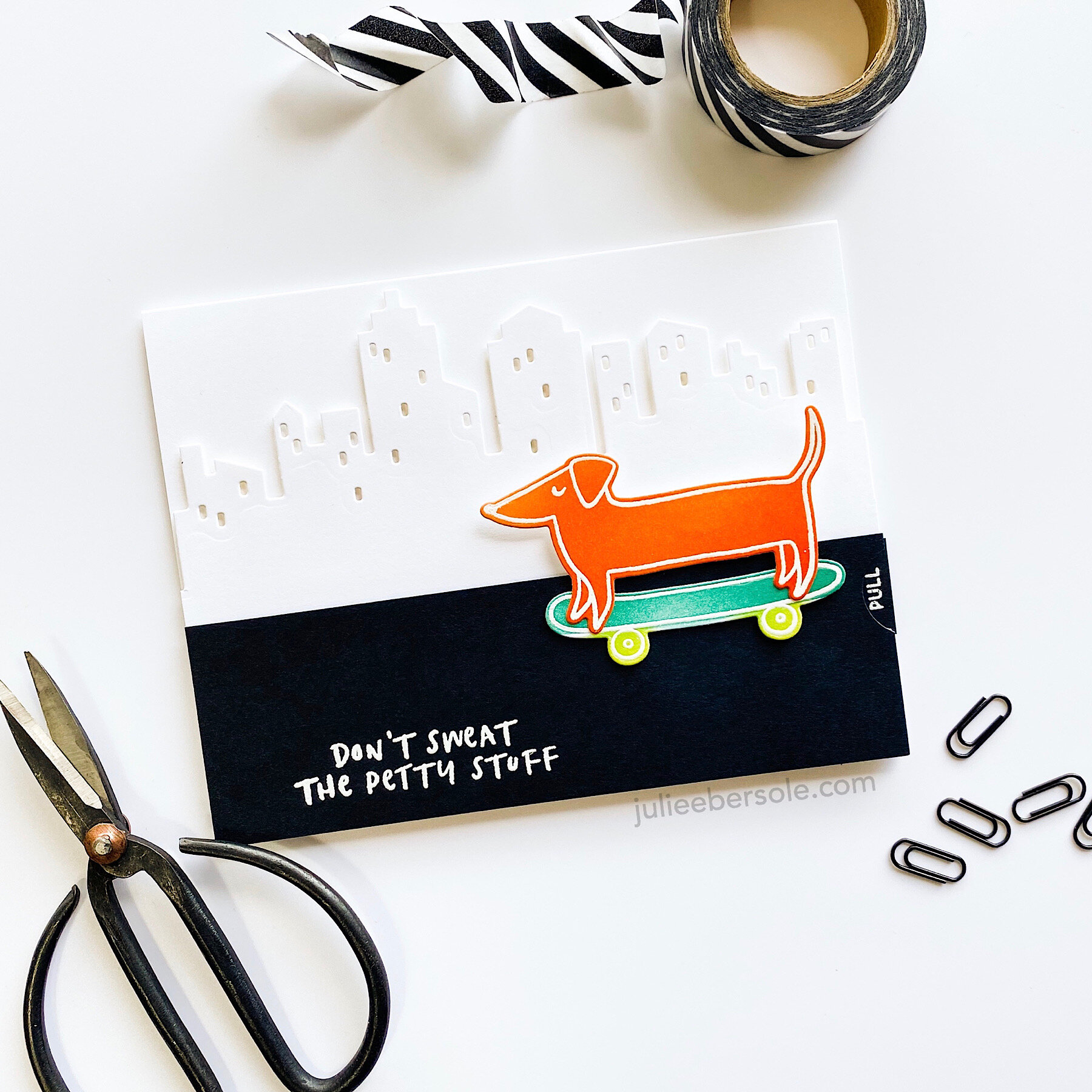
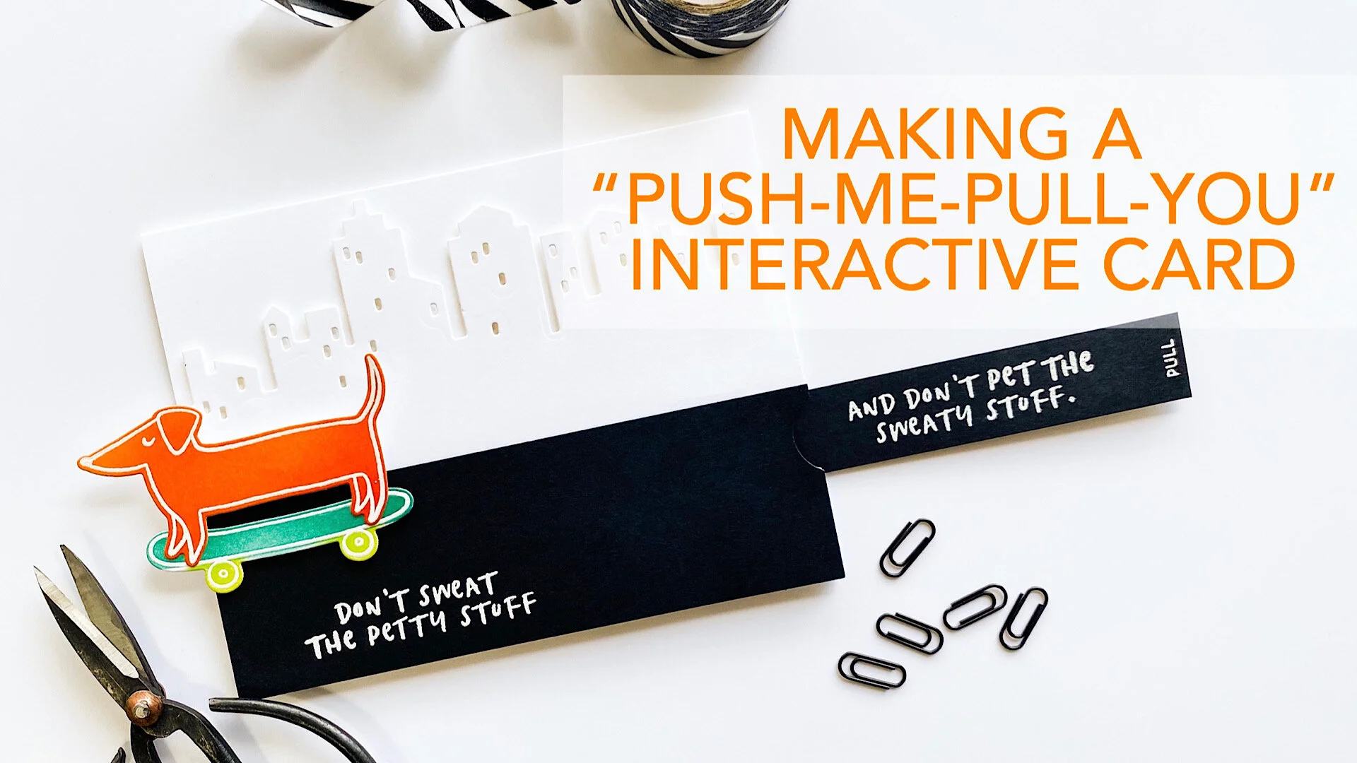
Years and years ago, when I first saw this type of card, it instantly made me think of the Pushmi-pullyu of the movie, Dr. Dolittle. So, I’ve always referred to it as a “Push-me-pull-you”, because of the way the mechanism works, but in Stampland, it’s typically called a “double slider” card. There are other cards called “double sliders” that may have two elements moving in the same direction as the tab when you pull it, or even penny sliders featuring two elements that spin/slide in one direction, depending on how you tilt the card, but mine today uses a reverse action motion.

It’s also a modified and somewhat simplified version of the concept; I don’t own any specialty dies that are specific to this type of card, so I took what I did have and found a way to make it work.

WATCH THE VIDEO BELOW OR ON YOUTUBE

Measurements, based on a standard A-2 Card (4 1/4 x 5 1/2”)

  • Slider Tab: 3/4” W x 5 1/2” L (adjust the length as needed to accommodate your project)

  • Cover piece that conceals the mechanism: 1 3/4” W x 5 1/2” L

  • Plastic strip: 5/16” W x 11” L (I cut mine from plastic page protectors, using a straight blade trimmer. Trim off excess length as needed). NOTE: The width of the strip is dependent on the size of the slots it will be threaded through. In this case, I borrowed the slot die from the Parcel Die Box to create my slots.

    5/16”??? Hey, it’s really not rocket science—it’s that notch between 1/4” and 3/8” on the ruler. (wink)

push-pull-interactive-001-B.JPG

If you don’t have a 3/4” circle punch like I used to make a semi-circle/thumb notch for your slider tab, a small circle die will work. If you don’t have plastic page protectors to make the strip, you might try cutting one from a plastic baggie.

Wishing you and yours continued good health!


SUPPLIES:

When you purchase via my affiliate links, I receive a small commission, at no extra cost to you. Thank you for supporting small businesses like myself and Ellen Hutson LLC ! It means the world!

LUCKY FAUX EPOXY

lucky-diagonal-001-1.JPG

I love LOVE me a good chunky font—especially in a die because you can make these awesome DIY chipboard/faux epoxy embellishments! And, whether you believe me or not, whenever I play with these types of dies, I start to groove to Big & Chunky . . .

Truth.

I digress . . .

I actually made several cards with DIY chipboard—this is probably my all-time favorite thing to do with word dies—the first of which is actually in a Hello, Monday video, linked HERE. The cards are slightly different, but the process is the same.

lucky-diagonal-001-2.JPG

The expression beneath “lucky” was sloppily colored with random strokes of a few Copic Markers (colors listed in supplies).

This project and the one with the video currently showcased on the Ellen Hutson blog were all actually made back in November 2019; I noticed the Cotton Candy Pink Card Shoppe Card Stock I used in the above is no longer available in the Ellen Hutson shop, BUT, I listed another color which would also be pretty for this—Candy Hearts. Yes, it’s darker/deeper, but it does look quite pretty with the Pale Rose and bright Marshmallow Chick (yellow) colors! I actually debated back and forth when making the card which hues of pink to use and at the time, tossed a coin and went with Cotton Candy. But, I won’t hesitate to make another with Candy Hearts in the future. (wink)

Don’t have any Glossy White NUVO Drops? No worries—just swap in pre-made Enamel Dots (listed below in supplies).

Hope you’re all safe at home and staying healthy! And, maybe getting in a little crafty time to keep the cabin fever at bay. (mondo squishy hugs all around)


SIMPLE INLAID DIE CUTTING

diggitydog-001-A.JPG

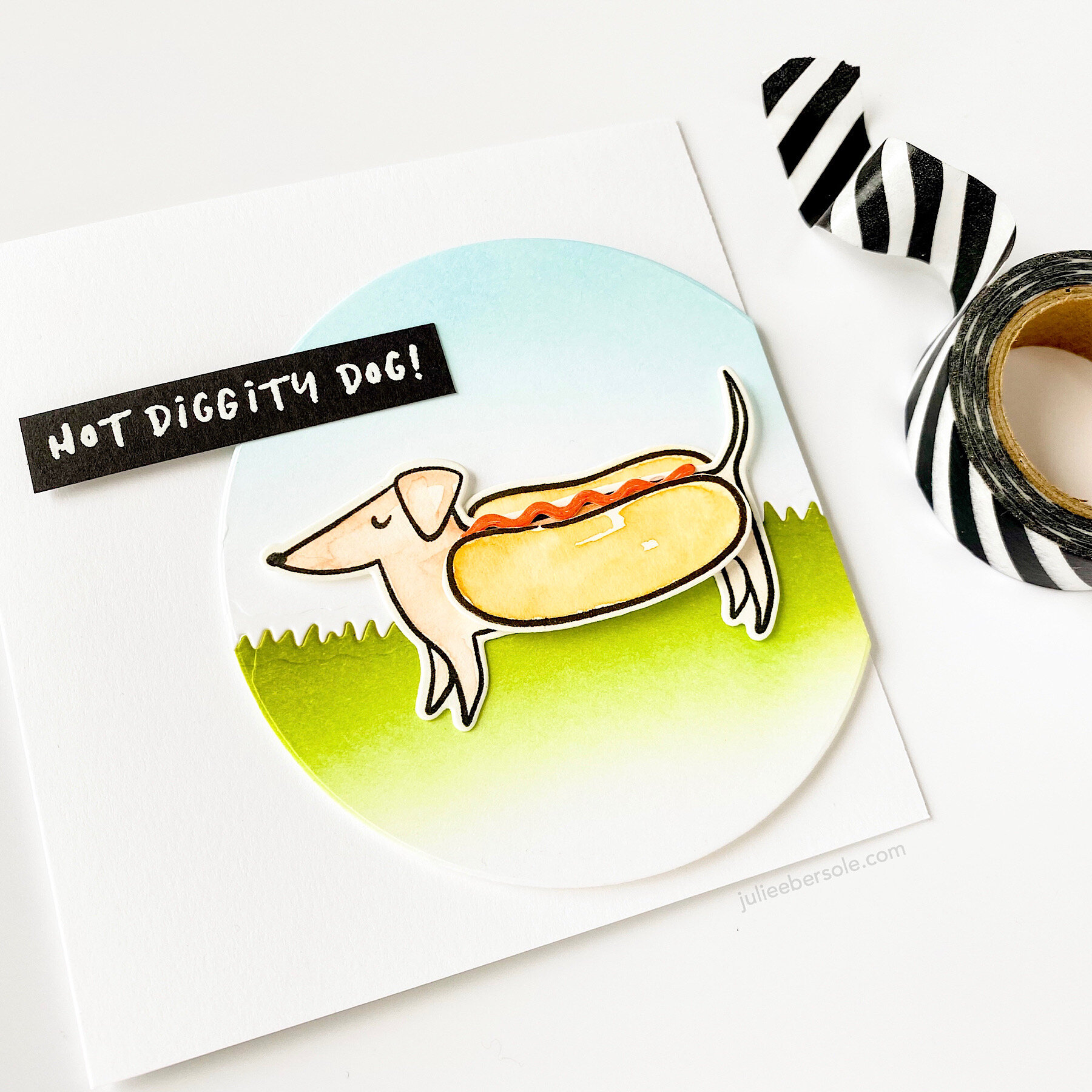
Hot diggity dog, it’s Friday! I know, another Clever Sausage card. And pun. But, seriously, how can you not chuckle over this one?

After I die cut a circle, I split it with a Landscapes die (the grass), and ink blended the sky and the lawn. My secret weapon for holding the the two pieces together: Scotch tape on the back. BOOM! And, then I just 3D mounted the whole shebang onto a square card.

diggitydog-001-B.JPG

Watercolored all the stamped images, then die cut ‘em; trimmed the hot dot bun’s foreground away so I could mount the back onto the other side of the dog, and 3D mount the bun on his front side.

The ketchup squiggle? It’s part of the coordinating die set. I wonder if folks noticed that. Watercolored a tomato red color swatch onto a scrap of watercolor paper and then die cut it out. Finishing touch after assembling the whole card was some glossy accents. Cuz ketchup is always enticingly glossy and yummy looking, right?! Heh, heh, heh!

Have a fab weekend!

Stay home. Stay healthy. Stay crafty!

(mondo squishy virtual hugs)