card design

RADIO SILENCE . . .

“Creativity needs to rest.”


I read that statement somewhere, and wish I could recall exactly where.

Sidebar: If this is a topic that doesn’t interest you, scroll on past.


But, it is something that hit me hard last spring and throughout these summer months; my work is “creative on demand”, by its very nature, and this comes with its own unique set of stressors. This is compounded, for me personally, by inherited clinical depression , anxiety (yes, I take medication and am not ashamed) and as someone who is a slow, methodical and linear sequential thinker (I envy those that can multi-task), with strong tendencies to hyperfocus on one task until it is completed. To the point of obsession.

When I am overwhelmed by all the above, I “withdraw” as a matter of self-preservation.

I’m pretty much a hot mess on a hamster wheel. Yeah, that sounds about right. And, while I can laugh about the vision this conjures up, I also know if I don’t step off the wheel when the warning signals begin rearing their ugly heads, things are really gonna’ go south. Don’t get me wrong; I firmly believe in hard work, but I also believe that the American “hustle culture”, in its current state, contributes greatly to mental health issues and burn out.

Like so many others, I am STILL trying to find balance between work and living life within my limitations . . .

“That’s all I got to say about that.”—Forrest Gump


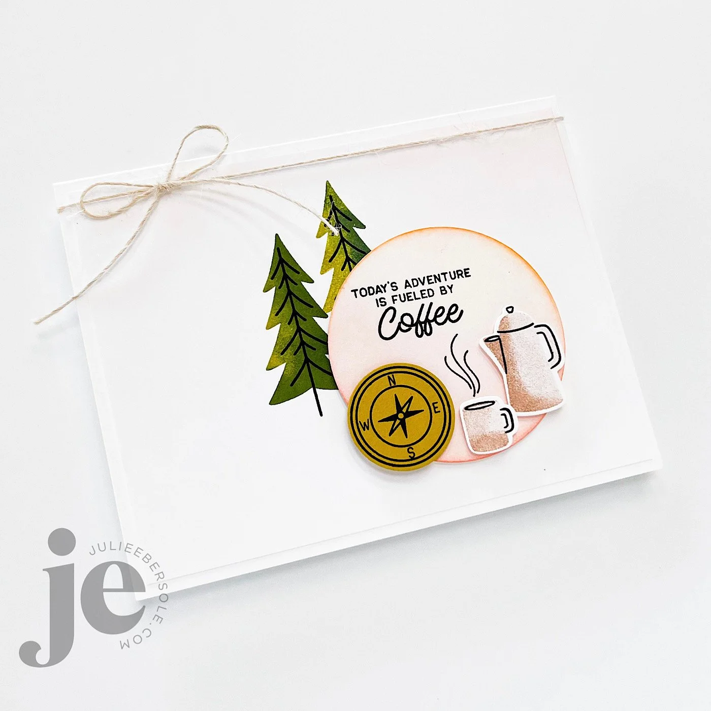
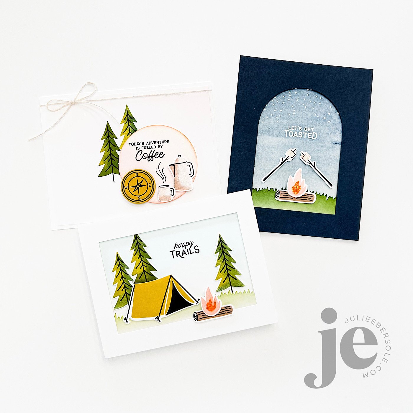
My latest collection of stamps & dies released last week on ellenhutson.com and I have a few samples to share that might inspire you! Do you love the great outdoors or have peeps in your life that do? Then this release is soooooo perfect!!! You can see the entire collection over on the Ellen Hutson Release Page HERE (affil. link)

Gosh, I love solid stamps so. much. !!! They just make me so giddy I can’t even . . . #allthehearteyes


And, I gotta share my little “Airstream™” trailer tutorial from the Ellen Hutson YouTube Channel:

Video Tutorial HERE

If you don’t have that Birch Trees Cover Panel in your collection yet, well, by golly, you are missin’ out! Just sayin’ . . . I love that thing . . .

Have a great weekend!


Disclosure: Affiliate links to the products used in my projects, that I like and use may be included; I make a small commission when you purchase via those links, at no extra cost to you. Thank you for all your support!

PUSH-ME-PULL-YOU FRIENDSHIP CARD

Finished card is A-2 size

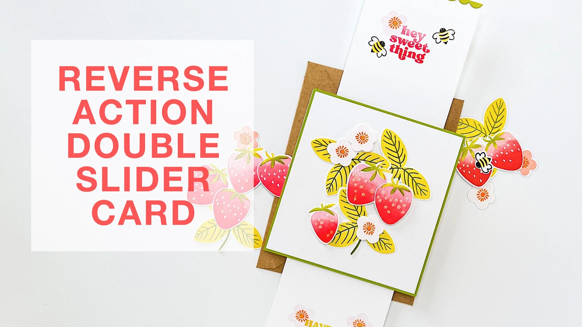
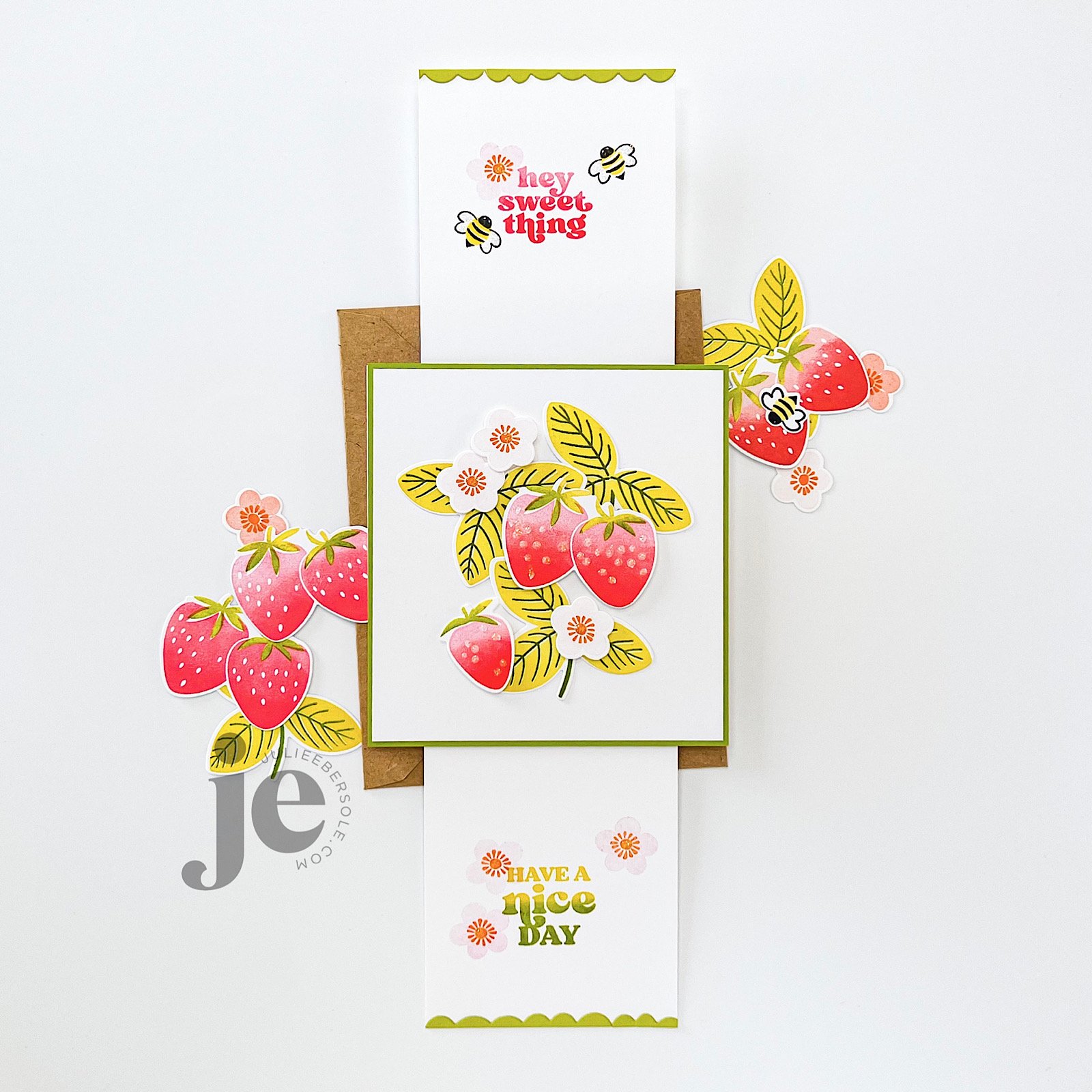
Consider this a (basic) tutorial (one of many different types that already exist, for sure!) for creating a reverse action/double slider card; it works for either portrait or landscape layouts—just make sure your images and sentiments are going the same direction.

I used the smaller slit from the Push-me Pull-you Die set. Is this set necessary for making this type of slider? Nope! You can use a straight-blade trimmer or a craft knife + a metal edge ruler, if that’s what you have. I just find the slit die works great and is the perfect size for this particular type of slider card, and I love that you can completely adjust the gap between the slits to suit your project, whereas on a duo slit die, the gap is fixed.

BASE MATERIALS:

  • 2 pcs. White card stock - 4.25 x 4.5” (for the back cover and for the mechanism itself)

  • 1 pc. Preferred color of card stock - 4.25 x 4.5” (for the front cover)

  • 2 pcs. White card stock - 3 x 4.5” (for the “handles”)

    • Optional: 1 pc. White card stock - 4 1/8 x 4 3/8” (for layering onto the front cover and allowing for a slight mat or border effect)

  • 1 strip of thin plastic or cellophane - 3 x at least 8” long (excess can always be trimmed off during assembly; grocery shopping, zipper style and cellophane bags work or you could even use ribbon, if you have some laying around that meets the dimensions)

VIDEO TUTORIAL

Now, if you prefer to skip the mat layer (the green “front cover” one shown in my prototype), just swap it out for white and you can skip the optional smaller layer. But, if you want to stamp directly onto that, make sure to do so while it’s flat and before you start assembling things.

And, don’t forget: Stickles LAST!!!

Have a fab day!


DESIGN DISSECTION #2

Originally, I intended this design to be a single layer. But, after creating the background, I banked left . . . slightly . . . LOL!

Read on, for the design breakdown . . .

DESIGN DISSECTION #2 • CLICK ON THE PIC TO ENBIGGAN

FURTHER NOTATIONS:

  • A 9-patch grid (indicated in aqua) helps to divide the space visually on your canvas and to guide you in placing “visual weight”. Notice how the initial pattern/design of strawberries is contained within a vertical column, down the center third, from top to bottom; this will later affect the rest of the design*.

  • Initially, I wasn’t going to pop up anything but the gold foiled sentiment and gold embossed tag line. However, they were getting lost against the strawberries in the background. To resolve that issue, I decided to add a circle die cut from vellum card stock; vellum acts as a diffuser, softening whatever is behind it. I didn’t want to soften the entire card front, I just needed more contrast in that particular area to help that sentiment stand out more.

  • On a vertical layout, it also helps to *position your sentiment, or your focal image towards the upper third or lower third, as opposed to dead center. Otherwise, it feels like the card is visually cut in half.

  • To give it even more visual oomph, I decided to pop up a trio of die cut strawberries and have them “hug” the sentiment. Odd numbers are (generally speaking) more visually pleasing to the eye, so I typically start with 3, making sure their placement balances the design so the eye doesn’t get “stuck” on one spot and has that nice triangular flow (those golden arrows).

  • I always consider metallics as part of the color scheme on a project; gold and copper can be used to warm up a card while silver tends to give off a cooler vibe.

By the way, it’s totally OK for strawberry stems to be a beautiful shade of red, instead of green; the color police are not gonna’ bust ya’. 😉

The end.

Hope the rest of your week is great!


DESIGN DISSECTION #1

In the past, I’ve posted pics of my card designs on my Instagram that included some notations and folks seemed to appreciate seeing why I did what I did, or why it works—I don’t know why I’ve never thought to share something like that here, so today, I am!

Design Dissection #1

In addition to the above notations, I’m hoping you can also see the “visual flow” of this design, highlighted with the soft pink arrows. This is a triangular path that leads the eye around the design. Even if there’s technically nothing in that upper right corner, the direction of the flower naturally draws the eye towards that area. The eye then flows down towards the left where the twine is tied into a bow. The line of that twine running across the bottom then leads the eye to the right, and “into” the card.

Side note: I usually make side-folding cards because I had so many folks who have taken my live classes tell me they preferred them over top-folding cards—side-folding cards easily remain upright when displayed. I honestly hadn’t thought much about that until they pointed it out to me! LOL!

So, what do you think? Is this helpful to you?


THE ESSENTIALS BY ELLEN MAR 2022 RELEASE IS NOW LIVE!

Click on any photo above to enbiggan.


Are you ready for Spring to arrive? I’m so SO happy—literally over the moon happy—about all the fresh fun of this release! The EH Design Ambassadors have been sharing the most KILLER samples and we’re having a hop over on Instagram—click HERE to check it out and leave some comment love for a chance to win some prizes!

And, by all means, please take a moment, if you haven’t already, to go see the uber cool samples Guest Designer Joan Bardee has been sharing on her Instagram —they will DELIGHT you and inspire you to drop everything and get busy makin’!


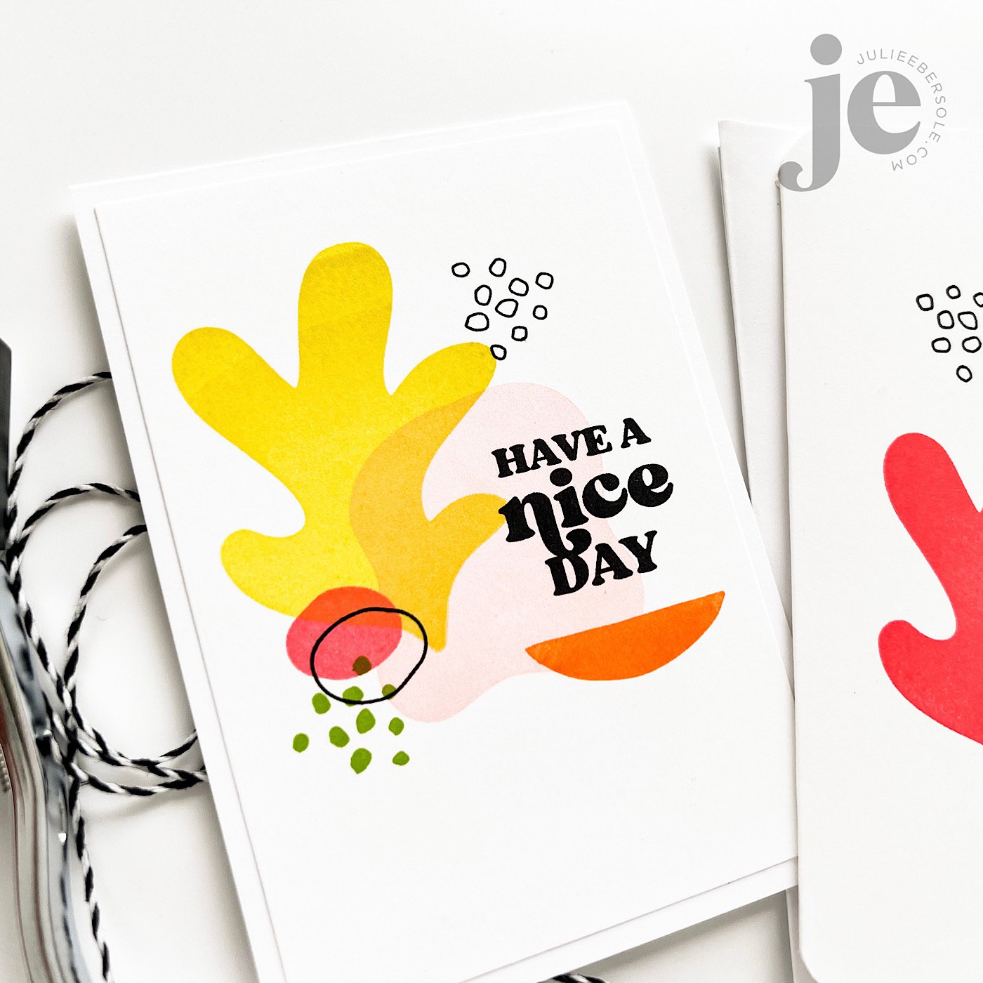
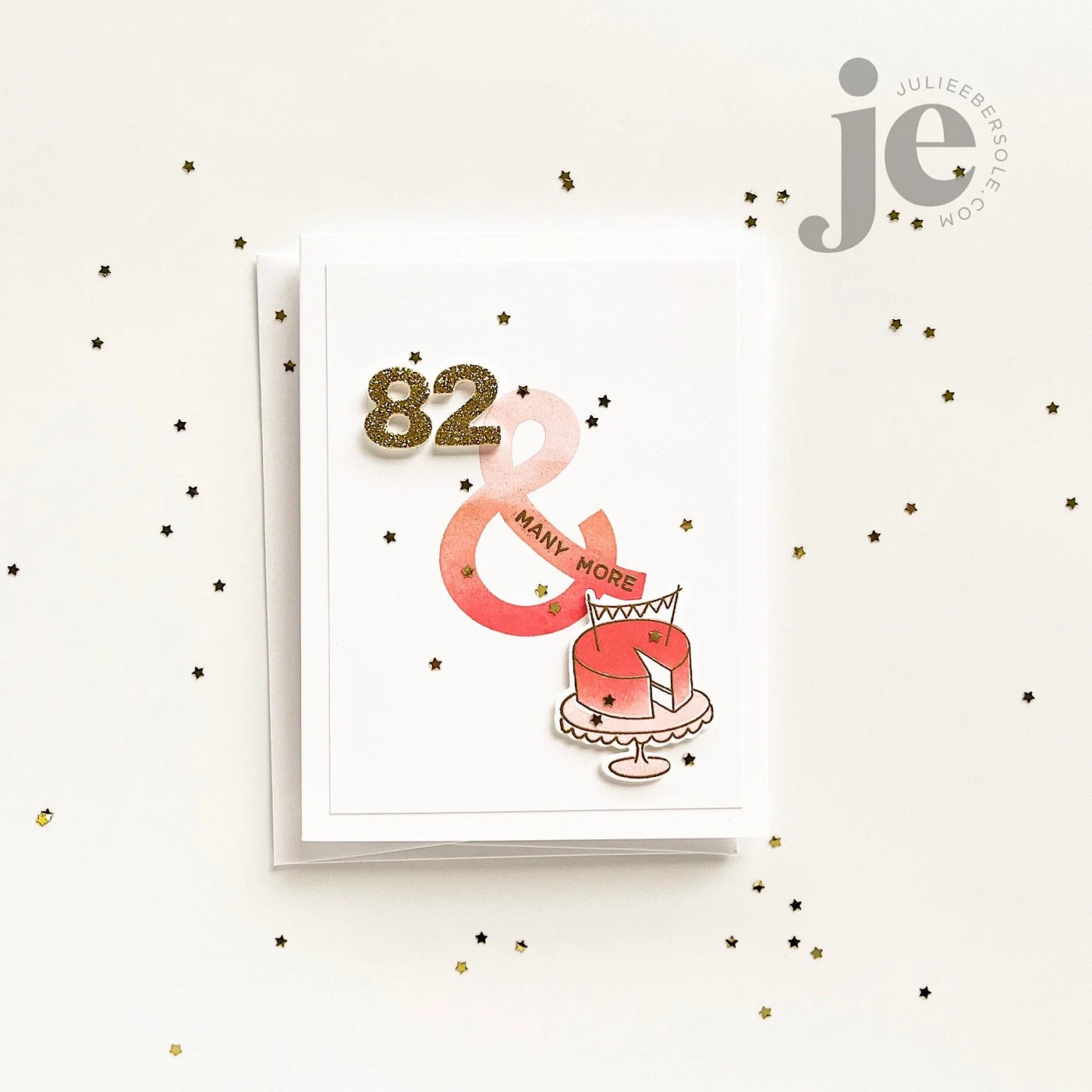
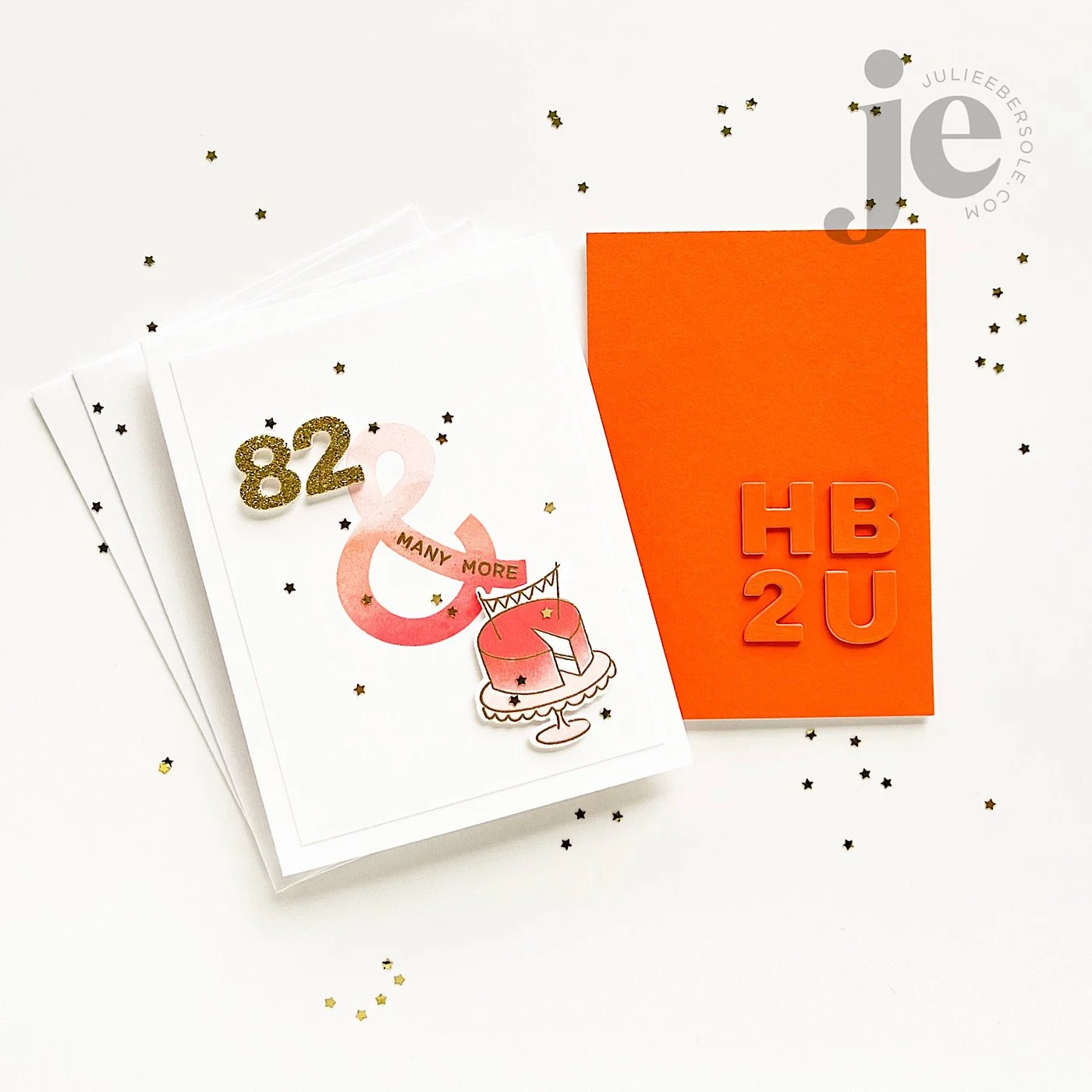
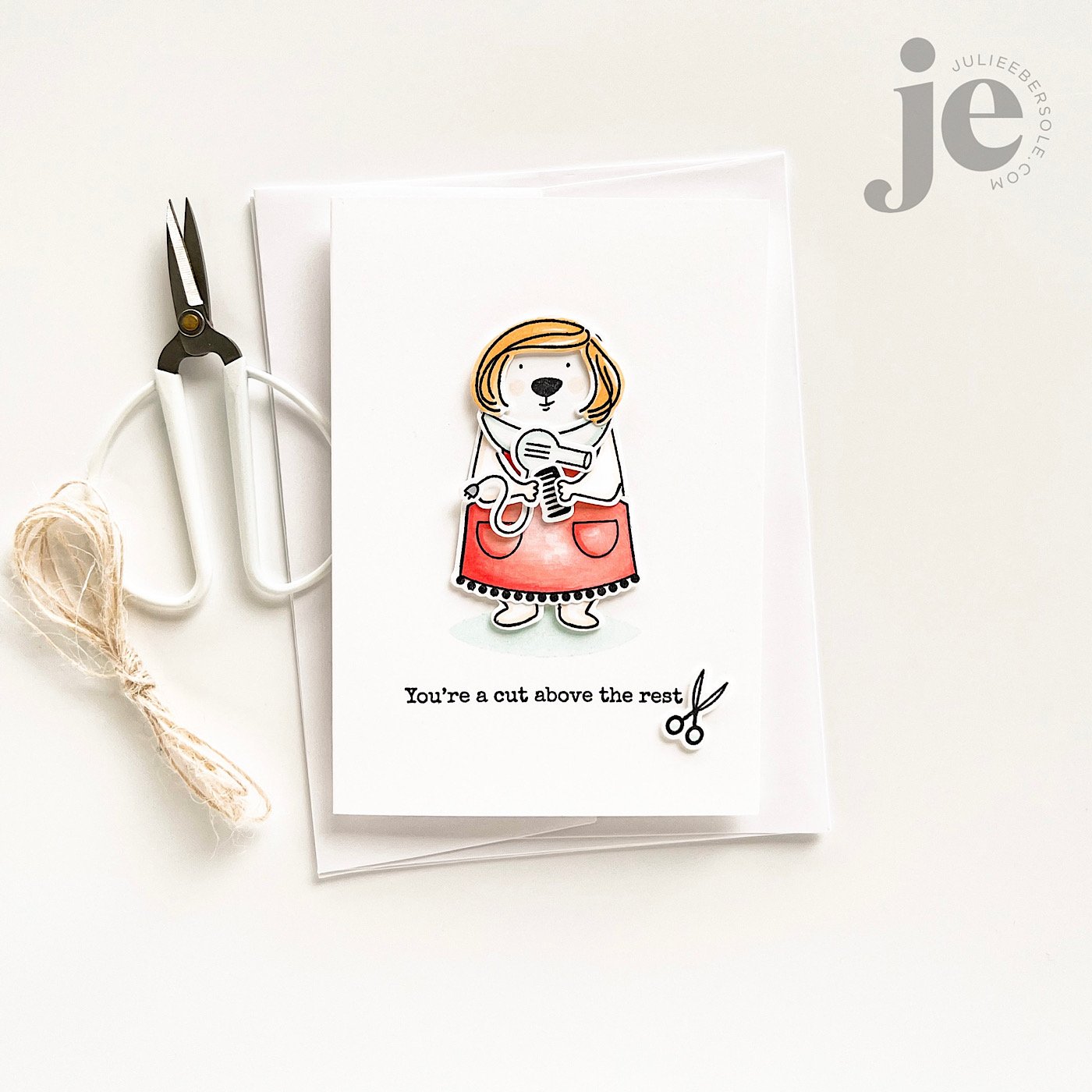
Also, I would like to send one of you all of the handmade sample cards pictured above! If you will kindly leave a comment on this post by Wednesday Mar. 9th, I will draw a name and announce by Friday, Mar. 11th! Side note: I promise not to write inside the cards so you can send them to family or friends, if you want.

****Comments are now closed****


Have a great weekend, and thanks for poppin’ in!


FEATURED:

ESSENTIALS BY ELLEN MARCH 2022 RELEASE

Disclosure: This post includes my affiliate link(s). If you use my links to make a purchase, thank you so, so much for your support!