tutorial

HOW TO USE IRON ON VINYL OR HTV ON PAPER

How to use iron-on vinyl or HTV with a Cricut machine for paper crafts.

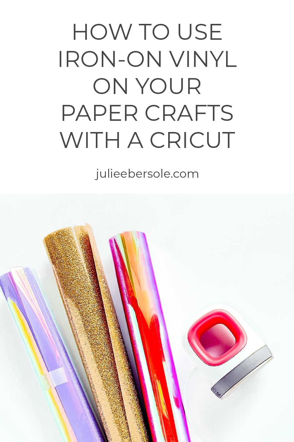
When I found out HTV (a.k.a. Iron-On Vinyl) could be used on PAPER, I was over the moon! Cutting smaller or more intricate pieces with my Cricut Maker from card stock can sometimes be a lesson in futility, despite having a clean, sticky mat, a brand new blade, and all the right settings. Enter Heat Transfer Vinyl. I bought some to use with my Cricut to make cute Tees for my grand-littles and loved how easy it was to work with, so I wanted to try it out on paper for myself.

I’m stoked to share that it is fun, easy and WOW! So far, I’ve only tried holographic and glitter HTVs—specifically Cricut Iron-On brand. Because I had it on hand. I made a few mistakes, and learned some tips I share in the video tutorial below. But, for your future reference, keep the following in mind:

  • Anything you plan to cut from Iron-on Vinyl/HTV needs to be “mirrored” in Design Space; you’re cutting through the vinyl from the BACK side and if you don’t mirror, words and such will not read correctly when you flip it over.

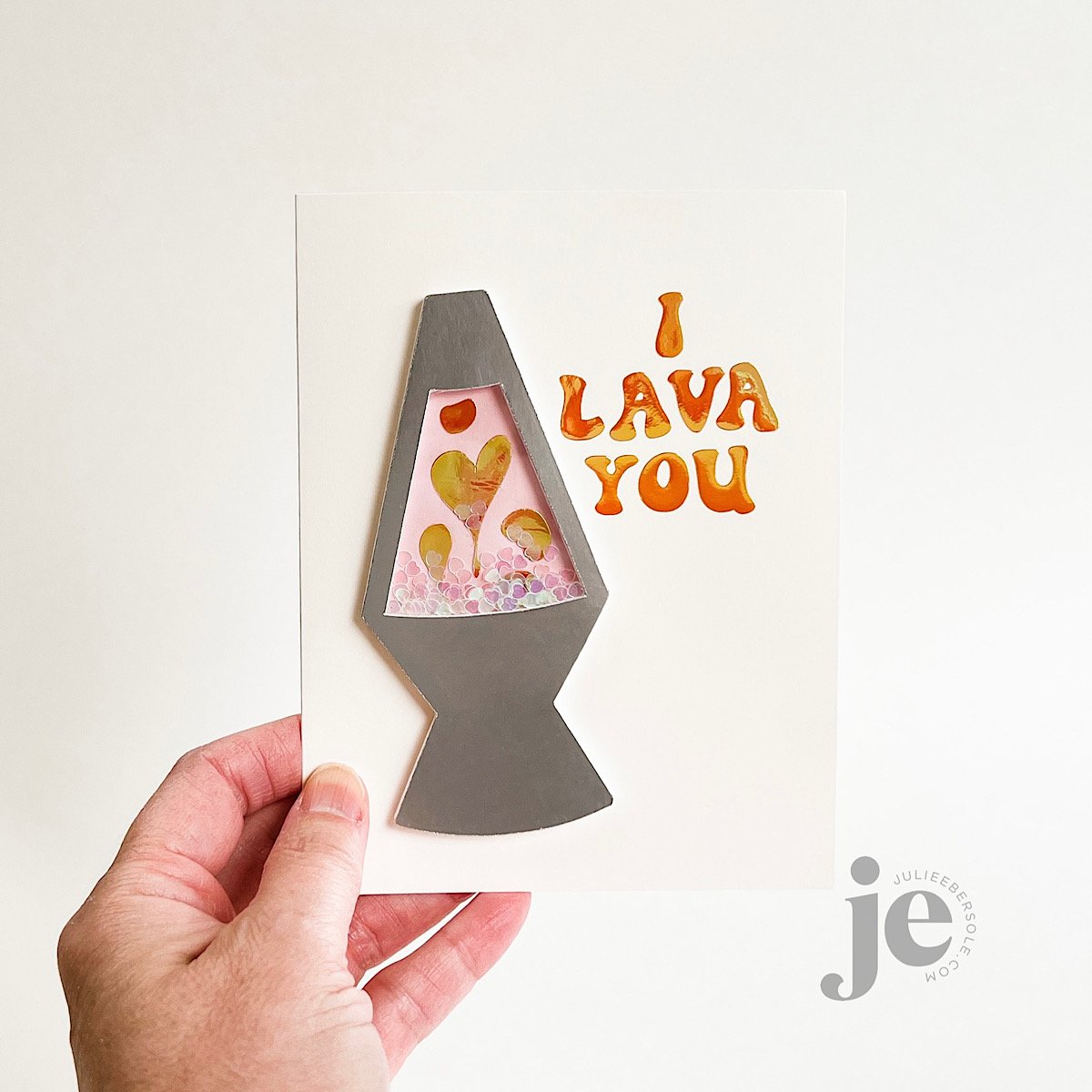
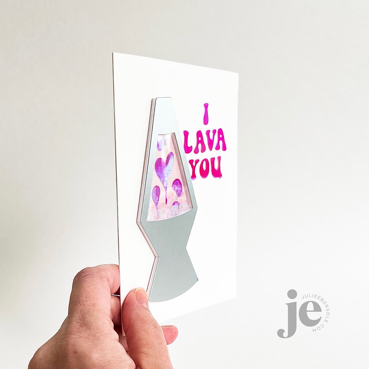
  • Select the proper settings, or as close as you can get, in Design Space to the material you’re using; I was cutting through Holographic Iron-On Vinyl for my Lava Lamp Shaker and mistakenly chose just “iron-on” vinyl. It didn’t “kiss cut” properly and I wasn’t able to properly weed the design and had to try again. We all make mistakes and sometimes waste supplies when we are learning something for the first time; it’s OK. Even pros occasionally forget.

  • Always place iron-on/HTV type materials FACE down onto the cutting mat; I think of it as “pretty” side down, ugly side lookin’ up at ya’.

  • If the vinyl is curling up on the mat or the mat doesn’t have enough stick-um to hold it down in place (critical), blue painter’s tape will really help! Apply some along all the outer edges to anchor the vinyl into place. It’s important the material does not shift/move during the cutting process.

  • When working with GLITTER HTV a weeding box will be your best friend! I go over this in the video and you’ll understand when you watch why it’s a great thing! After cutting, you can place the vinyl onto a light table/pad to better see where the cut lines are when weeding; alternatively, if you don’t have a light table/pad, you can tape it to a window where the natural light will help you see those cut lines better. You can also reference the original design visually to help guide you what parts need to be weeded and which should be left on the carrier sheet.

  • Whatever brand of iron-on vinyl/HTV you are using, read the manufacturer’s recommended heat settings, length of time for pressing and whether or not it’s a warm, cool or cold peel (to remove the carrier sheet). Every product line is different and all that info will vary from one to the next (including the various types of HTV made by each company).

  • If using a household iron, avoid steam by making sure you’ve emptied the water chamber completely before using. Also avoid the steam vents; they can leave an unwanted impression in some vinyl products.

Enjoy the video—I hope you find it helpful! Still shots of the projects I used HTV on are below the video. I didn’t film using the Glitter HTV, but the process is exactly the same—just remember to select “Glitter Iron-On Vinyl” in your materials setting, instead of Holographic; it makes a difference. 😉

Learn how you can incorporate iron-on vinyl/HTV with your paper craft projects using a Cricut.


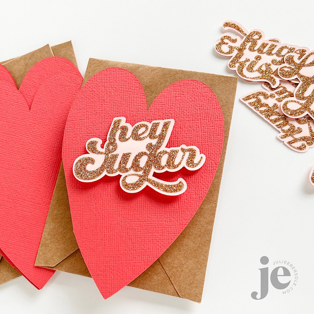
I seriously had a ton of fun using this stuff—I had been on a quest for no-shed glitter card stock because most that I own, shed glitter like crazy, which makes me NUTS! Love the look, hate the mess. So, when I saw someone using HTV, I literally started monkey-clapping!

Thanks for stopping by and have a great weekend!


Disclosure: I include affiliate links to the products used in my posts and make a small commission when you purchase via those links, at no extra dimes to you. 🙂 Your support is appreciated more than I can say!

SUPPLIES MENTIONED:

Tools & supplies I use regularly in my Cricut Crafting:

PUSH-ME-PULL-YOU FRIENDSHIP CARD

Finished card is A-2 size

Consider this a (basic) tutorial (one of many different types that already exist, for sure!) for creating a reverse action/double slider card; it works for either portrait or landscape layouts—just make sure your images and sentiments are going the same direction.

I used the smaller slit from the Push-me Pull-you Die set. Is this set necessary for making this type of slider? Nope! You can use a straight-blade trimmer or a craft knife + a metal edge ruler, if that’s what you have. I just find the slit die works great and is the perfect size for this particular type of slider card, and I love that you can completely adjust the gap between the slits to suit your project, whereas on a duo slit die, the gap is fixed.

BASE MATERIALS:

  • 2 pcs. White card stock - 4.25 x 4.5” (for the back cover and for the mechanism itself)

  • 1 pc. Preferred color of card stock - 4.25 x 4.5” (for the front cover)

  • 2 pcs. White card stock - 3 x 4.5” (for the “handles”)

    • Optional: 1 pc. White card stock - 4 1/8 x 4 3/8” (for layering onto the front cover and allowing for a slight mat or border effect)

  • 1 strip of thin plastic or cellophane - 3 x at least 8” long (excess can always be trimmed off during assembly; grocery shopping, zipper style and cellophane bags work or you could even use ribbon, if you have some laying around that meets the dimensions)

VIDEO TUTORIAL

Now, if you prefer to skip the mat layer (the green “front cover” one shown in my prototype), just swap it out for white and you can skip the optional smaller layer. But, if you want to stamp directly onto that, make sure to do so while it’s flat and before you start assembling things.

And, don’t forget: Stickles LAST!!!

Have a fab day!


PARTIAL DIE CUT VALENTINE CARD

ANNOUNCEMENT

My Blog RSS feed delivery via MailChimp will be ending soon. If you’d like to remain in the know, please sign up for my email list using the form located at the bottom right of my HOME PAGE (the form will not show up in RSS Feed Emails) , and then you can unsubscribe yourself from the Blog RSS Feed emails without missin’ a beat! Thank you!


I’m always looking for alternative ways to use my tools and supplies and this idea has been rolling around in my head for quite some time:

Less is More . . .

This is one of those “looks-more-complex-than-it-actually-is” kind of cards—the partial die cutting on the card front gives the appearance of more layers because of the colorful, stamped pattern . . . Always a winner in my book!

Full video tutorial below:

HOW TO:

  1. Score a 4.25 x 11” piece of card stock at 5.5” from the short end to make a horizontal side-folding card.

  2. Fold the card and place into the MISTI (the original sized MISTI works best for this because you get more platform area and can move the paper for repeat stamping.

  3. Stamp the longest paint stroke image in a series of stripes, some overlapping, some 2nd generation impressions and some reinked and stamped again to intensify the color.

  4. Use the partial die-cutting method to cut the cityscape through the card front only; trim away the negative piece with scissors or a craft knife (if you’re unsure, just watch the video above).

  5. Gold emboss images from Love Notes onto watercolor paper and watercolor using Zig Clean Color Real Brush markers and a waterbrush. Die cut when dry.

  6. Mount images to card as shown, taking care to position so that the card still swings open freely.

  7. Gold emboss sentiment onto scrap of red card stock; 3D mount to card front.

If you haven’t yet, this is a simple but fun die cutting method to try! Thanks for stopping by!


FREE ONLINE CARD MAKING EVENT

Last week I let you know about the Card Maker Success Summit, which kicks off next week. You’re going to hear from me on Day 1, Feb 17 2:00pm Pacific about Beginner-friendly digital die cutting for card-making.

You’ll also hear from some of my friends, including:

  • Daniel West

  • Therese Calvird

  • Laurie Willison

  • And a whole lot more!

These presentations are totally free to you for the first 24-hours, as long as you’re registered.

You can also get your hands on the VIP All-Access Pass for a reduced price right now. With it you’ll get:

  • VIP All-Access Pass to all 25+ presentations - no waiting!

  • Lifetime access to all 25+ presentations ($1,200 value)

  • 275+ page Card Project Digital Workbook with a card project planning calculator ($59 value)

  • 1 Live Virtual Crop over Zoom with fellow VIP attendees ($59 value)

  • Premium bonus content from our speakers and sponsors, including a Craft room Organization Guide Workbook, SVG Bundles, Free Card and Technique classes, exclusive discounts to your favorite craft stores, and much more! ($600+ value)

 Check out more details HERE


REPOST: FIT TO BE PIED

Because it’s apropos for today, which is Thanksgiving, I’m reposting one of my favorite Bear card designs!

And, if you’re shopping online while waiting for the big bird to finish roasting, heads’ up on the sale going on over at ellenhutson.com right now:


I hope your Turkey Day is indeed “fit to be pied”! (big grin)


HAH!!! Mama Bear and Li’l Bear have been busy making pumpkin pie. WOOT!!!

I usually refrain from coloring Bear; I just like him in white. But I do like to outline him with a soft color and often reach for Copic Milky White. All of these were stamped with Gina K Amalgam Jet Black Ink, which is alcohol marker friendly. You could also use colored pencils, water-based markers, etc. Normally, I reach for Versafine Clair Nocturne when stamping my images in black, but it does not play nice with alcohol markers unless you clear emboss it.

I also have a quick tip for using stamps that have coordinating SOLID dies. I used the Bear from All Inside for the demo, but this works for any solid die. You can watch right here or over on my YouTube Channel.

If you look closely, you may be able to see how some of the smallish images were outlined outside the lines with a pale blue—this can actually make white images appear even whiter (like the plate and the whip cream atop the slice of pie).

I used Orange Stickles on the pumpkin, but you can substitute Diamond Stickles in a pinch.

Have a fab day and thanks for stopping by!


FIT TO BE PIED

bearware4-bakingpie-001-1.jpg

HAH!!! Mama Bear and Li’l Bear have been busy making pumpkin pie. WOOT!!!

I usually refrain from coloring Bear; I just like him in white. But I do like to outline him with a soft color and often reach for Copic Milky White. All of these were stamped with Gina K Amalgam Jet Black Ink, which is alcohol marker friendly. You could also use colored pencils, water-based markers, etc. Normally, I reach for Versafine Clair Nocturne when stamping my images in black, but it does not play nice with alcohol markers unless you clear emboss it.

I also have a quick tip for using stamps that have coordinating SOLID dies. I used the Bear from All Inside for the demo, but this works for any solid die. You can watch right here or over on my YouTube Channel.

 
bearware4-bakingpie-001-2.jpg

If you look closely, you may be able to see how some of the smallish images were outlined outside the lines with a pale blue—this can actually make white images appear even whiter (like the plate and the whip cream atop the slice of pie).

I used Orange Stickles on the pumpkin, but you can substitute Diamond Stickles in a pinch.

Have a fab day and thanks for stopping by!