hot foil stamping

BIRTHDAY VIBES

Disclosure: I include affiliate links to the products used in my projects and make a small commission when you purchase via those links, at no extra dimes to you. 🙂 Your support is appreciated more than I can say!

ESSENTIALS BY ELLEN APRIL 2023 RELEASE IS AVAILABLE NOW (affil)

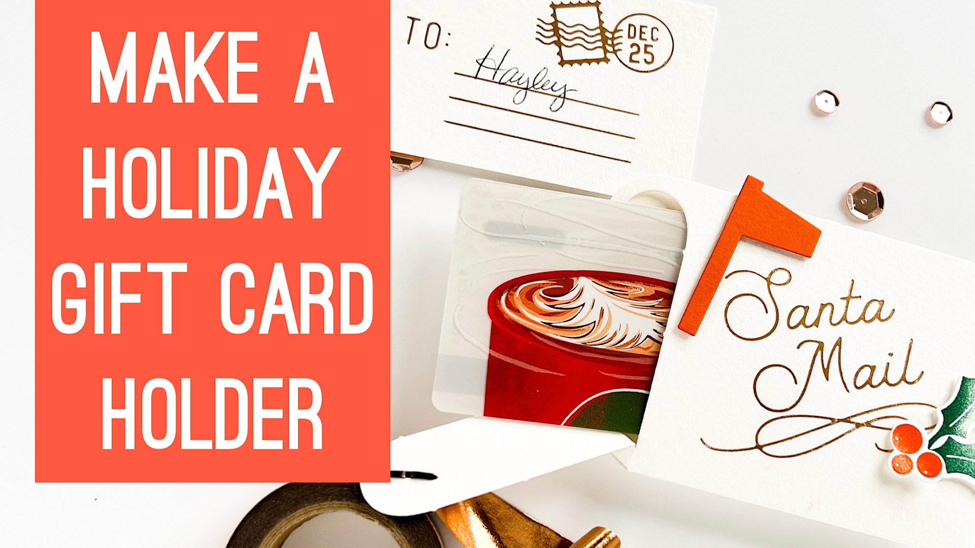
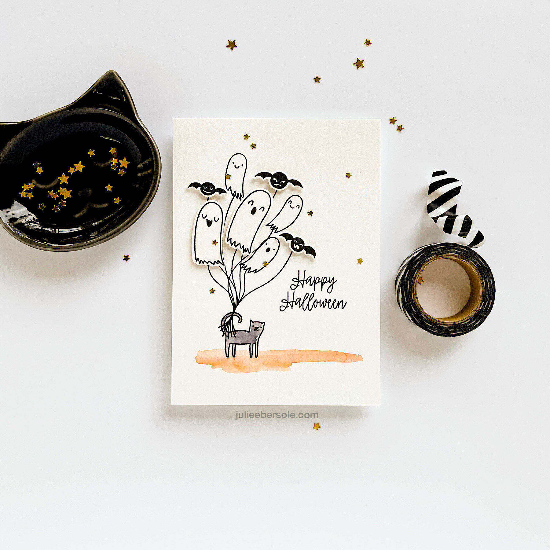
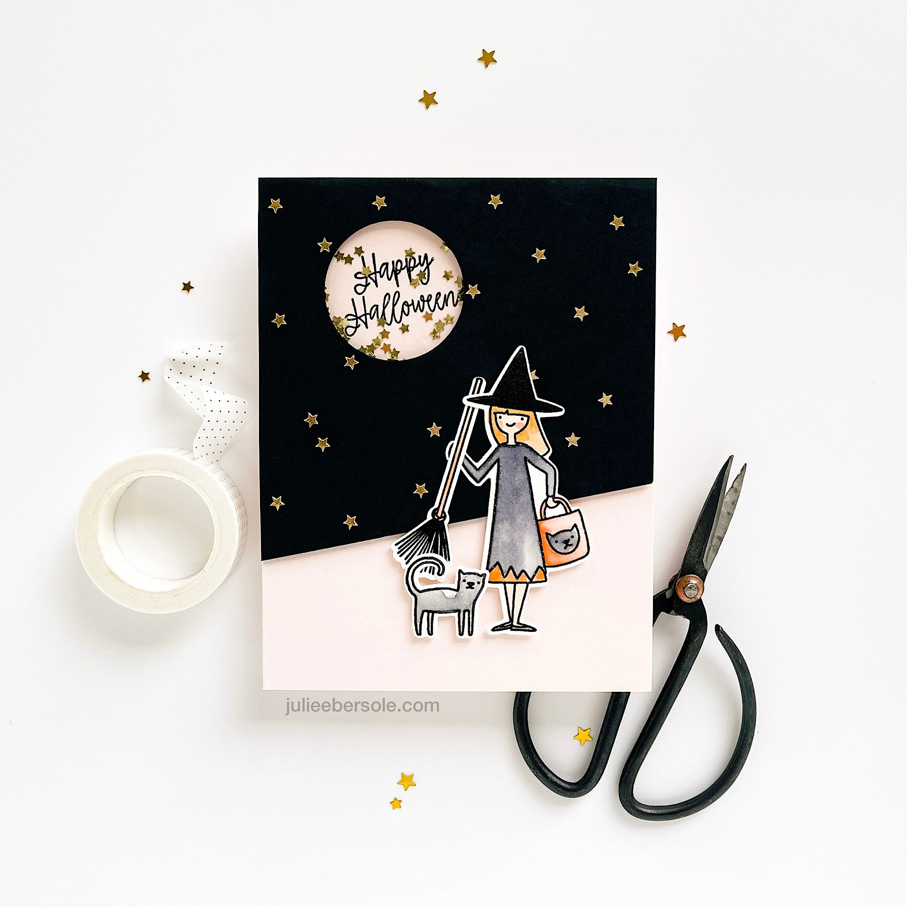
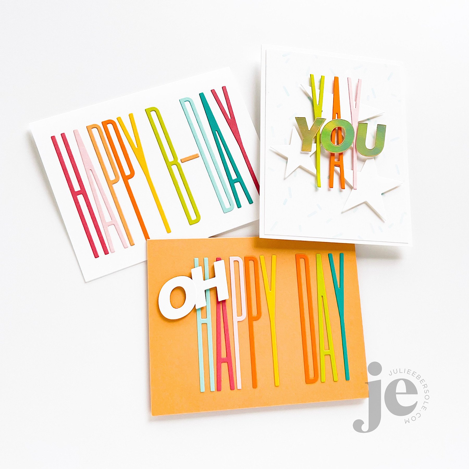
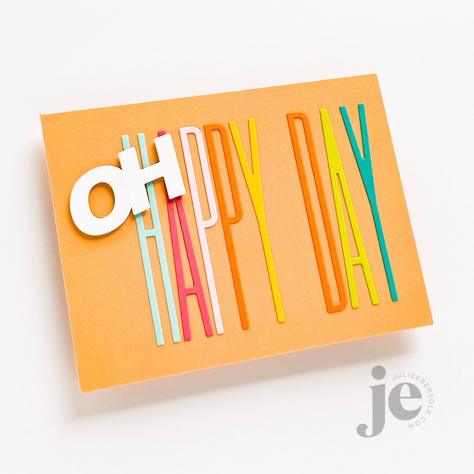
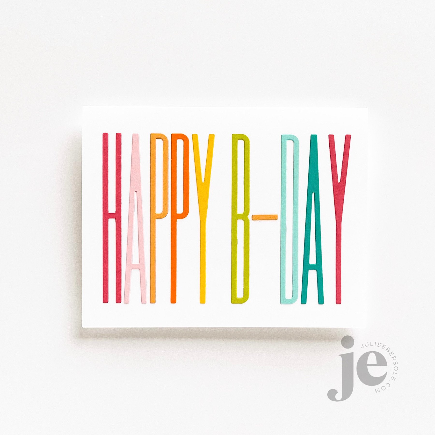
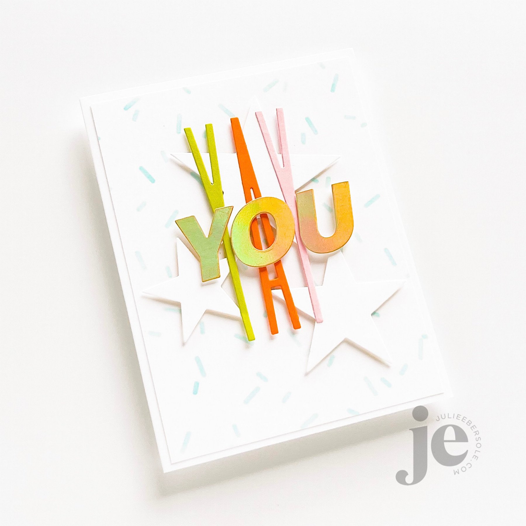
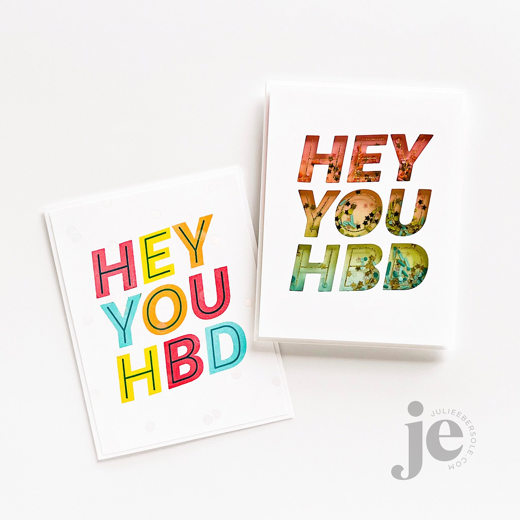
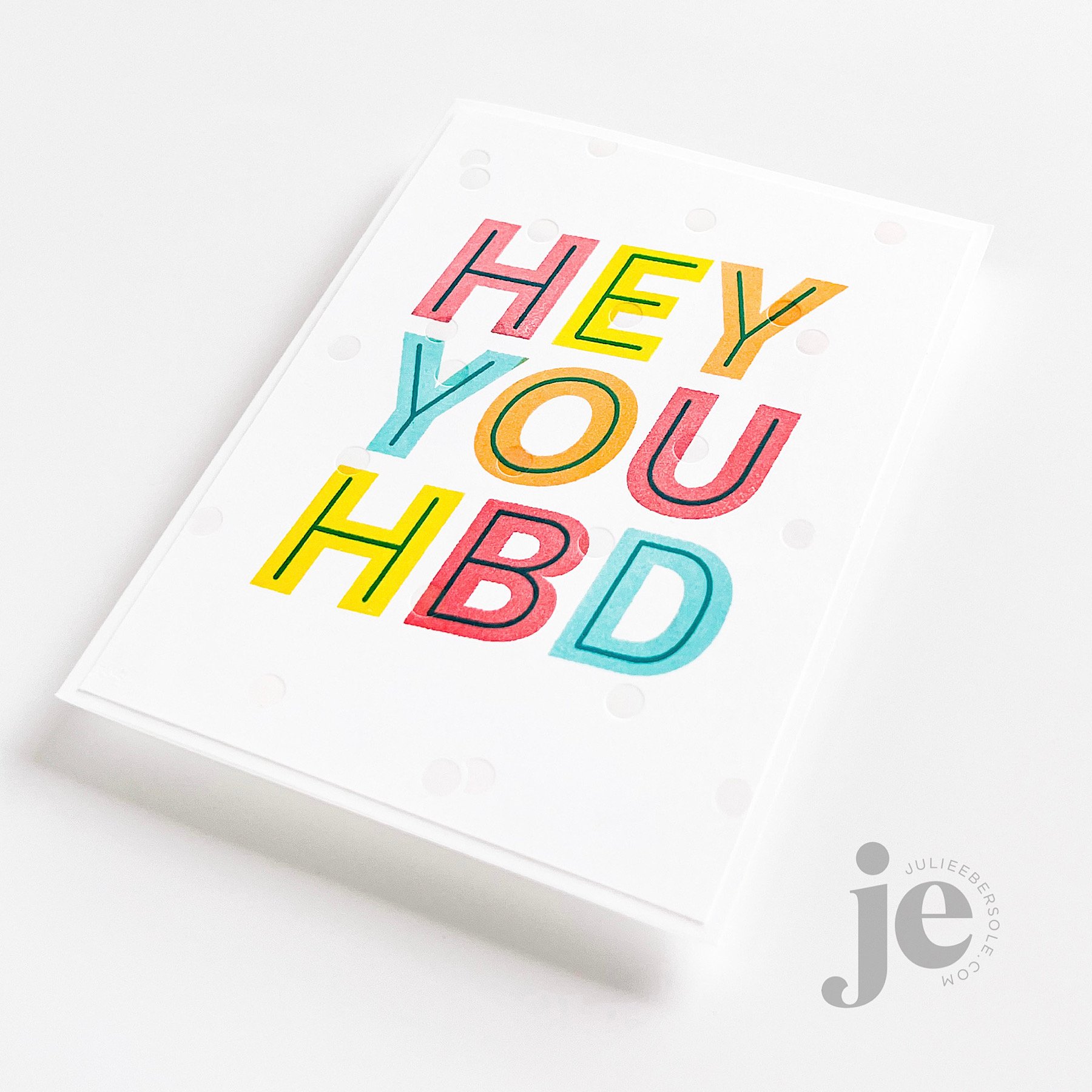
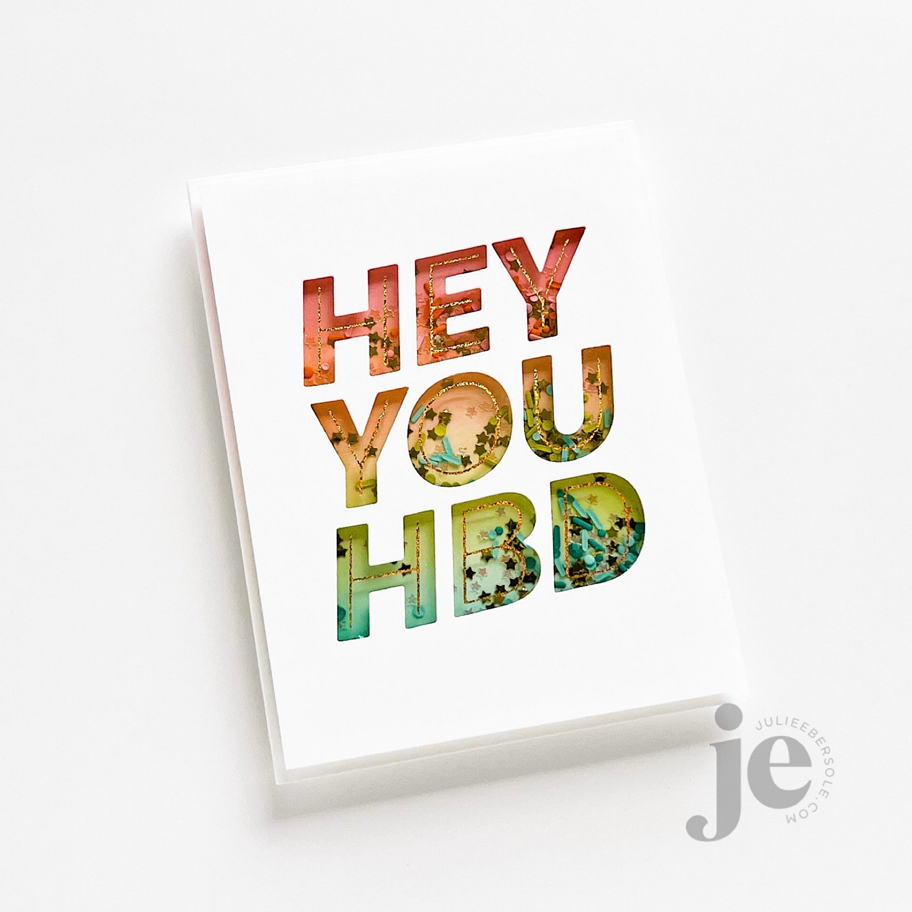
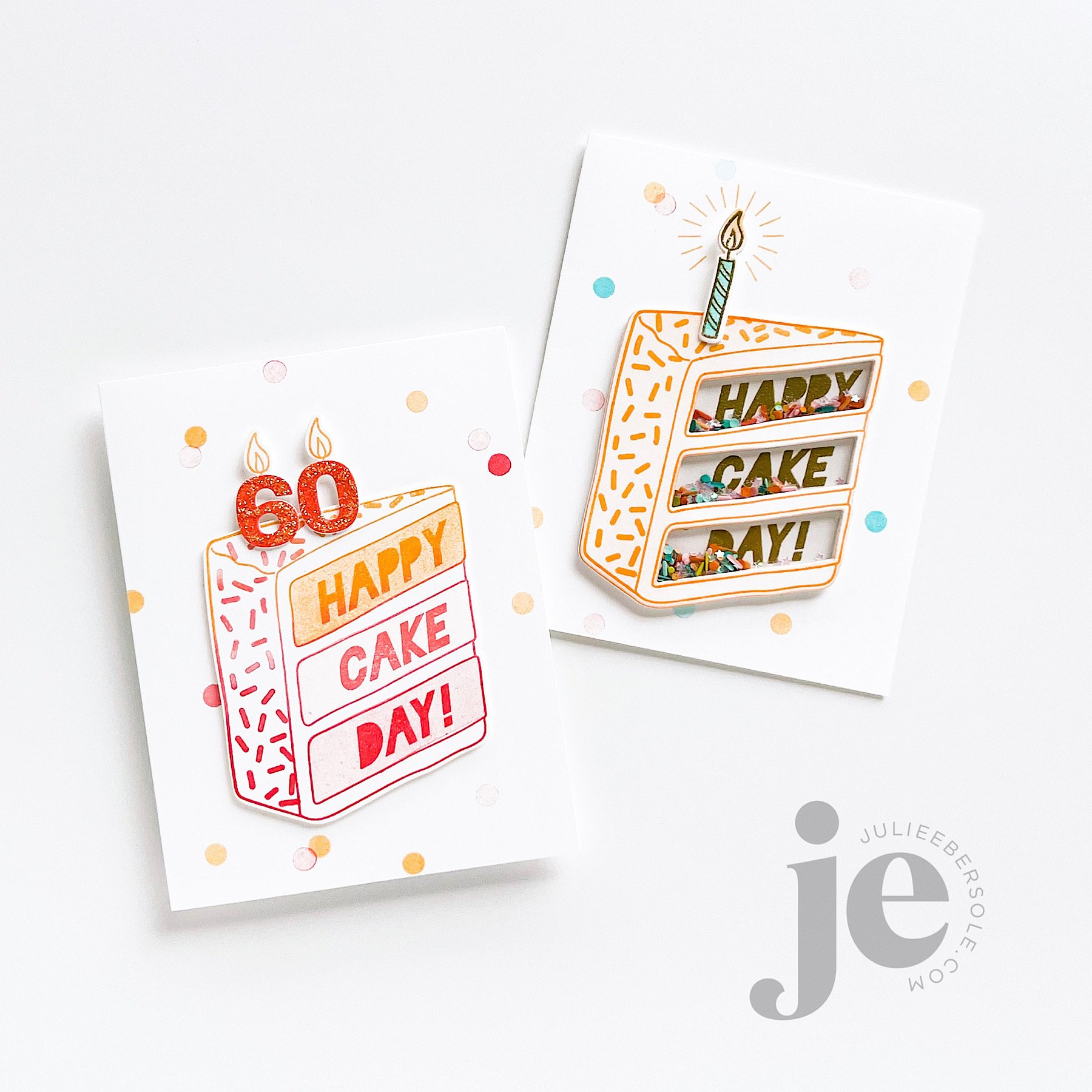
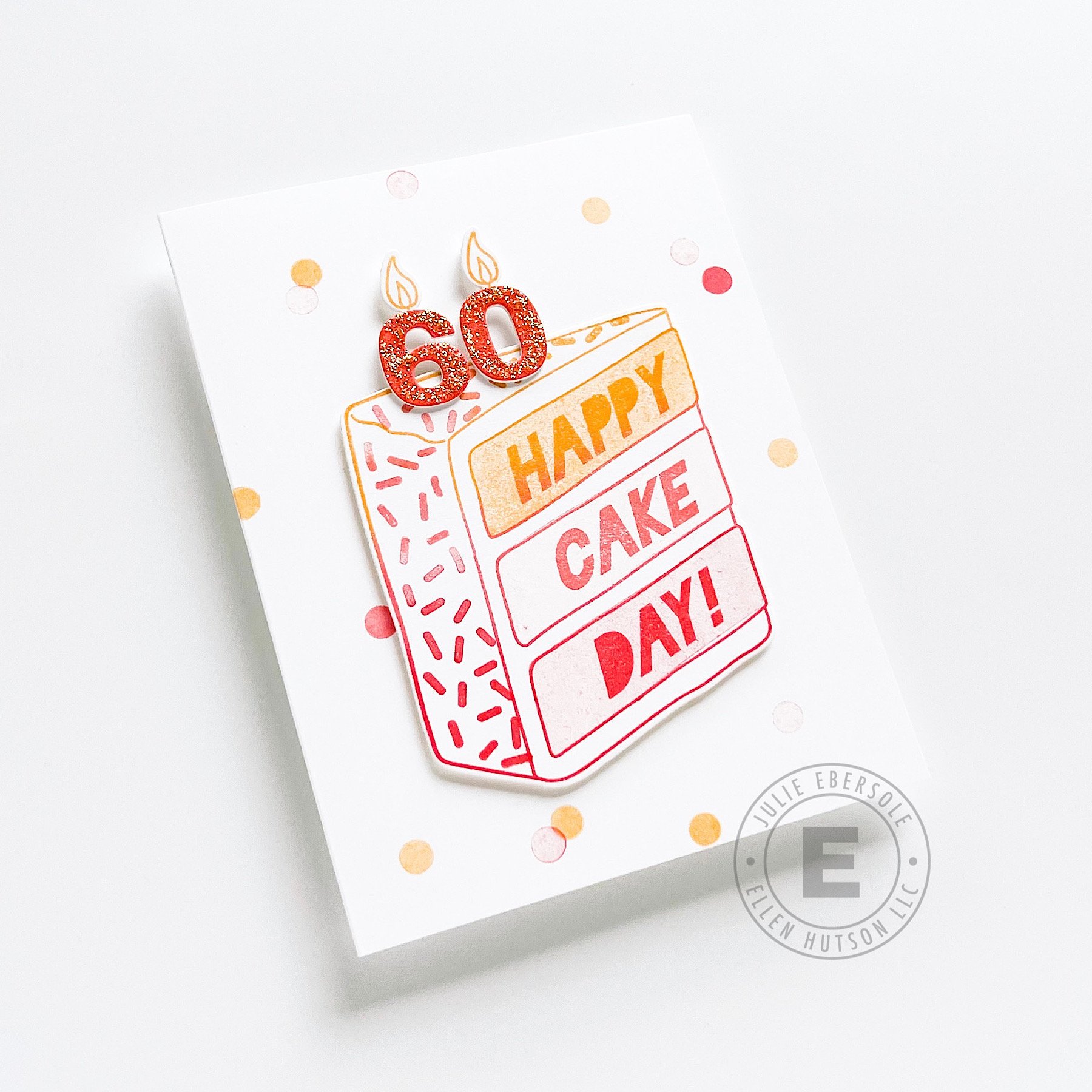
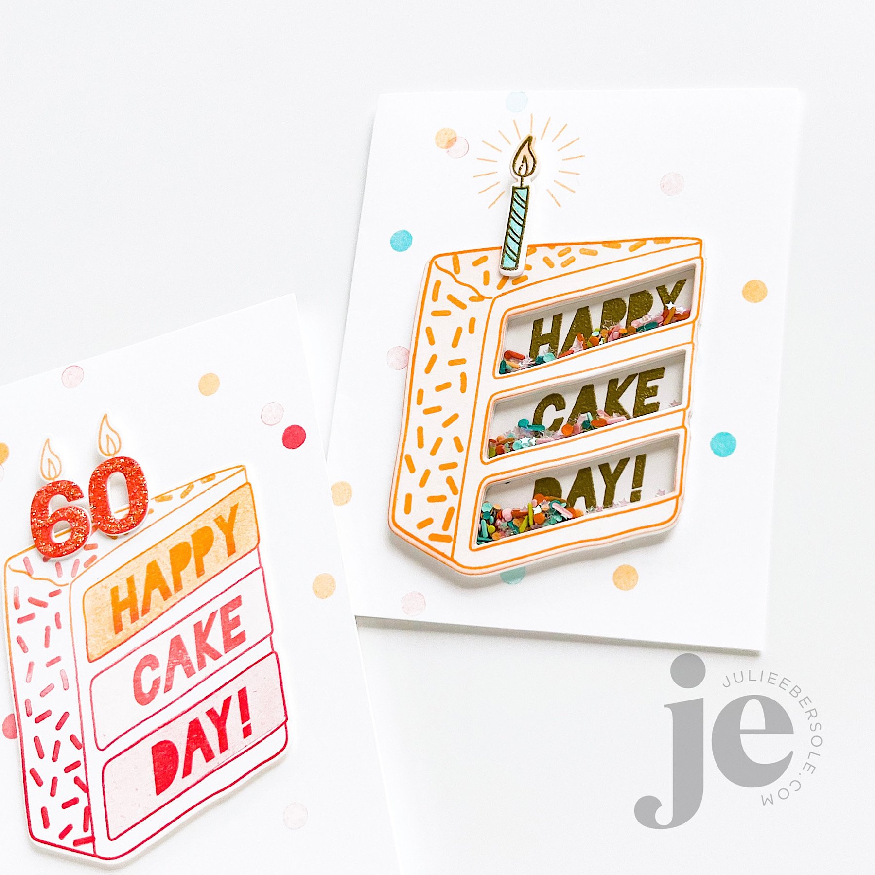
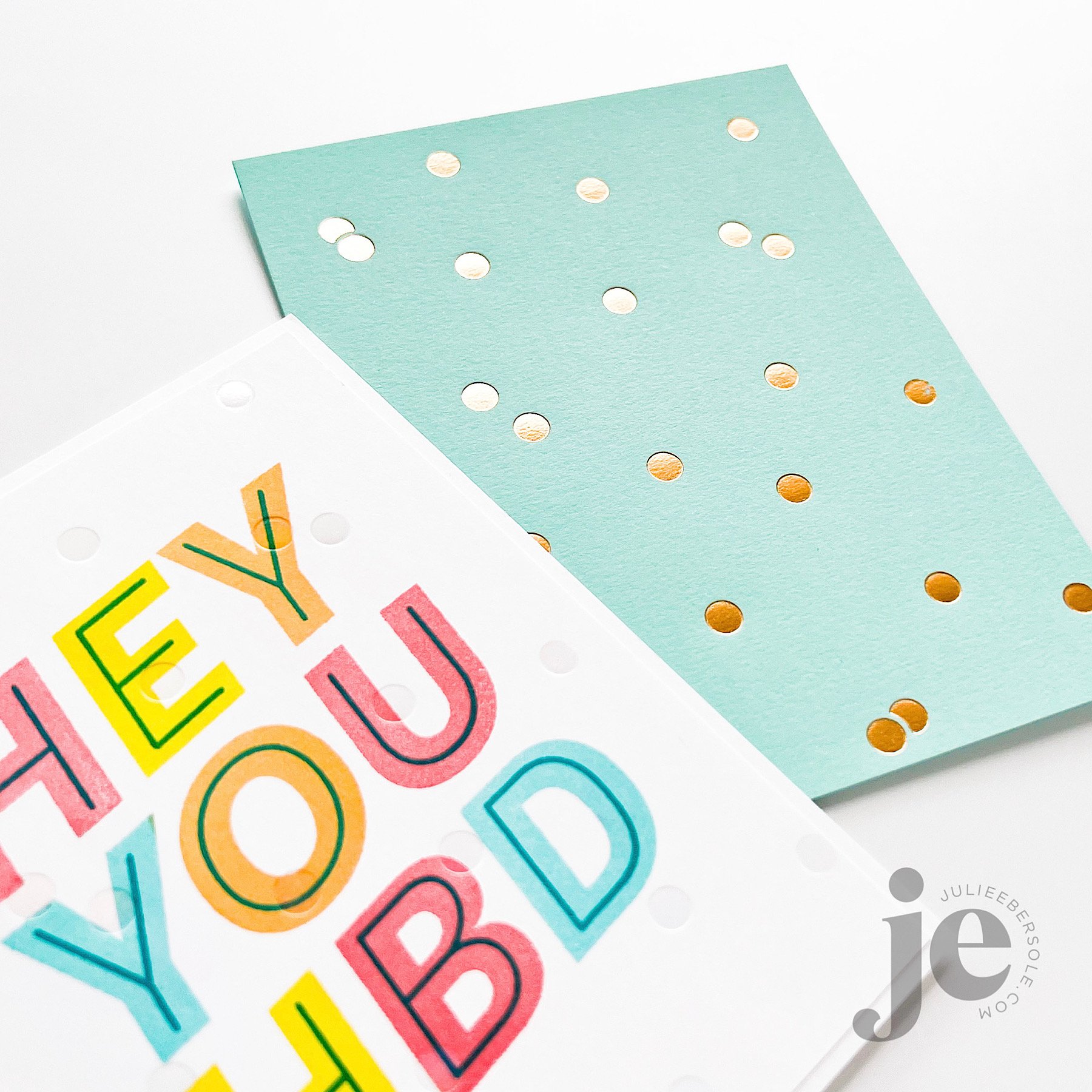
I am addicted to “type”. I love words, letter forms and typography. There’s a lotta’ my beloved type in this release and the larger the type, the more it makes me giddy. I’m sharing a few samples I made with my new stamps, dies and hot foil designs but there’s a lot more inspo and goodness over on the release page, so check it out by clicking the photo above, or the link directly beneath.

Closer details can be seen in the slide show below:

I share more insights and details on the products I designed and the samples above in a recent video on the Ellen Hutson YouTube Channel right HERE.

Someone on Instagram asked about the colors I used so I am listing the color palette I stuck with for all my samples down below in the supplies. Note, some are paper colors that have been discontinued 😭 but I have included suggestions for alternatives I think would be lovely and are very similar in hue.

Hope you get a chance to join the Ellen Hutson Release Hop over on Instagram—there’s a giveaway and all you need to do is leave some comment love on the hop stops, to toss your name into the hat for an opportunity to win! The eye candy is DELISH!!!

Thanks for stopping by today and I hope you found the above inspiring!


HOW TO MAKE A MAILBOX GIFT CARD HOLDER

I received some questions on Instagram regarding how to assemble this gift card holder so I did a video—I also included how to get the gorgeous foiled effect on watercolor paper! I have had such great results foiling on Canson XL, 140#. Note in the video I did use a 110# Neenah solar white shim. Because watercolor paper has a rough texture, I found I needed additional pressure. Depending on how your particular machine is calibrated, you may or may not need a shim; experiment on scrap with foil scraps!

How to make a gift card holder with the Happy Mail Die

Please note: I own the Gemini Foil Press and a Gemini Jr. motorized die cutting machine; they’re designed to work together. I also used Gemini Paper Craft Foil. I recently heard the Foil Press is being discontinued (or reconfigured? replaced with something even better??? I have no clue, but I’m really bummed!) That’s what I used in my video because I don’t own the Spellbinders Glimmer System. I can’t tell you what it’s like to work with first-hand. I do know I’ll use my Gemini Foil Press into the ground before replacing it because it has performed beautifully for me for as long as I’ve had it.


I hope this helps y’all see the method to my madness, LOL! I am ALWAYS on the hunt for a unique gift card presentation and I’m going to be making a big stack of these because they are so easy and so dang CUTE!!!

Have a splendid day!


Disclosure: *I include affiliate links to the products used in my projects and make a small commission when you purchase via those links, at no extra dimes to you. 🙂 Thank you for buying all the things!

SUPPLIES:


DESIGN DISSECTION #2

Originally, I intended this design to be a single layer. But, after creating the background, I banked left . . . slightly . . . LOL!

Read on, for the design breakdown . . .

DESIGN DISSECTION #2 • CLICK ON THE PIC TO ENBIGGAN

FURTHER NOTATIONS:

  • A 9-patch grid (indicated in aqua) helps to divide the space visually on your canvas and to guide you in placing “visual weight”. Notice how the initial pattern/design of strawberries is contained within a vertical column, down the center third, from top to bottom; this will later affect the rest of the design*.

  • Initially, I wasn’t going to pop up anything but the gold foiled sentiment and gold embossed tag line. However, they were getting lost against the strawberries in the background. To resolve that issue, I decided to add a circle die cut from vellum card stock; vellum acts as a diffuser, softening whatever is behind it. I didn’t want to soften the entire card front, I just needed more contrast in that particular area to help that sentiment stand out more.

  • On a vertical layout, it also helps to *position your sentiment, or your focal image towards the upper third or lower third, as opposed to dead center. Otherwise, it feels like the card is visually cut in half.

  • To give it even more visual oomph, I decided to pop up a trio of die cut strawberries and have them “hug” the sentiment. Odd numbers are (generally speaking) more visually pleasing to the eye, so I typically start with 3, making sure their placement balances the design so the eye doesn’t get “stuck” on one spot and has that nice triangular flow (those golden arrows).

  • I always consider metallics as part of the color scheme on a project; gold and copper can be used to warm up a card while silver tends to give off a cooler vibe.

By the way, it’s totally OK for strawberry stems to be a beautiful shade of red, instead of green; the color police are not gonna’ bust ya’. 😉

The end.

Hope the rest of your week is great!


HALLOWEEN STAMPING GOODNESS

Today I’m sharing three sweet and adorable Halloween Boo-quet projects here on the blog—also used this set on a Haunted House Treat Box Tutorial over on the Ellen Hutson YouTube Channel that turned out so STINKIN’ CUTE, it’s gonna kill me to wait until Halloween to gift them to the grand weebles! GAAAAH!!!

This was a super fast card, excellent for a last-minute Halloween greeting! So fun to string the balloon boo-quet to kitty’s tail! The matching die set has individual dies, in addition to one for the boo-quet as a whole, so you can pick and choose which of those to pop up, if you want! Options . . . always options, LOL! (wink!).

QUICK TIP: Stamp the balloon strings first, then position and stamp the ghost/bat balloons; so much easier to line them up accurately!

It’s hard to tell in the photo, but our sweet little witch has a pale pink watercolor wash on her dress. I foiled a quarter sheet of black card stock with the Tiny Stars Hot Foil Stamp and then die cut the clouds from that, popping them up, but upside down. Sometimes, I just like ‘em that way. My card, my prerogative. (hair flip)

After die cutting the black clouds in the previous project, I had some leftover, of course . . . So, I figured why not use it to make a background for my little witch to go trick-or-treating with her buddy and broom—and at that point I decided it would be fun to die cut a circle large enough to accommodate the sentiment and turn it into a quick little shaker element!

If you haven’t been bitten yet by the hot-foil stamping bug, I must say, it’s super satisfying—I just love the look of those shiny stars, debossed into the paper. I could just putz around and hot foil stamp the day away—which is actually a smart idea because then you could have a number of pieces ready to go when you need them. Truth.

What do you do more of? Halloween greetings or treat packaging? I’m a mixed bag because both are so much fun to make.

Hope your week is going splendid!


EBE SUMMER OF STAMPING WEEK 4 RELEASE NOW LIVE

Summer of Stamping Week 4 release is available now in the shop! Check out our Instagram Hop, beginning HERE, for tons more inspo and opportunities to win prizes! Leave some comment love at each stop along the way to throw your name into the giveaways hat!

Below, I’m highlighting Everything’s Beachy and the new hot foil stamp “Good Vibes Only” in my projects today!

As in pretty much all my card-making of late, I’ve been watercoloring everything—if I have to color, that’s my pick. This layout isn’t anything particularly special, but it’s one of my favorites—I split that top panel where I wanted the sea and the sand to meet using one of the Landscapes Dies , and watercolored just the edges of each separately; they were popped up with a slight gap between them and I embellished with some of those clear droplets I love so much! I really dig having the sunbrella hanging off the edge there, too. Adds interest!

I used the same Landscapes Dies to create the division—but this time I went on the angle, and very lightly ink blended the beach with a hint of Shea Butter and Sand Castle. The water’s edge was gently blended with All That Jazz and then I went over part of that with Lime Rickey to create another color.

I love having the pop of colored surfboards with the surfer dude there at one end of a series of uncolored boards; I must confess it actually turned out even better IRL than what I was picturing in my head (or chicken scratch sketches, LOL!).

And this last one? I’m crazy CRAZY happy about the retro style of this brand new hot foil stamp! I just made a monochromatic background by stamping the Swirl Background in Limoncello over Sour Lemon card stock (I did have to stamp several times to get the intensity of ink color I wanted—easy with a MISTI). Man, oh man, I guess I could have taken it further, but for me just the simple gold foiling (Gemini Foil Press) right over the top of that was absolute PERFECTION!!!

I’ll be sharing more of the samples I made for the release page here on my blog this week—thanks for stopping by today and don’t forget to cruise the Instagram Hop! May the odds be ever in your favour! (grin)


If you’d like more info on products that coordinate well with the Everything’s Beachy and the Good Vibes Hot Foil Stamp, please visit the full release page HERE.

Disclosure: Yup, those are affiliate links to the products used in my projects and I make a small commission when you purchase via those links, at no extra cost to you. Thank you for buying all the things!