strawberry fields

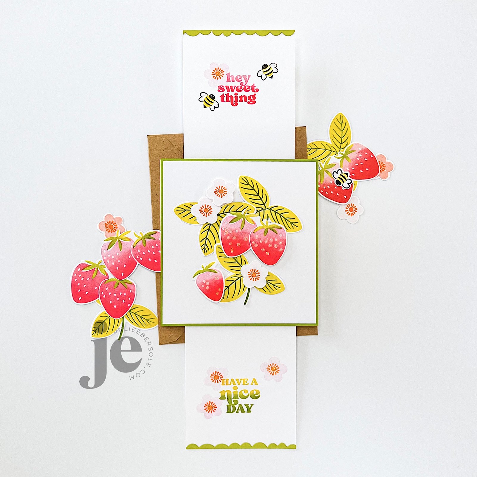
PUSH-ME-PULL-YOU FRIENDSHIP CARD

Finished card is A-2 size

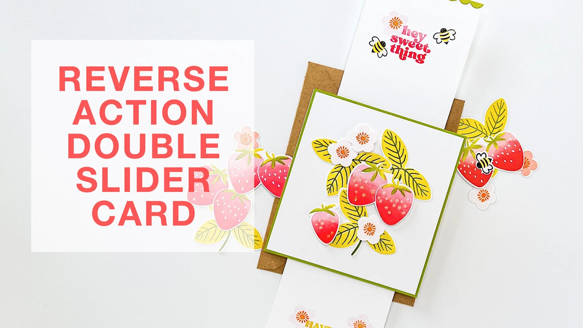
Consider this a (basic) tutorial (one of many different types that already exist, for sure!) for creating a reverse action/double slider card; it works for either portrait or landscape layouts—just make sure your images and sentiments are going the same direction.

I used the smaller slit from the Push-me Pull-you Die set. Is this set necessary for making this type of slider? Nope! You can use a straight-blade trimmer or a craft knife + a metal edge ruler, if that’s what you have. I just find the slit die works great and is the perfect size for this particular type of slider card, and I love that you can completely adjust the gap between the slits to suit your project, whereas on a duo slit die, the gap is fixed.

BASE MATERIALS:

  • 2 pcs. White card stock - 4.25 x 4.5” (for the back cover and for the mechanism itself)

  • 1 pc. Preferred color of card stock - 4.25 x 4.5” (for the front cover)

  • 2 pcs. White card stock - 3 x 4.5” (for the “handles”)

    • Optional: 1 pc. White card stock - 4 1/8 x 4 3/8” (for layering onto the front cover and allowing for a slight mat or border effect)

  • 1 strip of thin plastic or cellophane - 3 x at least 8” long (excess can always be trimmed off during assembly; grocery shopping, zipper style and cellophane bags work or you could even use ribbon, if you have some laying around that meets the dimensions)

VIDEO TUTORIAL

Now, if you prefer to skip the mat layer (the green “front cover” one shown in my prototype), just swap it out for white and you can skip the optional smaller layer. But, if you want to stamp directly onto that, make sure to do so while it’s flat and before you start assembling things.

And, don’t forget: Stickles LAST!!!

Have a fab day!


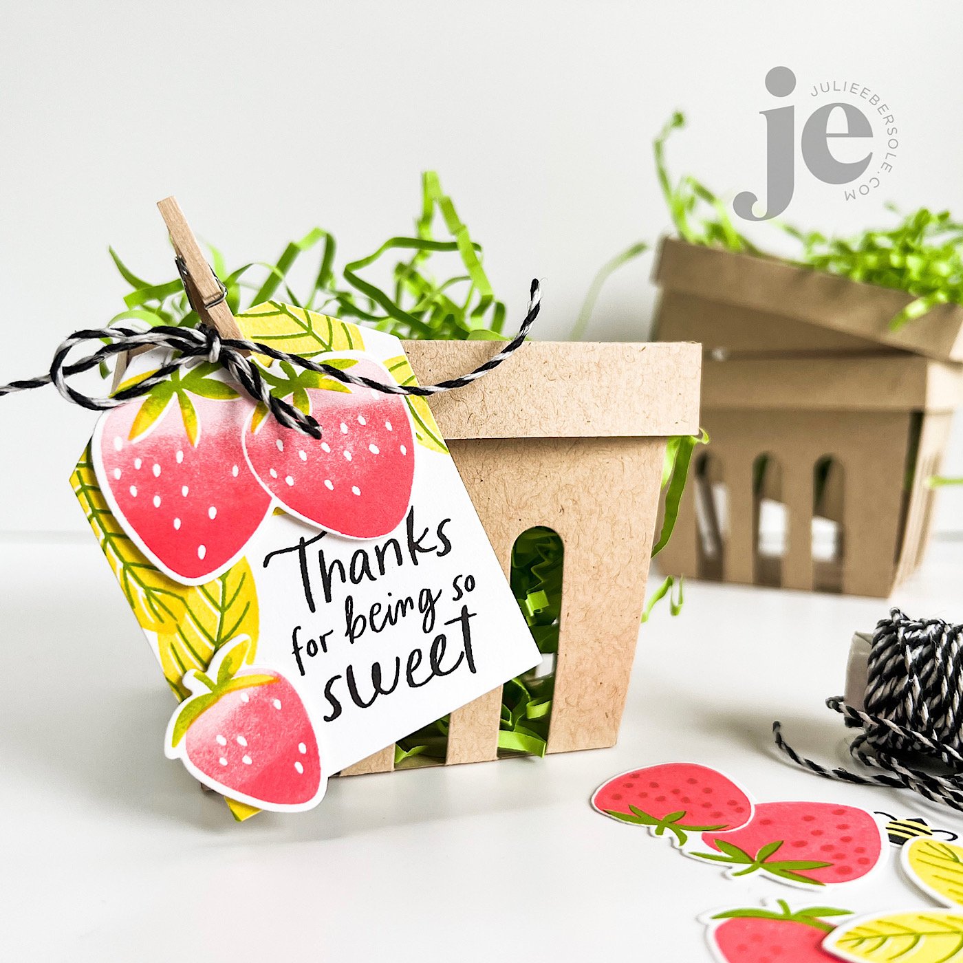
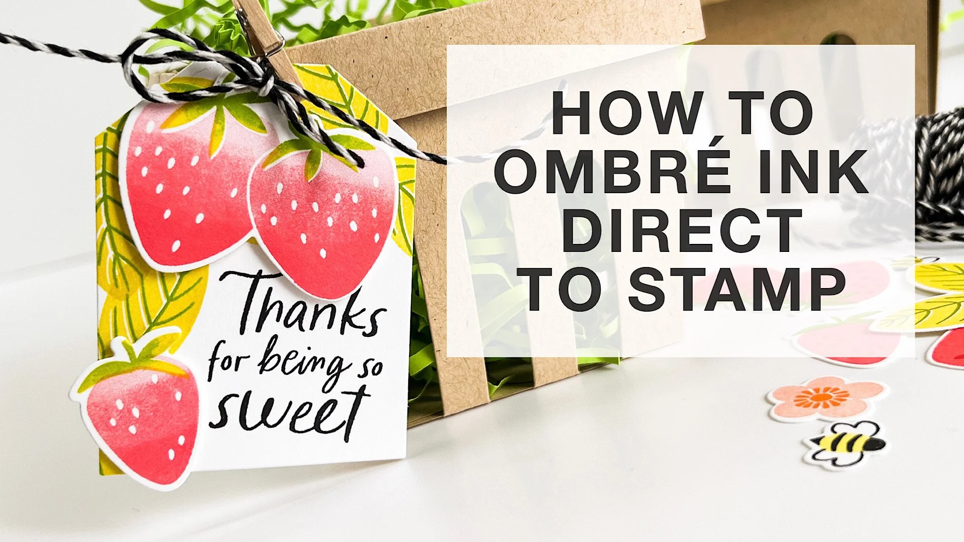
HOW TO OMBRE INK DIRECTLY ON YOUR SOLID STAMPS

That beautiful variegated or ombré ink effect is a wonderful look when combined with solid stamps. You can achieve it by blending ink colors directly on the stamp surface! I’m working with water-based dye inks and using a MISTI positioning tool; for this method, a positioner is key to being able to stamp precisely over the original impression multiple times.

VIDEO

HOW TO:

  1. Select 2-3 shades of ink in the same hue, ranging from light/pale to dark (for really large stamps, you may want 3-5 variations of ink color, but for stamps the size used in this project, 2 is plenty).

  2. Ink stamp with lightest color first and impress to paper; if mass producing and die cutting images out, try my suggestion of trimming quarter sheets of card stock even further down into smaller pieces so you only have to rotate those pieces and not reposition the stamp in order to maximize the paper.

  3. Use the darker color to ink only a portion or a side of the stamp where you want shading or deeper color.

  4. Use a blending tool, like the Little Smoothie, to rock or pounce the rounded end of the sponge across the edge of the ink to soften. Stamp over original impression.

  5. Repeat Step 4 as often as desired.

  6. Highly contrasting colors of ink may require you to clean the stamp before switching colors to avoid cross-contamination of ink pads.


All the beautiful shades of ink pads out there make this one of the easiest methods for achieving “multi-colored” images, especially when working with solid stamps!

Thanks for stopping by!


SUPPLIES:

Disclosure: Affiliate links to the products used in my projects, that I like and use may be included; I make a small commission when you purchase via those links, at no extra cost to you. Thank you for all your support!

DESIGN DISSECTION #2

Originally, I intended this design to be a single layer. But, after creating the background, I banked left . . . slightly . . . LOL!

Read on, for the design breakdown . . .

DESIGN DISSECTION #2 • CLICK ON THE PIC TO ENBIGGAN

FURTHER NOTATIONS:

  • A 9-patch grid (indicated in aqua) helps to divide the space visually on your canvas and to guide you in placing “visual weight”. Notice how the initial pattern/design of strawberries is contained within a vertical column, down the center third, from top to bottom; this will later affect the rest of the design*.

  • Initially, I wasn’t going to pop up anything but the gold foiled sentiment and gold embossed tag line. However, they were getting lost against the strawberries in the background. To resolve that issue, I decided to add a circle die cut from vellum card stock; vellum acts as a diffuser, softening whatever is behind it. I didn’t want to soften the entire card front, I just needed more contrast in that particular area to help that sentiment stand out more.

  • On a vertical layout, it also helps to *position your sentiment, or your focal image towards the upper third or lower third, as opposed to dead center. Otherwise, it feels like the card is visually cut in half.

  • To give it even more visual oomph, I decided to pop up a trio of die cut strawberries and have them “hug” the sentiment. Odd numbers are (generally speaking) more visually pleasing to the eye, so I typically start with 3, making sure their placement balances the design so the eye doesn’t get “stuck” on one spot and has that nice triangular flow (those golden arrows).

  • I always consider metallics as part of the color scheme on a project; gold and copper can be used to warm up a card while silver tends to give off a cooler vibe.

By the way, it’s totally OK for strawberry stems to be a beautiful shade of red, instead of green; the color police are not gonna’ bust ya’. 😉

The end.

Hope the rest of your week is great!