card design

ONE COMPOSITION, 4 LAYOUTS, 4 COLOR SCHEMES

allgood-1comp-4ways-001JPG.JPG

It’s All Good is one of my favoritest sentiment sets because it’s modern and pretty much timeless. It can go feminine or masculine, which is a huge plus!

You could color in the outline letters, but I find this alternative way to add color both super easy and super effective! I liked the composition so much, I made 3 more cards, but just switched the lay-out slightly and the color schemes.

I used Abstract Paint Strokes—another favorite of mine— to create the stripes of color and the spotty background. If you don’t have Abstract Paint Strokes, Flora & Fauna make a set you could easily use to create similar spots and stripes: Texture 10.

I must admit, I had to try a variety of color schemes (on scratch paper) found on Pinterest before I found combos that really appealed to me when laying the stripes down next to and overlapping each other. The skinny washi tape is from HAI Supply and I love that the pattern is a smaller scale than your average rolls of washi tape.


Thanks a Lot Color Scheme: Limoncello | Bellini | It’s a GirlOh. Em. Gee. Color Scheme: Mint To Be | Be Mine | Lemongrass | Limoncello | It’s A GirlHip Hip Hooray Color Scheme: Green Tea | Black Jack | Bellini | Mint To Be | Tutti FruttiHeck, Yeah C…

Thanks a Lot Color Scheme: Limoncello | Bellini | It’s a Girl

Oh. Em. Gee. Color Scheme: Mint To Be | Be Mine | Lemongrass | Limoncello | It’s A Girl

Hip Hip Hooray Color Scheme: Green Tea | Black Jack | Bellini | Mint To Be | Tutti Frutti

Heck, Yeah Color Scheme: Sauna | Mandarin Spice | Twilight | Bellini | Sand Castle | Eucalyptus

This is such a great composition that works well in all of the layouts above—hello, Easy Button! (fist pump)

Happy Weekend and thanks for stopping by!


My Pinterest Color Inspo Board: Coloring My World

SUPPLIES:

Disclosure: This post contains affiliate links; if you see something you like, want or need, and purchase via my links, I receive a small commission, at no extra cost to you, which I use to buy coffee, which fuels my creativity and provides energy to make more card ideas. And, pay the rent.

TWO CUTE COFFEE CARD IDEAS

rnc-2-lattelove-cards-grp.JPG

These two coffee card ideas for the Latté Love stamp set have been flittin’ around my brain for nearly a year—but the idea for incorporating a hidden gift card pocket was inspired by one of Yana Smakula’s creations. Super ingenious!

These were just fun to make using a simple faux watercolor technique that I’ve always loved.

rnc-2-lattelove-cards-001.JPG
Hidden gift card pocket was inspired by this Yana Smakula gem!

Hidden gift card pocket was inspired by this Yana Smakula gem!

So, anyone else as anal as I am about my card matching the theme or the colors of the gift card housed inside? I seriously doubt anybody who receives a gift card gives a flyin’ fig about that, so why, why, WHY do I ponder how to make them match at least somewhat???


MAKING A LIGHT UP CARD

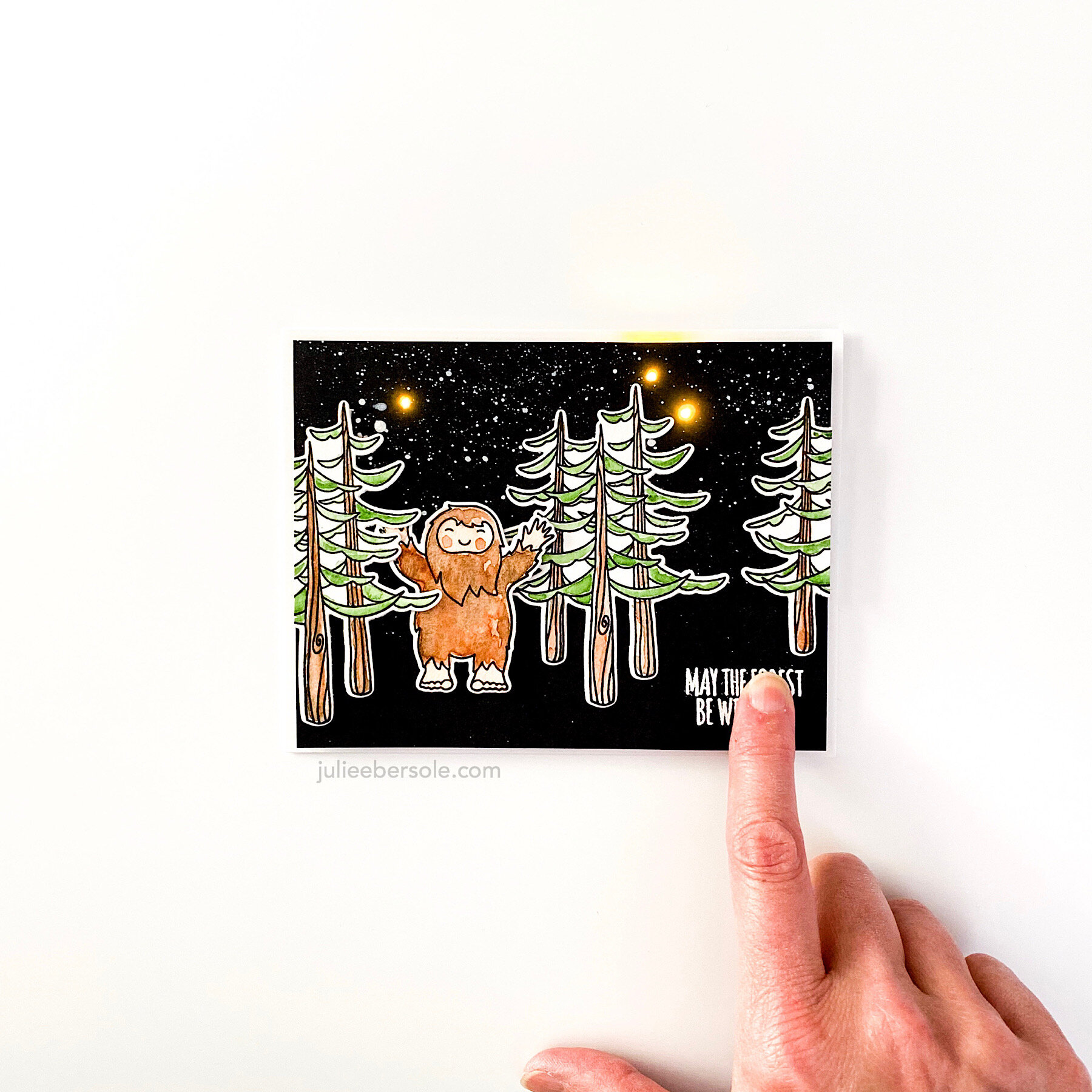
rnc-ezlight-squatch-001.JPG

I’ve been wanting to make this card for awhile now—so fun to make the night sky light up for this adorable Lil’ Squatch peeking out of the forest . . .

rnc-ezlight-squatch-002.JPG

Those EZ-Lights are my favorite—I love how quick and easy it is to work with them!

Have a great weekend—stay safe out there!


SUPPLIES:

Disclosure: This post contains affiliate links; if you see something you like, want or need, and purchase via my links, I receive a small commission, at no extra cost to you, which I use to buy coffee, which fuels my creativity and provides energy to make more card ideas. And, pay the rent.

RELAX & CREATE - PAINTING SKIN TONES WITH JUST 3 COLORS

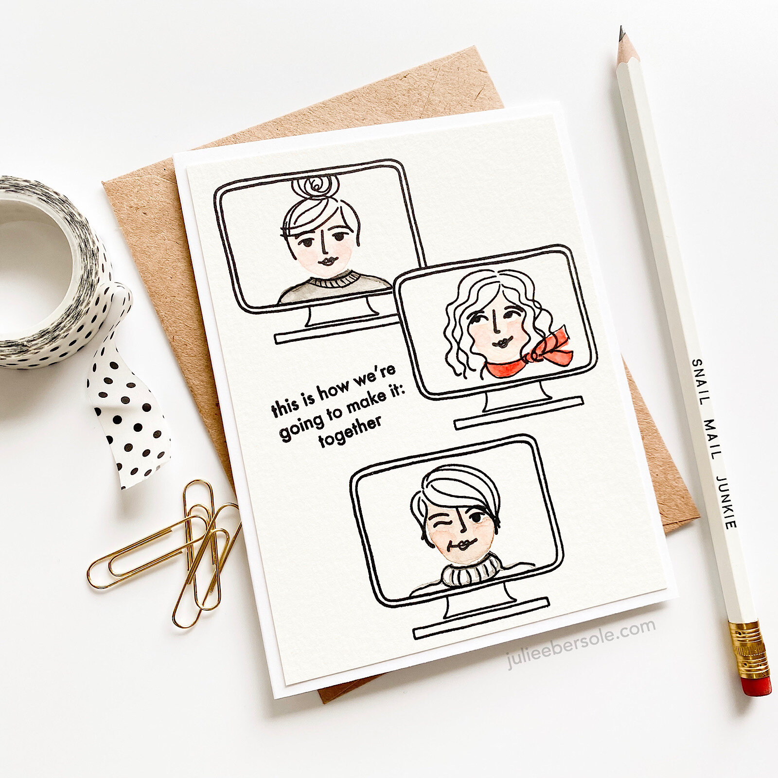
mini-voices-together-001.JPG

Surprisingly enough, you can use just 3 colors from your collection of Gansai Tambi watercolors to develop a wide range of skin tones! Watercolor is my favorite coloring medium, and it was fun to experiment with custom mixes. This card was actually inspired by some recent designs by my friends (and creatives extraordinaire) Lisa Spangler and Jessica Frost Ballas! I loved Lisa’s use of watercolors on her Mini Voices In My Head Designs, and Jessica’s minimalist approach with a basically black and white color scheme, accented by a pop of red.

gansai-tambi-for-skintones.jpg

You’ll see in the beginning of the video that I used the three colors shown above, and diluted them down with water from my waterbrush, and then played around with mixing the colors—I suppose I could have made a color chart, but honestly, when I have to mix colors, I tend to do so on the fly—and if I should need to repeat the mix down the road, I oddly enough remember the colors I worked with. What can I say? It’s a gift.

KIDDING.

I AM KIDDING YOU.

Also, I have to mention that I LOVE using the Waffleflower Mini Media Mat as a palette—it is just sooooo handy! And if the colors dry up while I’m working, I just rehydrate them with a couple drops of water by squeezing the waterbrush.

In one part of the video, I use a “thirsty” brush to wick up wet color from an area where I got a little heavy-handed; “thirsty” just means dry. I swipe my paintbrush against a clean paper towel to soak up the water (if I need, to, I might even pinched it with paper towel to get it REALLY dry); when I apply the dry brush to an area that has too much water or too much paint, it wicks it up into the bristles (hence why they call it a “thirsty” brush). I off load that onto paper towel, then I can go back and wick up more, if needed.

As you can probably tell, I had increased difficulty getting those rosy cheeks I was after when I tried to do them on the darkest skin tones; I’m going to need to practice. Rosy cheeks are a thing for me. I literally can’t help myself from painting rosy cheeks. Weirdness.

 
mini-voices-together-002.JPG

That expression from Brandi’s “You Should Know” set just seemed to suit my design nicely, so I had to borrow it. Seriously, this turned out so cute I let out a squeal when I finished! •all the heart eyes•

Hope you are continuing to stay safe and I appreciate you stopping by!


SO MANY VOICES

sos-hop2-ebe.jpg

Hey, hello, and hi there! I have some new stamp sets to share as part of the Essentials by Ellen Summer Of Stamping Release! You can see the new sets in detail here:

I have a few samples to share from each of them below and a video of me practicing my people colorin’ skills with Copic Markers. The EH Ambassadors are hopping along today and also have samples to share—be sure to read about the prize info at the bottom of my post.

Love that my girl has her own laptop and bevvies, like that cuppa hot tea . . .

The sentiments in Vol. 3 couldn’t ring more true—and nearly all of ‘em fit perfectly within the laptop “screen”. . . Sooooooo many options for that screen, I’m tellin’ ya’ . . . ! EEP!!!

I don’t color people very often, but for today’s hop and video (below), I wanted to try with my Copic Markers!


HOP/PRIZE DETAILS:

We’ve got a super fun prize!!! One random & lucky commenter will win $25 to the EH shop!!! To enter for a chance to win, make sure to leave comments at each stop along the hop! And don’t forget to comment here too for a bonus entry! Comment before Saturday, August 1st at 11:59pm PDT. The winner will be notified by email.

HOP ROSTER: