USE AN EVERY DAY IMAGE TO INSPIRE YOUR CARD MAKING

As you scroll down through these photos, you’ll see when you get to my finished project how they ultimately combined to inspire the direction I took.

Image Credit: Pinterest

Image Credit: Pinterest

This first photo was the one that sparked me . . .

Image Credit: Pinterest

Image Credit: Pinterest

This second photo drove my color scheme.

Image Credit: Pinterest

Image Credit: Pinterest

This last photo was a winner for the sentiment, which naturally led to me reaching for my beloved Classic Block Alphabet Die set.


cs-PSL-fall-001-1.jpg

For the last few weeks I’ve been down in the salt mines (working on illustrations/projects I can’t share right now, of course). Anyway, when I caught a break at the end of last week, I stressed out, knowing I hadn’t done any videos for the blog during that time (something I have been trying to improve on, but still can’t seem to get significant traction on). Before I beat myself up too much, I have to remind myself I was actually working (under a deadline).

I decided to try making a video. I spun around in circles trying to figure out what to do and it wasn’t until the end of the day that I told myself to stop stressing; if nothing is coming, quit forcing it. (It can oftentimes take an entire day to develop a card idea, and then another day shooting the video, editing the footage, photographing the finished project, doing the voiceover, and finally getting it uploaded. Oh, yeah, and writing up an accompanying blog post.)

I gave up. And, jumped into the Pinterest vortex . . .

I was surfing for anything Pumpkin Spice Latté because of something my daughter and I had been chatting about . . .

cs-PSL-fall-001-2.jpg

It doesn’t always work out this way; sometimes an idea just doesn’t come no matter what I try. And, I hate forcing things.

How about you?


PINKFRESH STUDIO HOLIDAY 2020 HOP

Welcome! And, thanks for stopping in, by way of Jessica Frost-Ballas’s blog!

The Pinkfresh Studio September 2020 Release is full of sweet and charming goodies—hope the samples I’m sharing today spark some ideas for you! And, be sure to read on below for info on giveaways/prizes—oooooooh!!! Nice, right?! (wink)

To see the entire release as a whole, please click ➞ PinkFresh Studio NEW

PFS-holiday2020hop-00-5.jpg

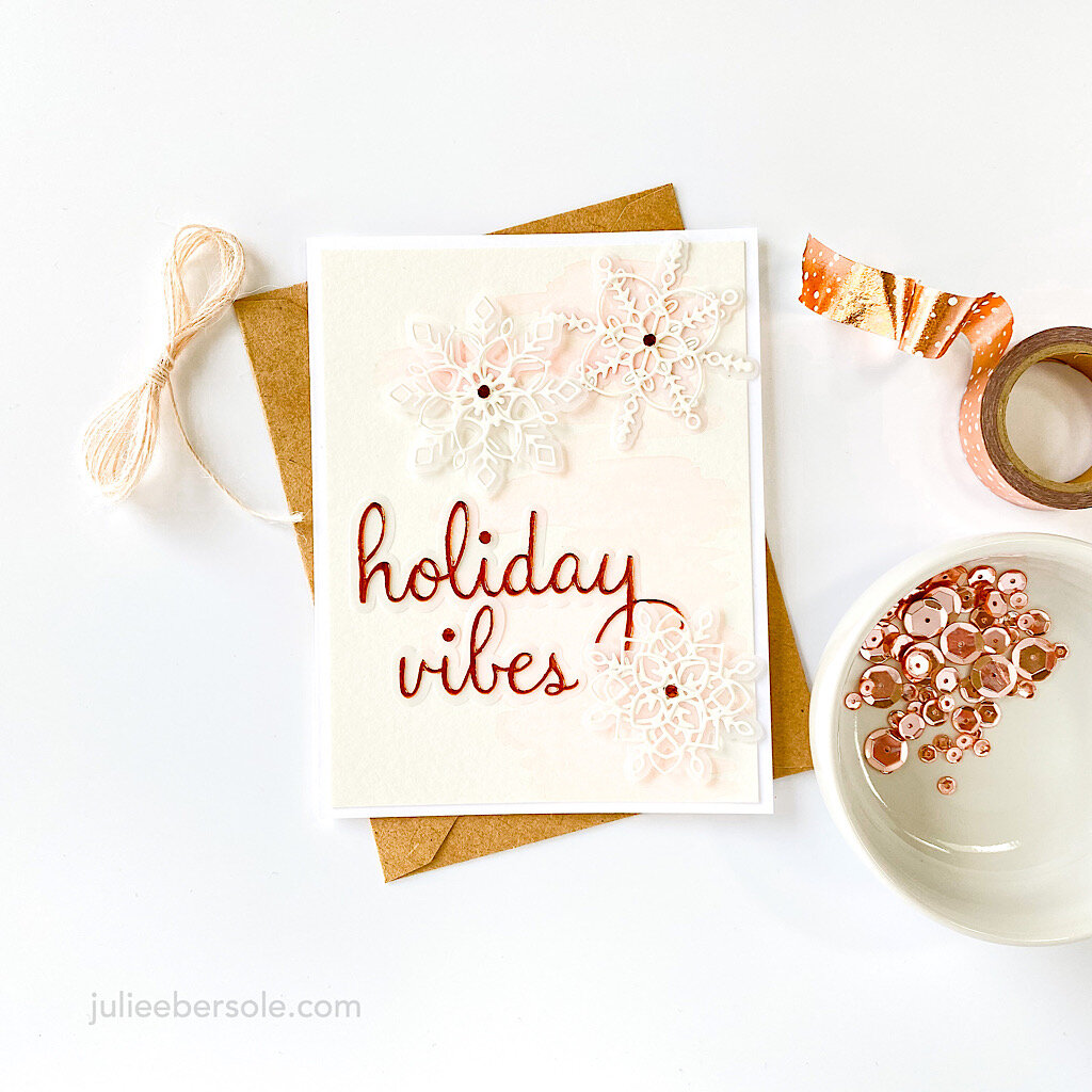
These snowflake die cuts are so delicate and when you layer them, they remind of lace—such a pretty effect! I layered all the die cuts onto vellum because it makes them look like they’re floating on a layer of frost. Muy dreamy! (chuckle)

And that copper foil card stock looks B.O.M.B! with that soft wash of pink watercolor . . .

PFS-holiday2020hop-00-3.jpg

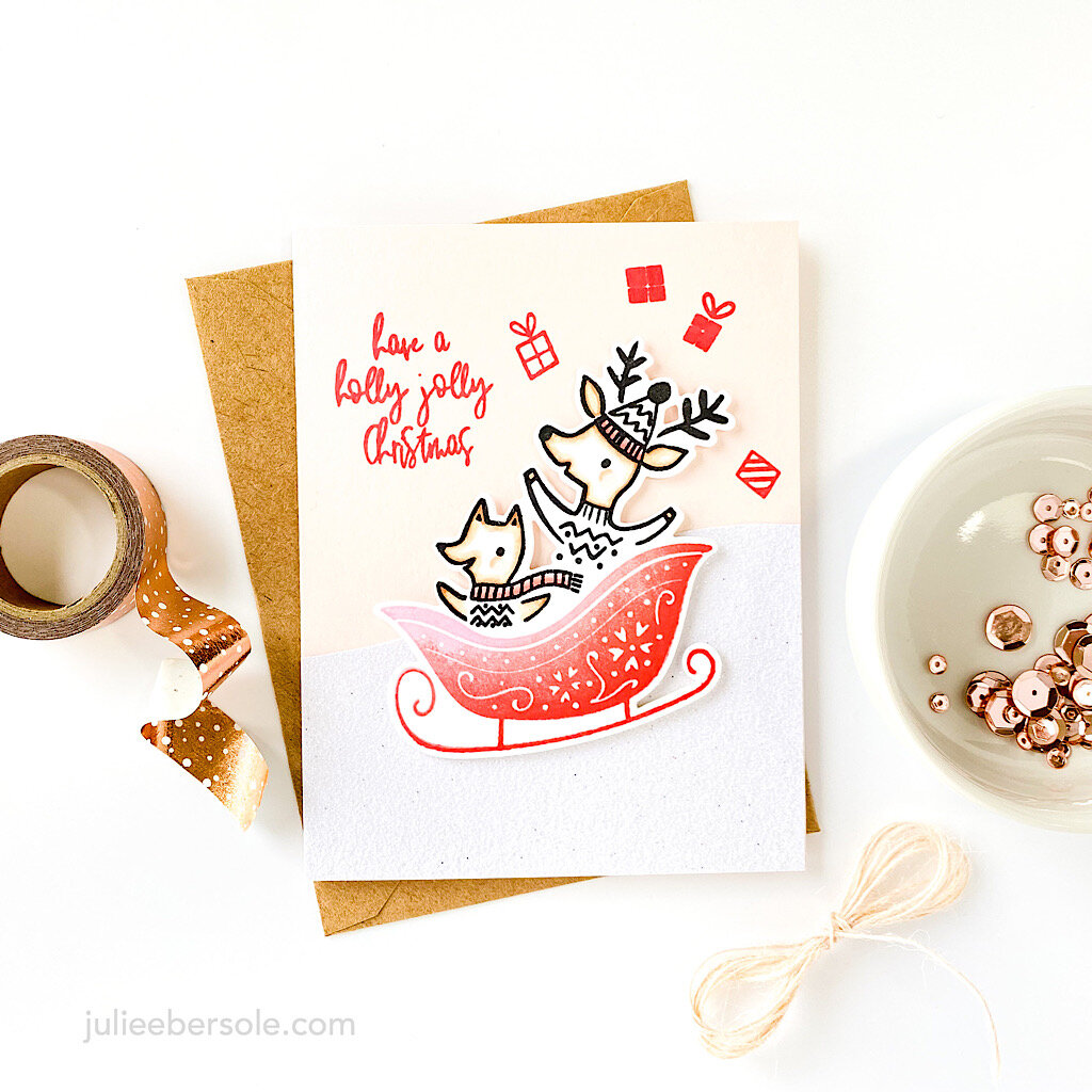
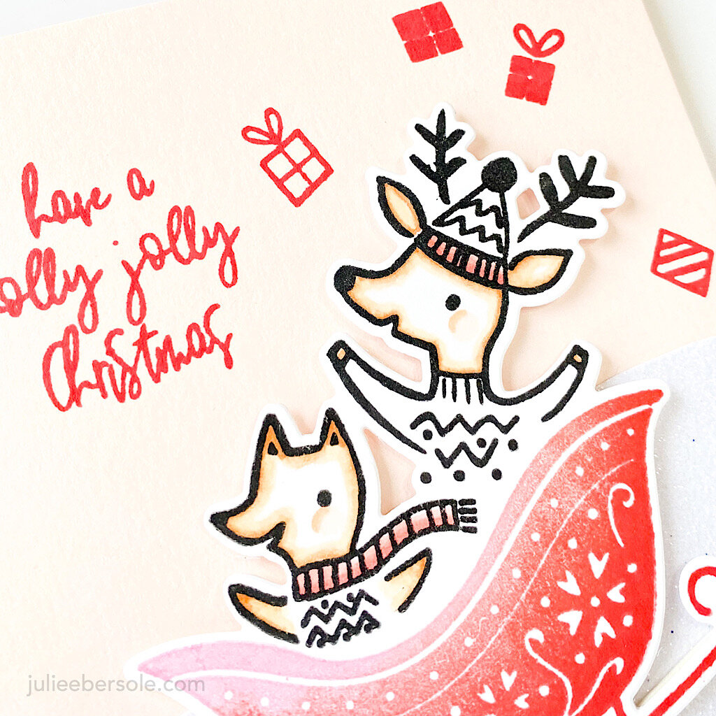
These adorable critters by Lizzie M. for Pinkfresh Studio are joy-riding down the slopes ! I absolutely love how the critters are “built in” with the sleigh die so all you have to deal with is one piece—YASSSSSSS!!! (fist pump)

PFS-holiday2020hop-00-7.jpg

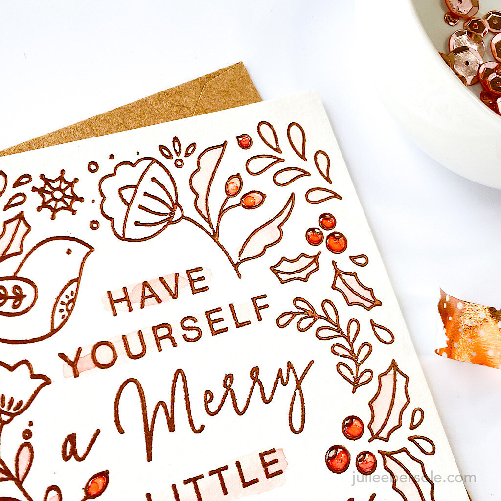
This cling stamp is cool in that you can separate the sentiment from the graphics if you want; otherwise it nests right inside—options, options, options! I was still on my copper kick with the pink watercolor washes, so I just stuck with it (image was copper embossed)—embellished all the berries/buds with glossy accents to give them extra pop.


GIVEAWAYS:

-Pinkfresh Studio will be giving away the full release on the Pinkfresh blog, their IG feed & YouTube channel..

-Each of the designers on this hop will be giving away a $25 gift card on our blog hop posts. Winners will be picked from the comments.

-Winners will be pulled and posted on September 24, 2020 on the Pinkfresh Studio GIVEAWAY PAGE. Please check that page & claim your prize within 2 weeks.


You are invited to the Inlinkz link party!

Click here to enter

As you can see from the list above, your next stop is Kay Miller!

Thanks for stopping by my place and leavin’ some comment love!

And, may the odds be ever in your favour!


MAKE A TROPICAL CARD DESIGN USING AN AMARYLLIS IMAGE

tropical-amaryllis-00-1.jpg

Today’s my sweet Mama’s birthday and I wanted to share the card I made for her. As I mention in the video, she was born and raised on the island of Kauai.

IMAGE CREDIT:  PINTEREST

IMAGE CREDIT: PINTEREST

These beautiful colors remind me so much of the gorgeous flora on Kauai, which is fondly referred to as the “Garden Island”.

tropical-amaryllis-00-2.jpg

Hope this inspires you to see what kind of spin you can put on images you own.

Enjoy your weekend, and stay safe!


ONE COMPOSITION, 4 LAYOUTS, 4 COLOR SCHEMES

allgood-1comp-4ways-001JPG.JPG

It’s All Good is one of my favoritest sentiment sets because it’s modern and pretty much timeless. It can go feminine or masculine, which is a huge plus!

You could color in the outline letters, but I find this alternative way to add color both super easy and super effective! I liked the composition so much, I made 3 more cards, but just switched the lay-out slightly and the color schemes.

I used Abstract Paint Strokes—another favorite of mine— to create the stripes of color and the spotty background. If you don’t have Abstract Paint Strokes, Flora & Fauna make a set you could easily use to create similar spots and stripes: Texture 10.

I must admit, I had to try a variety of color schemes (on scratch paper) found on Pinterest before I found combos that really appealed to me when laying the stripes down next to and overlapping each other. The skinny washi tape is from HAI Supply and I love that the pattern is a smaller scale than your average rolls of washi tape.


Thanks a Lot Color Scheme: Limoncello | Bellini | It’s a GirlOh. Em. Gee. Color Scheme: Mint To Be | Be Mine | Lemongrass | Limoncello | It’s A GirlHip Hip Hooray Color Scheme: Green Tea | Black Jack | Bellini | Mint To Be | Tutti FruttiHeck, Yeah C…

Thanks a Lot Color Scheme: Limoncello | Bellini | It’s a Girl

Oh. Em. Gee. Color Scheme: Mint To Be | Be Mine | Lemongrass | Limoncello | It’s A Girl

Hip Hip Hooray Color Scheme: Green Tea | Black Jack | Bellini | Mint To Be | Tutti Frutti

Heck, Yeah Color Scheme: Sauna | Mandarin Spice | Twilight | Bellini | Sand Castle | Eucalyptus

This is such a great composition that works well in all of the layouts above—hello, Easy Button! (fist pump)

Happy Weekend and thanks for stopping by!


My Pinterest Color Inspo Board: Coloring My World

SUPPLIES:

Disclosure: This post contains affiliate links; if you see something you like, want or need, and purchase via my links, I receive a small commission, at no extra cost to you, which I use to buy coffee, which fuels my creativity and provides energy to make more card ideas. And, pay the rent.

TWO CUTE COFFEE CARD IDEAS

rnc-2-lattelove-cards-grp.JPG

These two coffee card ideas for the Latté Love stamp set have been flittin’ around my brain for nearly a year—but the idea for incorporating a hidden gift card pocket was inspired by one of Yana Smakula’s creations. Super ingenious!

These were just fun to make using a simple faux watercolor technique that I’ve always loved.

rnc-2-lattelove-cards-001.JPG
Hidden gift card pocket was inspired by this Yana Smakula gem!

Hidden gift card pocket was inspired by this Yana Smakula gem!

So, anyone else as anal as I am about my card matching the theme or the colors of the gift card housed inside? I seriously doubt anybody who receives a gift card gives a flyin’ fig about that, so why, why, WHY do I ponder how to make them match at least somewhat???