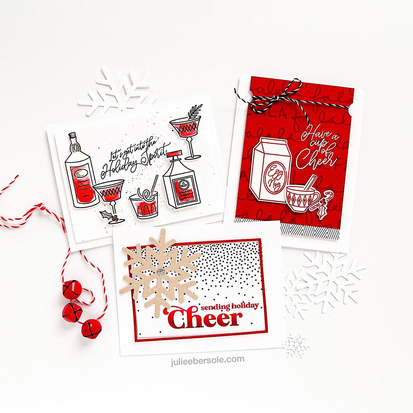
feat. CUP OF CHEER STAMP SET + DIES / FA LA LA LA BACKGROUND STAMP / SENDING HOLIDAY CHEER / ESSENTIALS SNOWFLAKES DIES / MODERN GRAPHICS PAPER
When I shoot release page samples, I sometimes group them into little ensembles that make my eyes happy. I just love using those snowflake die cuts in the background—I hope we get snow this winter; it’s always so hit or miss ‘round these parts . . . •sigh•
Eggnog. Because tradition. Because they start putting it out on the shelves looooong before Christmas. Because dessert in a cup. (insert cheeky grin)
I was going to color these, but they looked so pretty just stamped in red that I couldn’t bear tampering with perfection, LOL!
Stamped Fa la la la Background with Peppermint Scrub over red card stock and I love it—sometimes when I stamp a background stamp like this with black, it competes too much with the images in the foreground. After a couple of design fails I decided to try this approach instead. Used my heat gun to set the ink and also pounced the surface with anti-static powder to make sure it was COMPLETELY DRY. Then I could white emboss “Have a cup of cheer” over top and not worry about the powder sticking where I didn’t want it.
Originally, my plan for this sample didn’t have any patterned paper, but once I added that little bit along the bottom of the main panel? Of a sudden, it elevated the whole design. Even when I sketch plans and make notes, sometimes samples can end up going a different direction, slight or massive.
I gotta’ say, the different reds in the Kuretake Gansai Tambi watercolor sets are so SO lovely! I originally tried to watercolor these with all sorts of other means (red markers, red ink pads pressed against an acrylic block, etc.) but they didn’t look right. Nothing was working until I grabbed the Gansai Tambi. I’m super picky about my reds, what can I say? (shrug)
My daughter went nuts over this design—told me it was so nostalgic for her because it was reminiscent of the OG Grinch storybook; the illustrations were all black and white, with red to accent. I took that as a compliment—an unexpected, but sweet compliment. It really made me smile because I remember reading this book to her sooooooo many times when she was a little girl . . .
More ombré inking on that bold sentiment—beautiful bold lettering like this just calls out to me for it! I describe how to do ombré inking on my previous post, linked HERE.
I highlighted the patterned paper with a skinny red frame (using the Essentials Rectangles Dies). If you wanted to take this a step further, you could also use the MINC to foil the snowfall patterned paper (yes, these patterned papers work with toner reactive foils* ! WOOT!!! ); I think it would be gorgeous in silver, to match the Silver Stickles in the center of the kraft snowflake! Metallics look so pretty with kraft—silver, gold, copper, rose gold . . . I honestly don’t think you can go wrong mixing metallics with kraft.
Which metallic do you lean towards for kraft? Or, are you like me, winner takes all? LOL!
SUPPLIES:
Cup of Cheer by Julie Ebersole, Essentials by Ellen Clear Stamps
Cup of Cheer by Julie Ebersole, Essentials by Ellen Designer Dies
Holiday Sprigs by Julie Ebersole, Essentials by Ellen Clear Stamps
Holiday Sprigs by Julie Ebersole, Essentials by Ellen Designer Dies
Modern Graphics Vol. 2 by Julie Ebersole, Essentials by Ellen Paper Pack
New & Improved Mini MISTI Laser Etched Stamping Tool (6-1/8 X 7), My Sweet Petunia
Platinum 6 Die Cutting And Embossing Machine, Spellbinders Tools
Disclosure: I include affiliate links to the products used in my projects and make a small commission when you purchase via those links, at no extra cost to you. Thank you for buying all the things!


